Application Builder
The inorigo® Application Builder is a module to build Applications that enables users to view and interact with data and structures. Applications can vary widely in usage, complexity and in their layout.
This Resource hub article is a stub. If you need further support regarding the subject, contact the inorigo® helpdesk.
Overview
An inorigo® Application presents curated parts of the metagraph model created in the Model Builder or Metagraph Builder. Knowledge sets, typically created in the Knowledge Set Builder, can be reused across multiple applications within the inorigo® instance. Applications are not limited to data from the inorigo® database—they can also display and combine data from multiple external sources.
Check the Resource Hub article on applications for more details about applications runtime and how to interact with applications.
Launching Application Builder
The inorigo® Launcher is used to start the Model Builder and Application Builder Modules. You can read more about the Launcher here.
Windows
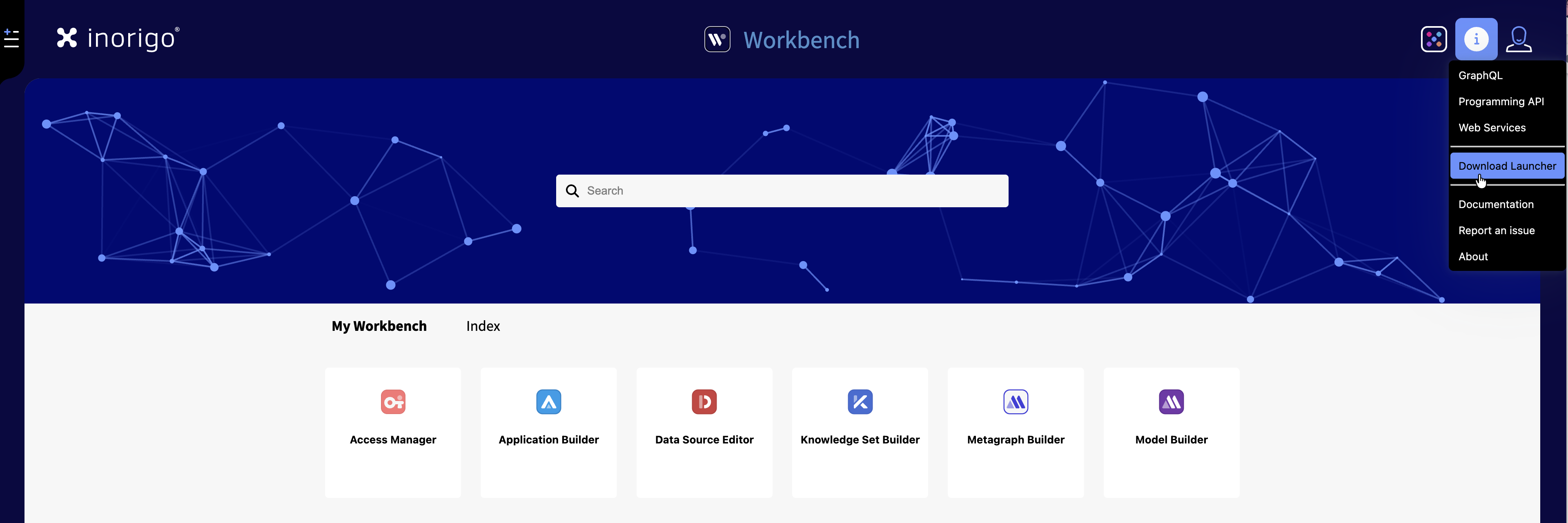
Download and install the inorigo® Launcher. You can find it under the Info menu › Download Launcher
Or navigate directly to the inorigo® Launcher on Microsoft Store and follow the installation instructions. The launcher will receive automatic updates through the Microsoft Store.
Once the Launcher has been installed, access Application Builder through the Workbench. The inorigo® Launcher will automatically download and install the necessary Java files to your computer.
Troubleshooting
– Nothing happens when I click the Model/Application Builder icon in Workbench
Ensure that your browser and operating system permits inorigo® Launcher to start from your browser.
Other Operating Systems
Java Webstart is used for all other operating systems.
For Mac. Install Java JDK21.
Open Applications & Bookmarks
When opening Application Builder the Applications panel appears with all available (accessible by User) Applications. Access this menu again through File › Open [CTRL + O]
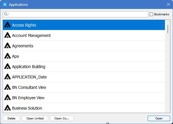
Filter the list with the Search Field and toggle Bookmarked / All Applications
| Action | Description |
|---|---|
| Open | Open the selected Application in same window |
| New | Create new Application |
| Open Limited | Opens a popup that allows you to open the Application empty, or with a limited set of data in each filter component. This is useful when working with Applications that contains several hundred thousand of rows in source filter component, or when the Application contains many filter components – typically more than 50 filter boxes. |
| Open Copy | A copy of the selected Application will be created as a new Application “Copy of …” |
| Delete | The selected Application will be deleted |
It is possible to open multiple Applications from the same instance simultaneously. First open a new Application Builder window through Modules › Application Builder and then bring up the Applications panel [CTRL + O] to open a second application.
Model Builder: Menus and Side Panels
Below is an overview with the different side panels and menus of Application Builder.
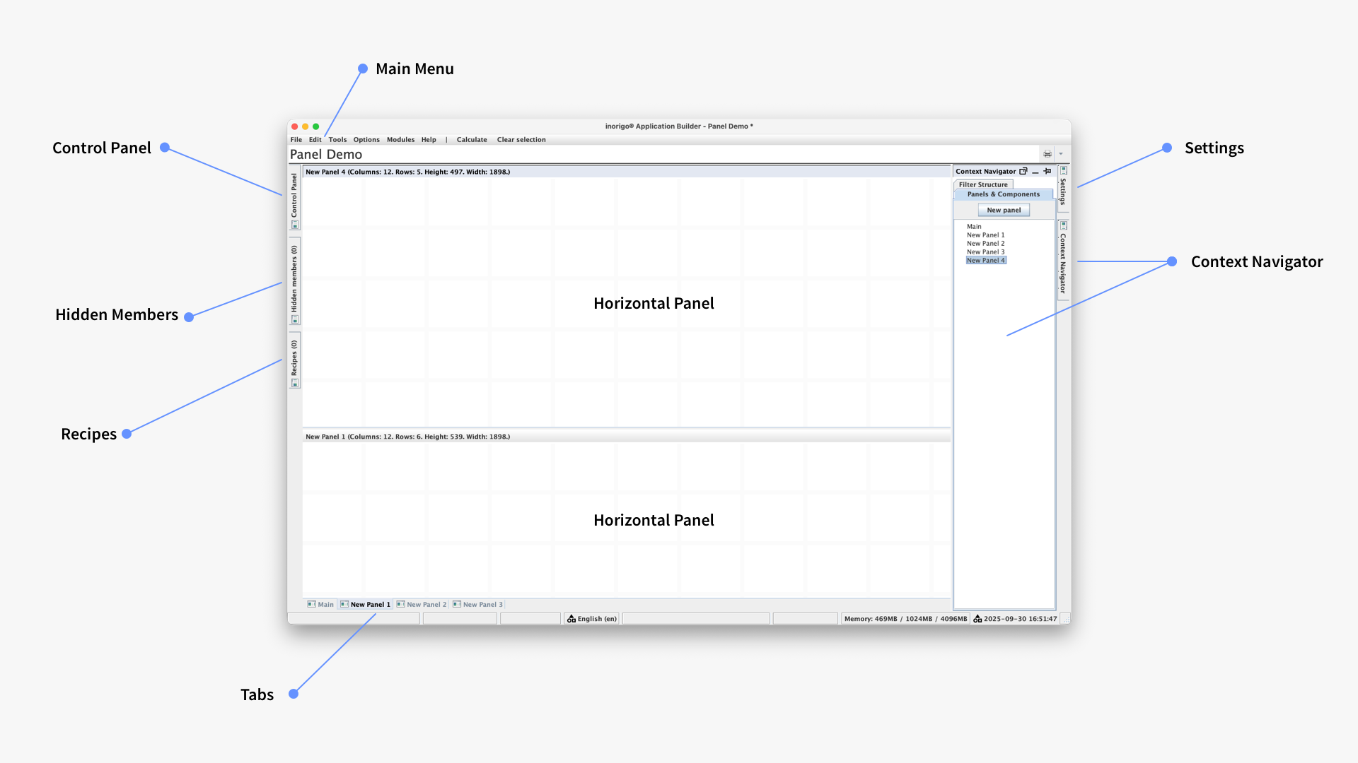
Anatomy of the Application Builder
Main Menu
Below you'll find an overview of all the application menus and their content.

| File | |
| Open… | Opens Applications Panel [CTRL + O] |
| Bookmarks… | Opens Applications Panel with Bookmarks [CTRL + SHIFT + O] |
| New | New Application [CTRL + N] |
| Save | Save current Application [CTRL + S] |
| Delete | Delete current Application |
| Bookmark | Toggle Bookmark/ Un-bookmark current Application [CTRL + B] |
| Import… | Import - Import an application saved as an XML file |
| Export… | Export -Export an application and save as an XML file |
| Edit | |
| Add Component | Add a new component, the menu can be revealed by right-clicking in a panel |
| Layout | Allows for toggle between Absolute (legacy) and Grid layout |
| Settings… | Settings for the application, like auto calculate and hide locked items |
| Variables… | Panel for managing Variables |
| Data Sets… | Panel for managing Data Sets |
| Selections & Filters… | Panel for managing filters for the app's components |
| Manual Links… | Panel for managing Manual Links between component's columns |
| Rights | Shortcut to the Access Manager module |
| Rollback application version… | Lets you restore an older, saved version of the application |
| Replace application… | Lets you replace the current application with another application |
| Tools | |
| Clear Selection | Clears all selections [ALT + S] |
| Calculate | Performs a calculation on current selection [ALT + C] |
| Refresh | Reloads data from all sources used in current Application |
| Open Design Mirror | Opens a Design Mirror in default browser – set with or without data under options [CTRL + SHIFT + D] |
| Open in browser | Opens Application in default browser [CTRL + SHIFT + A] |
| Options | |
| Auto Calculate | Toggle Auto Calculate on and off |
| Mirror design without data | Design Mirror displays components size and position, but without data |
| Mirror design with data | Design Mirror displays Application as seen by end users |
| Modules | |
| Model Builder | Open/tab to Model Builder [CTRL + M] |
| Application Builder | Opens a new Application Builder window |
| Help | |
| What's new | Opens the News section of the Resource Hub |
| inorigo® "*" | Opens the corresponding documentation in the Resource Hub |
| Report an Issue | Open Bug Report page |
| Programming API | Opens Programming API documentation |
| About | Reveals information about the inorigo® instance |
Context Navigator
The Context Navigator is an Application menu that provides overview over panels and components. The Context Navigator consists of two tabs, Panels & Components and Filter Structure.
The Context Navigator can be pinned to the work area or opened in a floating dialog window.
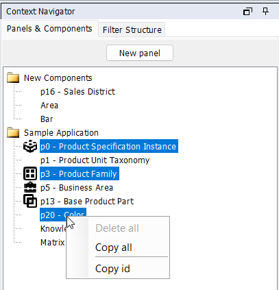
Panels & Components
Panels & Components provides overview of the application through a tree-structure list. Panels and Tabs are represented by a folder, and each component a list item within those.
Multiple components/panels can be selected from the list with CTRL + Click. Use this functionality to delete or copy several components simultaneously.
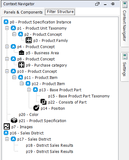
Filter Structure
The Filter Structure tab shows a tree structure with the different filter component and how they are linked.
Hidden Members
You can choose to hide a component from the main panels by right-clicking and select Hide Component.
All Hidden components can be found under the Hidden Members Panel, from where it is possible to restore the component to its original panel.
To Restore a component double-click it in the Hidden Member's list. You can also move a hidden component to any panel by right-clicking it in the list and select Move to Panel.
Designing Applications
This article covers the technical aspects of Application Builder. To learn about design principles and best practices when it comes to building effective and user-friendly applications, check the**Application UX-Guidelines** under Tutorials.
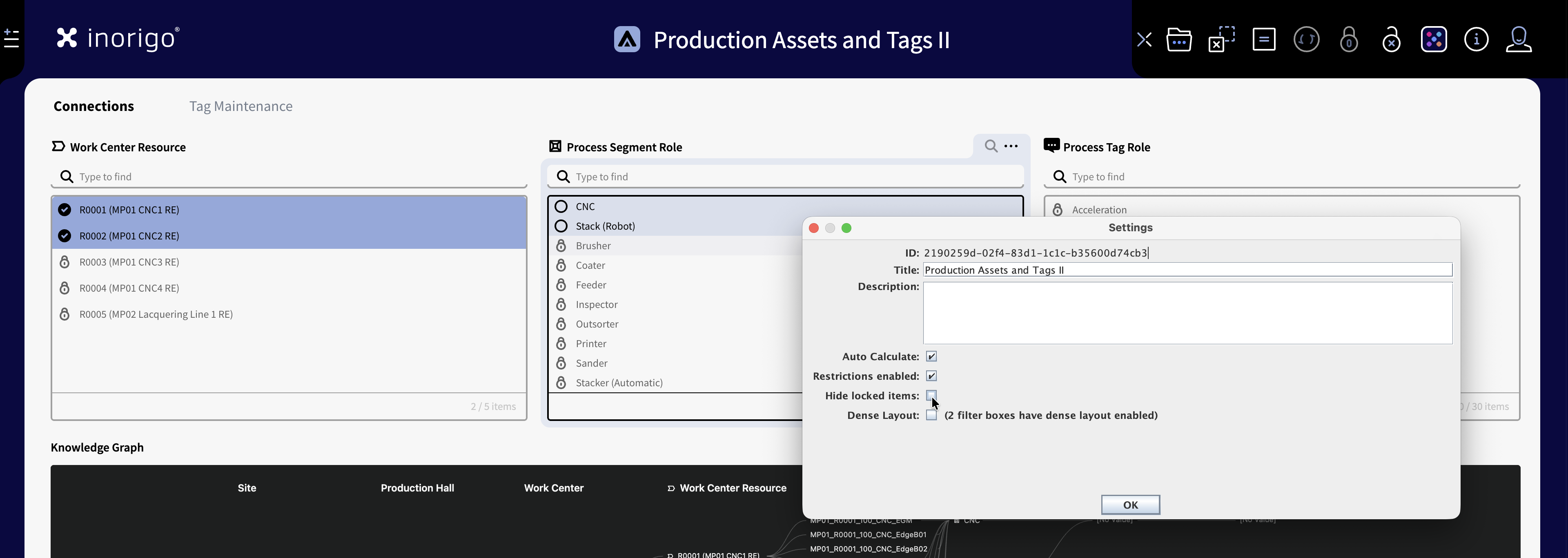
Application Settings
To configure settings for the current application, open the Main Menu and select Edit › Settings…
ID
Lists the unique ID of the application in inorigo®
Title
Lets you edit the name of the application. Note that you can also click the title in the main view.
Description
Lets you write a description for the application.
Auto Calculate
Enabled by default. When disabled, results for calculation-dependent components (e.g., Matrix) update only when the user clicks the Calculate icon in the toolbar. Disabling can improve performance in slower applications.
Restrictions Enabled
Enables the Restrictions functionality in Runtime. Restrictions can be applied from the application’s Restrict to Selected icon in the toolbar, or by right-clicking a list item and selecting Restrictions › Restrict to.
When applied, the restriction originates from the selected item(s):
When selected, all incompatible (non-selectable) items in linked filter components become locked. It also restricts so that it is not possible select another item from the same filter component.
To remove a restriction, right-click the restricted item and select Restrictions › Remove as Restriction, or use the Remove Restrictions icon in the toolbar.
Note: Clear Selection does not remove restrictions.
Restrictions: Both the Application Builder 'Application Settings' Window and the runtime application in the background with restrictions applied.
Hide Locked Items
Hide locked items is only available as an option for Restrictions Enabled. When it is enabled, any items that becomes locked as a result of Restric to Selection is hidden. When the Restrictions is removed, they become visible again.
Dense Layout
Changes the height of the list items, and font size in the filter boxes. The list becomes more dense - more rows can fit within the component's height. Nota that at this may cause the application and text to be harder to read and increase the overall cognitive load. IE More items at the screen often makes the application less effective. Dense layout can be enabled on individual componets in the component's layout settings.
Panels
A panel is the area, "the canvas" to which components can be added to an Application. There must always be at least one panel per application. You can organize and structure an application by splitting a panel into multiple panels. Each panel can have its own collection of tabs.
Components will maintain the scale and position given on a panel when an application is running.
By default a panel named Main is added to all new Applications. Like components a panel can be hidden and named. Watch the video below for a quick overview of Panels.
Tabs
A panel can be divided into multiple tabs. To create a tab you can right-click in the panel and select New Panel › As Tab. You can also drag an existing Panel on top of another panel to convert it into a tab.
A Panel can contain tabs, but not vice versa. A tab cannot contain tabs of its own.
Tabs are displayed as tabs in the bottom of the Application Builder window, in Runtime the tabs are shown at the top of the panels. You can re-arrange tabs by dragging them, or right-click a panel and select Move Left or Move Right.
Note Selections in components are shared across tabs and panels.
Multiple Panels
An application can be split into multiple panels. However you cannot combine Horizontal and Vertical panels in the same application. Read more about how to utilize Panels in the UX-Guidelines.
You can either add a new panel by right-clicking in any panel and select New Panel oryou can open the Context Navigator and select New Panel from there.
You can change a panel from horizontal to vertical, and vice versa by dragging its header either to the top or bottom edge – or to the left or right edge of the Application Builder.
Example of an app with two Horizontal Panels and Tabs
Horizontal Panels
You can have any number of horizontal panels. Each Panel will be 12 columns wide (Full app width). You can add a new horizontal tab by right-clicking in the panel and select New Panel ›Bellow . You can manually set the height of the panel by dragging the area between the panels. (minimum of 2 rows). A vertical scrollbar will be added to accommodate for any components within that's taller than the set height.
Vertical Panels
You can have up to 4 vertical panels in the same application. You can add a new Vertical tab by right-clicking in the panel and select New Panel ›To the Right. The minimum width is one column wide, but it's really not recommended to have a panel narrower than 2 columns. Components will shrink to the width of the column and the panel will not scroll horizontally. There's no limit to the height of each vertical panel.
Panel Layout Options
Application Buidler supports two layout settings. You can change switch between these from Edit/Layout in the menu bar.
Note that switching between layouts will cause all currently visible components to become hidden. You can find hidden components under the Hidden Members panel.
Grid Layout
By default Application Builder uses a 12 column wide responsive grid to which the components snap. This facilitates orderly and neat applications that scales with the browser. You can read more about the best practices of application design under the UX-Guidelines section of the Resource Hub.
Absolute Layout
It is possible to change the layout to Absolute layout, which means that components can be placed freely without the restrictions of the grid. Note that switching to absolute renderers the application non-responsive which can cause issues on some browers and resolutions – it is not recommended for those reasons.
Components introduction
inorigo® Application Builder makes use of Components to display information and visualizations of data.
The main component types are:
- Filter Component list data for users to select and view
- Result Component visualize or clarify data by rendering Charts, Maps, Graphs, Matrices
- Layout Component display text or images
- Plugins are optional components. Data Grid is installed as default. Read more about the Data Grid here.
Adding a Component to a Panel
To add a new component to a panel, right click on it and select the desired type from the list. The New component will be placed where you initially clicked.
You can also add a component by going to the menu bar, Edit › Add component ›. The component will automatically be placed on the currently active panel.
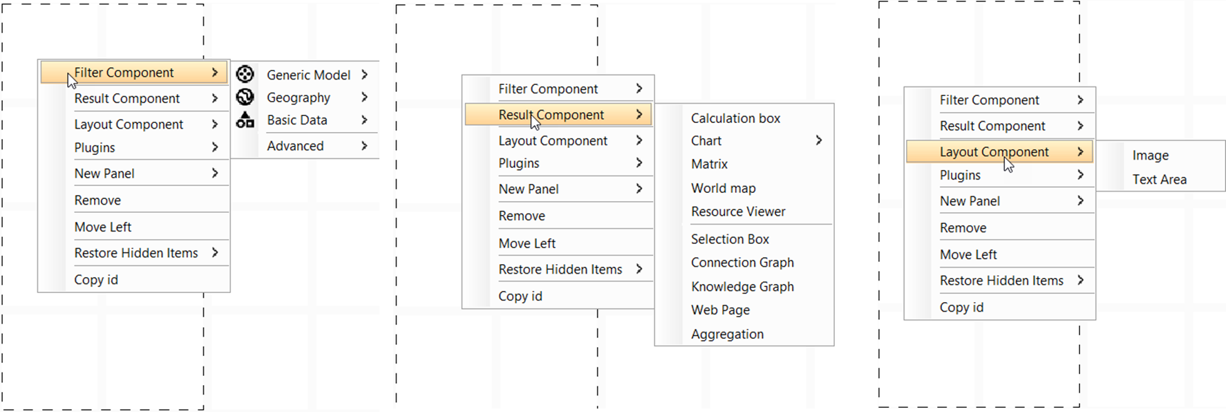
Right click menu gives the option to add one of the three component types, among other things.
Managing components
The Application builder places new components where there's free space, it is however possible for components to overlap. This is typically not something you'd want to do, but there might be exceptions.
The Context Navigator is efficient for viewing and editing multiple components simultaneously.
Component layering management
Components can be layered on top of one another. To manage layering, the following functions can be found by right-clicking on the component header, or in the View Navigator
- Bring to Front =Target component is placed at top front
- Bring Forward = Target component moves 1 step forward from its position in the layers
- Send to Back = Target component is placed at the very back
- Send Backward = Target component moves 1 step backward from its position in the layers.
Copy and Paste Components
All types of components can be copied and pasted. Right-click on a components header or the View Navigator and choose Copy/Paste.
Multiple components can be copied and pasted simultaneously from the View Navigator. If the copied components are located within the same panel, their positioning will be honored. If not, they are listed left to right.
A copied component holds all the settings and links as the original component. A filter component that has been linked from another filter component will thus stay within the same tree structure when copied.
Subset copy
Subset copy can be used to clone a filter component, whilst creating a link between them. This is useful when the first filter component in a structure, is to be copied, and a link should be established between it and the original.
General Component Settings
All Components in Application Builder has a section with General Settings. Settings for the currently selected component be found in the Setting Panel. The General Settings are the same for all types of components, with an exception for that Filter Components that has an additional option for linking components.
The General Components settings are as follows:
General
Title
Title of the component that appears in the component's header.
Icon
Sets an icon for the component header. Use the search icon to upload a file from your computer or select an existing resource from inorigo®.
Description
Description for the component. By checking the Show As ToolTip option the description will be shown when hovering over the component.
Location
Shows the components position and size on the application grid.
Visibility Expression
Allows for writing an expression to control whether the component is shown.
Filter Components
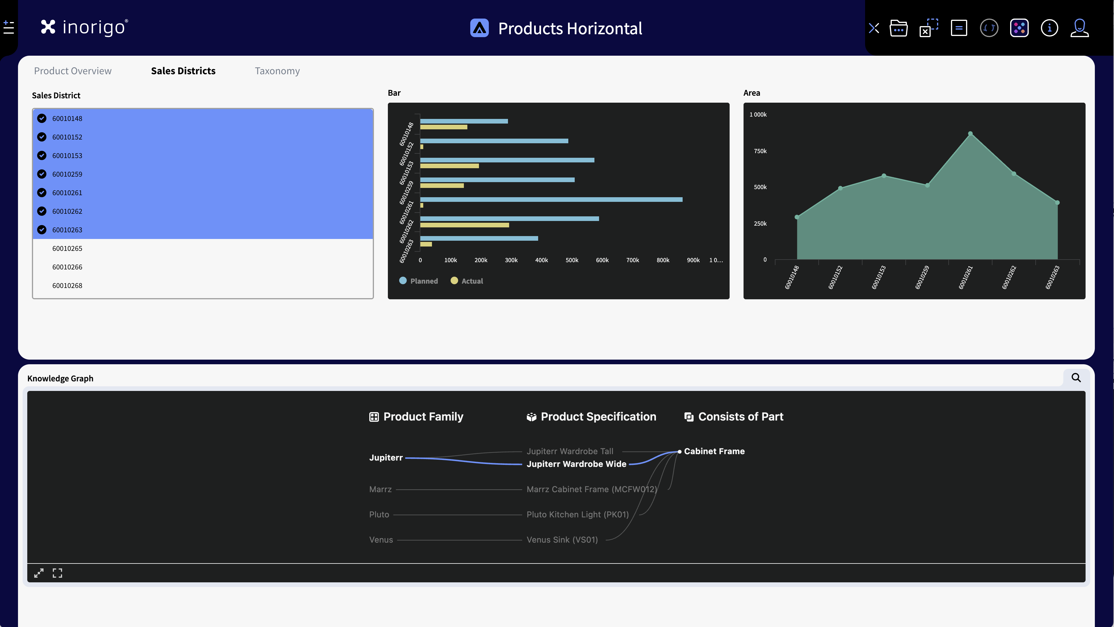
A Filter Component holds either information units from inorigo® or other data sources defined by search queries. Users of the Applications interact with Filter Components by selecting units that they contain. A selection in turn can trigger connected Result Components, connected units in other Filter Components and more.
An application with different filter componets, in the Application Builder and the Browser.
Each Filter Component is given a p number for referencing. The first box gets the identifier p0, the second box p1 and so on. The identifiers may be used to refer to a Filter Component in expressions.
Creating Filter components
There's two main ways to create a Filter Component and populate it.
Query based Filter Components
To create a new filter component with any Data Type in the model, right-click the canvas. From the menu, select Filter Component and then select any of the available Data Types.
Filter Components are populated through Querying the metagraph for the desired data objects. More information about how to compose a Query can be found here. Once you're done, press Query to populate the Filter Component.
The most common Data Types, Definition Node and Instance Node can be found under Filter Component › Generic Model
An example how to select a Node Definition to define the content of the Filter Component, and then link to a new component with Node instances.
Knowledge Set based Filter Components
There are many advantages in using Knowledge Sets as foundation for applications. To name a few, you are able to
- Write queries that determines the content of Filter Components in ways that the Search Panel cannot do, such as adding OR statements.
- Leave out Filter Components that contains references between content for improved performance structure in Application Builder
- Reuse Knowledge Sets in multiple Applications to build your Applications faster and to centralize data governance.
Creating an Application from a Knowledge Set
Knowledge Sets are built with the Knowledge Set Builder, read more about how to create them here
Load the content of a knowledge Set into Application Builder from Filter Components, Advanced, Knowledge Set.
Find the desired Knowledge Set via the search panel and load it to the Application.
When loading, you will be asked if you want to add all columns. If you press OK, the columns will be added as separate filter components in addition to an advanced filter component. You can make these filter components manually as well.
Notice! For information in a Knowledge Set to be converted back into inorigo® units when a Knowledge Set is loaded in Application Builder, the Knowledge Set should hold the unit’s IDs. You can tell that a column holds an inorigo® unit, rather than a primitive value from the icon or by right-clicking it and choosing Open.
Use links from the settings menu to pull out columns from the knowledge set into separate Filter Components.
Updating a Knowledge Set in Application Builder
Queries that control the content of columns in a Knowledge Set are effects the knowledge set in Applications as soon as the data is refreshed/reloaded.
Metadata, such as the name and order of the columns is not updated with a data reload, but require a manual update of the Knowledge Set from Application Builder since this update may have consequences on content in the Application.
The content of a Filter Components pulled out from a Knowledge Set is determined by the order of the column in the Knowledge Set.
If you make any changes to the order of the columns in a Knowledge Set (That is changes made from the Knowledge Set Builder), any Filter Component effected by that order will have to be manually set to fetch its content from the new column.
You can choose the content from the settings menu for every filter component. Notice that you are not prohibited to change the content of a filter component, as long as the new content is of the same Data Type as the original.
Create a Filter Component by selecting a Knowledge Set
This example shows how to select a Knowledge Set, add all columns from the Knowledge Set and remove those not needed.
Important note
When definition is not specified for a Filter Component, the attribute references will NOT be loaded. Performance would be greatly reduced if all references were to be loaded, and most of them would not make any sense.
Linking Components
The ability to link components is an essential function of inorigo's® applications. It allows for filter data sets and populate components with relevant data. Filter components can link to other filter components, result components, or plugins like the data grid.
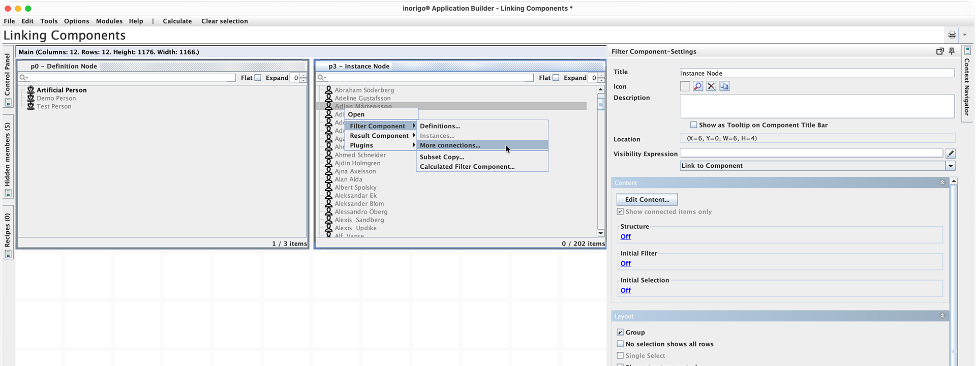
Linking a filter component with instance nodes through the right-click menu.
Linking Filter components
A key feature of Filter Components is their ability to visualize relationships between entities and filter out items that are not connected to the active selection. You can read more about how selections work in the Applications article.
The prerequisite to link two filter components is that the content - the objects in the components, has a relation in the model. A Definition Node always has a relation to its Instance Nodes, and vice versa. You can also link through any available Reference.
To see all possible ways to link a component right-click one of the entities in the filter component, or select Link to Component in the Details Panel, and then Filter Component › More Connections…
Linking to Result Components
Result Components are typically utilized to show and visulize the selection from Filter components. This can for instance be data points in a chart, locations a map, a knowledge graph, or just displaying an attribute value in text.
To create a link to a new result component right-click on any of the objects in an existing filter component and select the Result Component › and the component type you want to link to.
You can also find Link to a Component in the General Settings section for a selected filter component.
You can overview how components are linked in the Context Navigator's Filter Structure tab.
Read more about the different Result Components here.
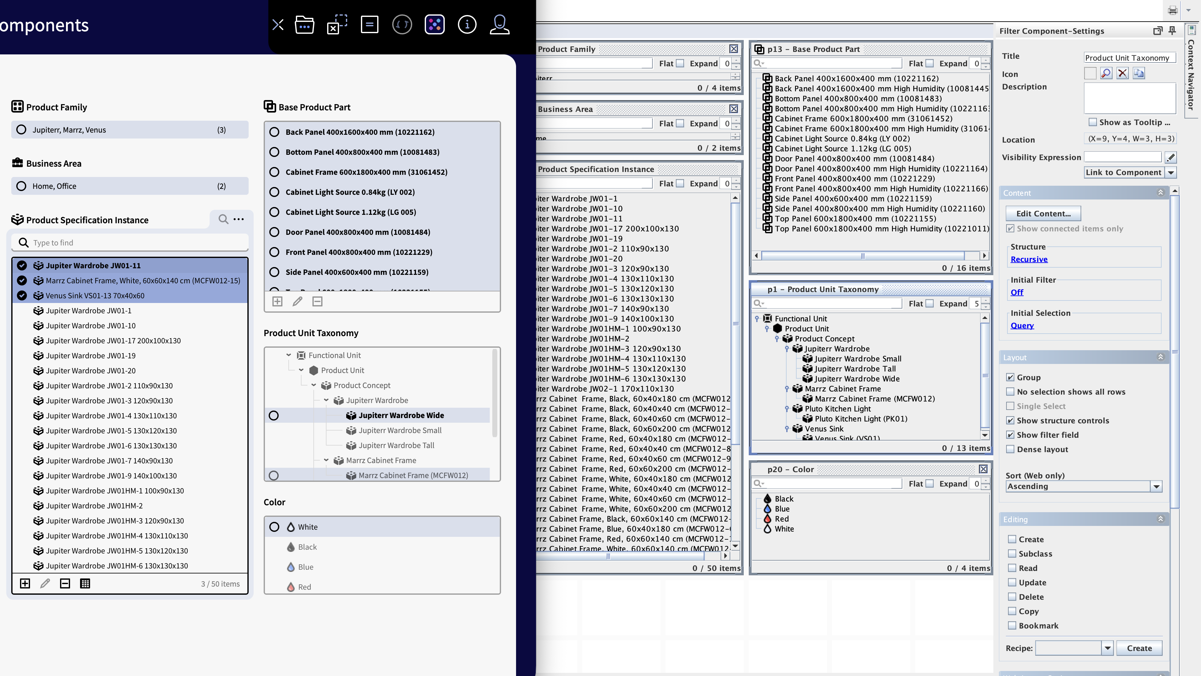
Filter Components Settings
To see and edit the setting for a filter component, select it and open the Settings Panel. (By default located on the right side of the Application Builder's window. In addtion to the General component settings there's the following sections:
Content

Content settings in content panel
Structure
You can configure the filter component to show a Recursive Structure. This will show the content of the filter component as a browsable tree-structure.
The outcome in a Structured Filter component is dependent of the initial content in the Filter component, and the different kind of relations that exist to this content.
How to create a Structured Filter component
Structured Filter components are created between objects of same type like Node Definitions.
A Structure Filter component can be configured as Recursive, or one of the legacy structures: Classification or Composition.
When Recursive Structured is selected you must chose the Connection Type from the availbe in the list. E.g. Is A Kind of, Classifies, Implements etc. To select the connection type, select it in the list and press the arrow button to make it active and enable the settings. Only one Connection is allowed per Filter Component.
Only Recursive Structure allows to display Bundle (on web). Only Recursive Structure allows to display Optimized Tree (on web)
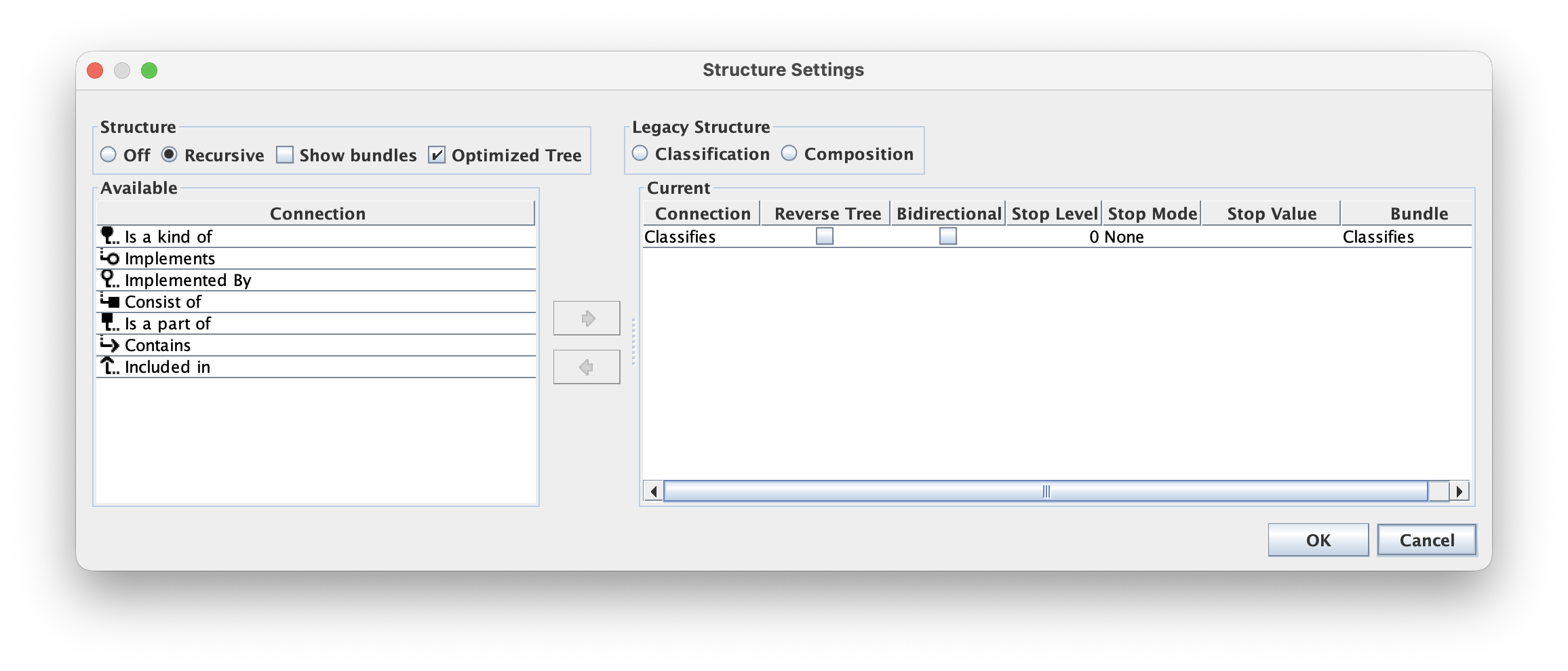
Structured Filter Component Setup
| Structure Section | |
|---|---|
| Off | Structure is turned off and this is the default setting for new Filter components. |
| Recursive | Ticking this radio button will enable the Connections list |
| Show Bundles | Will add an extra level in the tree |
| Optimized Tree | |
| Legacy Structure section | This is for backward compatibility |
| Classification | Legacy Classifies / Is a Kind of structure setting is moved (kept) here to retain backward compatibility. |
| Composition | Legacy Consist of / Is a Part of structure setting is moved (kept) here to retain backward compatibility |
| Available section | |
| Connection | A list of available relations that can be added to the list of Current relations. Can be any of Instance Node or Definition node |
| Current section | |
| Connection | Name of the Relation Type, only one is allowed for each Filter component. |
| Reversed Tree | The default method used when building a tree is to find its parent(s), and to display the result from Parent to its children. The Reversed Tree, when ticked, does the same thing in the other direction, i.e. a Reversed Tree applied on a Consist of relation will use the Is a Part of relation when building the tree. |
| Bidirectional | Each node will be traversed in both directions. |
| Stop Level | Defines the number of nodes to display in each branch, default is 0 (zero) which means no stop. |
| Stop Mode | Select condition for stop building tree, default is None. Options available; |
| Stop Value | The value that will stop tree traversal. Stop Mode must be set. |
| Bundle | The one selected from Available Connection in the left hand panel. This is the name that will be displayed on web when Bundle is enabled. The name will switch perspective with Reversed Tree option. |
A good piece of advice is to consider the different options to build a structure that enhances readability and decreases unnecessary complexity.
Initial Filter & Initial Selection
All Filter Components, visible or non-visible has the content settings Initial Filter and Initial Selection.
An Initial Filter hides any entity in a Filter Component that does not match the specified Search Query/Expression. The purpose of the function is to be able to control Application content.
An Initial Selection selects any unit in any Filter Component that match the specified Search Query/Expression. The purpose of the function is to be able to initially select objects when loading an Application. Together with the @CURRENT_USER_… expression, objects may be initially selected/filtered dependent on current user.
You can also find settings for Initial Filter/Selection for all Filter components in the app in the Control Panel found in the upper left corner of Application Builder. To define a new Initial Filter/Selection from the Control Panel, click on the cell that matches Filter Component and Filter/Selection. This will open a configuration panel.
The Selections & Filters tab in Control Panel give an overall view of all filter components Initial Filter/Selection:
| Group | This column lists all filter components added to Application |
| Filter | Indicates whether or not a Filter has been applied on component with values empty, Query or Expression |
| Selection | Indicates whether or not a Selection has been applied on component with values empty, Query or Expression |
These settings apply for “regular” as well as Advanced Filter Components, structured as well as flat and regardless of whether the component shows connected items only, or not.
It may be set to Off (not used), Query (used with a Search Query) or Expression (used with an Expression).
Note: The Initial Filter or Selection is applied on all Filter components that are linked together, i.e. the function need only to be applied on one component to impact all components that are linked together.
Query vs Expression
Initial Filter and selection can be defined either by Query or Expression.
Once set, it will be clearly visible which type of Filter or Selection that has been applied.
Expression must be evaluated as Boolean True or False.
For both Query and Expression, and only for Initial Selection, it is possible to Lock the Initial Selection.
Additionally, in the Application Settings: Edit › Settings…, it is possible to hide items that are not part of a selection lock. (applicable for Initial Selection only)
Counter is affected: Be aware of that Initial Filter might have an effect on the total number of items counter in the Filter Component, as will the Hide Blocked Items option when Selection Setting Lock Selection is used.
The Layout setting No selection shows all rows does not expose hidden objects to any other component.
Layout
Layout settings affect appearance and behavior of the filter component.
Group
Enabled by default. When Group is active, the selected objects in the Filter Component are moved to the top of the list (in alphabetical order), regardless of their original position.
This is useful when the filter contains more items than can be displayed without scrolling, as it makes it easier to see which items are selected.
When group is disabled
selected object in the component will keep their position in the list. This is typically recommended in a structured filter component, as users may perceive that the tree layout may behave in an unexpected way when combined with group.
If there's just a handful items and no scrolling, Group can be turned off, to create less movement in the application.
No Selection Shows All Rows
Disabled by default. When this option is enabled, any component using it to provide content will show all its objects when nothing is selected in the filter component.
For example: A Matrix component is using the filter component p0 to populate it with content. The default behavior is that the Matrix is empty until a selection is made in the p0 filter component. When No Selection Shows All Rows is enabled, the Matrix will instead show all items from p0, until a selection is made.
Single Select
Single Select is only available when the Filter Component is set to Compact Layout. This option makes it so it is only possible to select a single item from the Compact Filter Component at a time.
Show Structure controls
Enables additional settings for structured components. Note that these settings are only shown in the component in Application Builder, and not as controls in Runtime (Web).
Expand
A controls that lets you set the default level of which the tree is expanded in Runtime.
Flat
Flattens the structure in Application builder. (But not in Runtime)
Show Filter Field
Lets you search within the structured filter component in Application Builder. To enable Filter controls in Runtime see Web Layout Options.
Dense Layout
Changes the height of the rows in the component, so that the list becomes more dense. Note that though you can show more items in the component without scrolling, typically the app becomes harder to read and the cognitive load of the application can be affected negatively.
Sort
Dictates how the list will be sorted in Runtime (Web). Ascending (A > Z / 1 > 9) or Descending (Z > A / 9 >0). Ascending is the default setting.
Editing
The editing settings dictate which editing capabilities should be available for the component and users.
Create
In order to enable the create functionality, first a recipe must be setup and selected. When enabled, Read and Update are automatically enabled. 'Create' is available in runtime. from the right-click context menu and the [+] icon in the component's footer, if enabled. See Web Layout Settings.
Subclass
Create Subclass is only available for Definition Nodes. 'Create Subclass' is available in runtime from the right-click context menu.
Read
When enabled, items in the filter component can be opened in a modal dialog from the right context menu. If Update is enabled, user can also edit the object.
Update
Allows for editing the object in a modal when enabled. Either by selecting Open from the right-click context menu (See Read) or the "pen icon" in the component's footer, if it is enabled. (See Web Layout Settings)
Delete
Allows for deleting an object. Either by selecting Delete from the right-click context menu or the icon in component's footer, if it is enabled. (See Web Layout Settings). Note that objects with dependencies cannot be deleted.
Copy
Enables Copy from the right-click context menu that creates a copy of the selected object.
Bookmark
Enables Bookmark objects in the component from the right-click context menu.
Recipe
Lets you select an existing recipe or create a new one. See Recipes. All Recipes for the application can be found in the Recipe Panel.
Web Layout Options
Border Visible
Always enabled for Filter Components. (When enabled for a Layout Component or Result component, the component will have a focus frame when hovered. And an image will be drawn with a thin black outline.)
Compact Layout
When enabled the component will be set to its minimum vertical height and its content will be presented in a drop-down type list (Runtime only).
Counter Visible
Requires that Footer Visible is enabled. When enabled the footer shows the number of items in the list and the number of selected items. For example "1 / 20 Items".
Dark Mode
Not available for Filter Components. Enables a Result component to be shown in dark mode.
Edit Buttons Visible
Shows the edit buttons in the footer (Create, Edit, Delete) if these are enabled. See Editing. Requires footer to be enabled.
Footer Visible
Enables the footer for the component. A prerequisite for Edit Buttons, Counter Visible and Maximize button.
Header Visible
Enabled by default. When enabled the component is shown with its title, menu, icon (if enabled) and search button (if enabled).
Icons Visible
When enabled objects in the component is shown with their icons.
Maximize Button Visible
Adds a maximize button to the footer (if enabled) that lets the user open the component in a large modal dialog.
Menu Visible
Enabled by default. Adds the […] menu in the top right corner of the component, with actions such as "Select all", "Download" and "Open in new tab".
Row Headers Visible
Not available for Filter Components. Enables Row headers for Matrix and Aggregation result componets.
Search Button Visible
Enabled by Default. When enabled the Search icon is shown in the component's header. Clicking the Search Button in runtime shows the Search Field. Not available when Compact Layout is enabled.
Search Field Visible
Whenenabledthe Search field is shown by default. If Search Button Visible is enabled, clicking the button will hide the search field. Not available when Compact Layout is enabled.
Filter component – Advanced
It is possible to display tabular data in Application Builder, either from a source in the form of an Excel-sheet or a tab-separated text-file. The source has to be stored as a “Resource” in inorigo®.
You also have the possibility to retrieve the data by an SQL-statement or a URL pointing to tabular data, i.e. an Excel-sheet or tab-separated text-file.
File option
While using the File location specifier, e.g. file:/c:/temp/example-data.txt, which is the location on the server, the file need to be stored locally in the same location on your computer before creating the advanced filter component (URL) in Application Builder. When Application Builder have identified the columns in file, it is possible to remove the local copy of the file; the Application will from now on fetch the file contents from server when loaded.
Calculated Filter Components
Video tutorial on Calculated Filter Components
A Calculated Filter Component is generated from the content of another filter component via an expression. They provide formatting capabilities for tailored, with no required changes to the business model.
To create a Calculated Filter Component, select the Link to Component from the Settings panel of a filter component, or the right-click and select Calculated Filter Component…
The default expression, @itemcreates a subset copy of the filter component.
To update content in a Calculated Filter Component, edit the expression under Content in the Settings Menu.
Additional cases can be added to the expression.
Notice that the same result can be achieved by creating and linking objects in the Model Builder, Calculated Filter Components are useful for application-specific solutions that are not intended to be kept in the model.
Result Components
A result component bases its input on selections made in filter components. The selected values becomes available to the result components via expressions. Every filter component is assigned a variable name, e.g. p0, p1 etc. In the result component you are able to access the selected data by using the appropriate variable name, e.g. $SUM({p0}). The expressions gets the input (p0) which is a list of selected objects and aggregates the values of the attribute Amount. The result is subsequently available to the component.
You can create a link (and the expression) from a filter component to a result component by using Link to component or right-clicking in a filter component. For more details about this, check out the section on Linking Components.
In addition to using expressions, you also have the opportunity to use methods for more advanced calculations. In some components you may select a method directly, however, a method can also be invoked from an expression, e.g. $call(“My Process Unit Definition/My Method”, @p0, @p1). Please note that you can supply any number of input parameters to the method and the method should return a result that can be visualized by the component.
Result Components Types
inorigo® comes with many different Result Components. Below is some of the most common variants, and how to setup them.
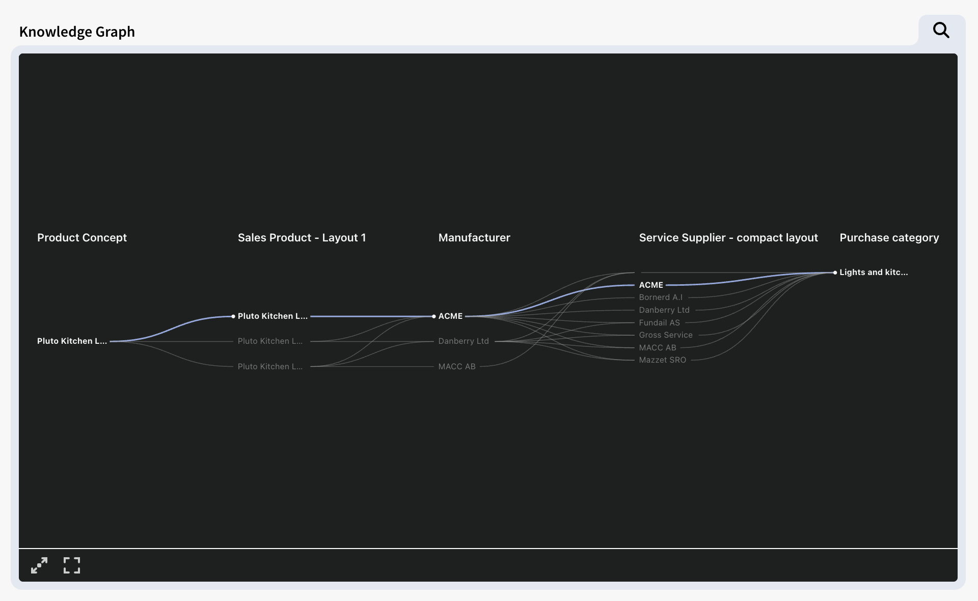
Connection & Knowledge Graphs
Connection and Knowledge graphs are result components that visualizes the connections between selected objects in the filter components as a tree of nodes and edges, sorted in columns.
The two component types are similar in function and in runtime the components themselves are practically identical. However they generate trees in slightly different ways, which makes them suitable for different scenarios.
Connection Graphs
Connection graphs shows content hierarchal, that is: they always follow the structure of connected filter components in a linear fashion – from the lowest to the highest Filter Component number. Connection Graphs don't need to show every step of the model: for instance they can show p0 > p3 > p5 > p6, but they cannot show content in a non-linear order. (e.g. p5 > p3 > p0 > p6)
When two or more filter components are are on the "same level" in the tree (i.e. Connected to the same node in the model) the connection graph will render these in the same column in the connection graph. This can result in a more compact visualization and gives the ability to group data according to the underlying structure of the model.
Knowledge Graphs
Knowledge graphs can be setup to display content in a non-linear fashion in – that is: in any order (e.g. p5 > p3 > p0 > p6). The order is setup in the component's content settings, by checking the filter components in the desired order.
Since the order of the tree isn't linear but dictated by the exact order it was setup, the content of two filter components will never share the same column in the graph. I.e. Data will not be grouped. As a result of this Knowledge Graphs has a tendency to become less compact than Connection graphs, but in return the layout is more customizable.
To add a Connection or Knowledge graph select Edit › Add component, or right-click in an empty area on the canvas, choose Result Component › Connection Graph or Knowledge Graph.
A Connection Graph & Knowledge Graph, side by side showing the same content in different ways.
Connection & Knowledge Graph Settings
The settings panel for Connection and Knowledge graphs are in essence identical, but the setup differs slighly.
Content
Filter Components
This is where you choose the filter components that will provide content for your graph.
The setting shows all the available filter components in the application – and how they are connected, as a tree structure. Check all the filter components that you want the graph to visualize when a object is selected from one of them. Note that the graphs can only show "one tree" at a time. For example if your application contains 2 separate "trees" of filter components that are not connected, you will only be able to select filter components from one of these.
Connection Graphs are bound to the structure of the model (the order of the filter components) and are hierarchal. p0>p1>p2 etc. You can however skip steps in the tree like such p0>p3>p5.
Knowledge Graphs can be setup to show the filter components in any order. To setup a Knowledge graph, select the filter components in the intended chronological order (They will appear from left to right in the Knowledge Graph – or from the top if Top to Bottom Orientation is selected). The order will be shown in the panel, just below the tree.
Layout
Max Text Length
Set the maximum characters that are shown for each text in the graph (30 by default). This is to mitigate very long names that may cause the graph to be hard to read or make the layout impractical to use. Texts that are longer than the Max Text Length are truncated (…).
Column Headers Visible
When enabled the Title of the filter components used by the graph will be shown as column headers. Note that in the case of Connection Graphs, the Title with Filter Component with lowest "p" number will take priority when shown in the same column.
Orientation
Determines the layout direction of the graph's tree. Left to Right (Horizontal) or Top to Bottom (Vertical).
Calculation Box
The Calculation Box allow for any kind of calculations based on information from other filter components in the Application. It may for example calculate costs and time and concatenate strings. A calculation box may be configured to calculate almost anything related to selected information in the Filter Components.
To add a calculation box select Edit › Add component, or right-click in an empty area on the canvas, choose Result**Component › Calculation box.**
Settings
| Layout (HTML) | |
| Multiple Value Separation | |
| Font | |
| Size | |
| Alignment | |
| Text Color | |
| Bold | |
| Word Wrap |
Method Calculation
A method refers to a change method, defined in the Methods tab of a change. Find the predefined method in the drop down or search for it using the lookup button. Defining a method is a skill of its own and requires education and a very good understanding of the information structure in inorigo® Model Builder.
Expression Calculation
An expression is a simple form of method. It doesn’t contain any advanced functions (like looping), but is more powerful than methods to use for simple calculations, such as summarizing attribute values.
Defining an expression is also a skill of its own. It requires some training, but no formal education. A simple example will illustrate the nature of expressions:
| “€” | Writes the € sign in front of the calculated result. |
| + | Concatenates what is before and after into a string. |
| $round(…) | Invokes the function round (all function invocations are prefixed with the $ sign), which rounds the result of the arguments within parenthesis. |
| $sum(…) | Invokes the function sum, which sums the arguments within parenthesis. |
| @p0 | First argument in the sum function. It refers to the selected items in selection box p0. A Filter Box does not need to be visible in order to refer to it. |
| “Amount” | Second argument in the sum-function. It refers to the attribute Amount owned by the units in the filter box which the first argument refers to. |
Expressions can also hold HTML code, for use in Calculation Boxes or Text Area Components.
Charts
The chart components in Application Builder give the user a way to graphically view and examine the data stored in inorigo®. The different chart components are Bar Chart, Bubble Chart, Line Chart, Pie Chart and Meter which all work in a similar manner.
The basic principle is that you populates the chart with values, through expressions, from filter components. The selected items in the filter components dictates what is shown in the chart. Some charts can have multiple series (A collection of data points) and can get its data from multiple filter components.
Add a chart by selecting Edit › Add component, or right-click in an empty area on the canvas, and choose Result**Component › Chart › Chart type**
Content
Contains the settings for the setup of the chart.
Chart Type
The Chart types in inorigo® has different uses:
Area
The Area Chart displays quantitative data over time or categories using filled areas beneath a line. It emphasizes the magnitude of change and the relationship between parts and the whole, making it useful for showing cumulative trends or comparing multiple datasets.
Bar
The Bar Chart represents categorical data with horizontal bars whose lengths correspond to their values. It is effective for comparing quantities across categories, especially when category names are long or there are many items.
Bubble
The Bubble Chart visualizes three variables in a two-dimensional space, where the position of each bubble shows two values and its size represents a third. It is useful for displaying correlations and distributions within complex datasets.
Column
The Column Chart uses vertical bars to compare values across categories or time periods. It is ideal for showing discrete data and highlighting differences or trends at a glance.
Line
The Line Chart shows data points connected by straight lines to illustrate trends over time or continuous data. It is ideal for highlighting changes, patterns, and relationships between multiple series.
Pie
The Pie Chart divides data into proportional slices of a circle to represent parts of a whole. It works best for visualizing simple compositions where the number of categories is limited. Pie charts can only show values from a single series.
Solid Gauge
The Gauge displays a single value within a range, typically on a semicircular scale. It is useful for showing performance against a target or progress toward a defined goal.
Title
An optional title of the graph that appears within the component. The Component itself may also have a title.
Subtitle
On optional subtitle for the graph that appears below the Title.
X-Axis Title
Sets a title for the chart's X-axis values. Shown horizontally below the Graph. When Tooltip is checked, hovering over the chart element (any of the data points) will show the X-axis title followed by its value in a tooltip.
Y-Axis Title
Sets a title for the chart's Y-axis values. Shown vertically to the left of the Graph. When Tooltip is checked, hovering over the chart element (any of the data points) will show the Y-axis title followed by its value in a tooltip.
Z-Axis Title
Additional, optional title, only relevant for Bubble type chart. When Tooltip is checked, hovering over the chart element (any of the data points) will show the Z-axis title followed by its value in a tooltip.
Sorting
Decides what Axis will dictate the sorting of the chart, and how the values are sorted – Ascending or Descending.
Series
Charts in inorigo® can show different series. A series in a chart is a collection of related data points – values, that are plotted together. It is possible to add additional series by pressing the [+] plus icon.
Color
Sets the color for the chart elements in the series. There's 3 options how the chart colors are selected:
Fixed: All chart elements in the series use a single, fixed color selected from a color picker. inorigo® provides 12 customizable color variables to select from: these are defined by the active theme. It is also possible to set a custom color. For more details on theming, see Extended Palette under the UX Guidelines.
Fixed is recommended when comparing different series.
Note: For Line Charts, the fixed color determines the color of the line, while the data points can be set to Generated or Expression.
Generated: Each chart element in the series will first be given one of the 12 colors from the theme's Extended Palette. (Dictated by the active theme). If there's more than 12 data points, it will generate additional colors.
Generated is useful to distinguish different data points within the same series.
Expression: The color of the chart elements are set by an expression. See expressions.
For instance the expression $GET({p0},"Color") will pick the color attribute (if defined) from the selected objects.
This option is useful when the objects themselves has color values that you want to show to the chart.
Legend Entry
Sets a title or short description for the series. The Legend Entry will be shown in the Tooltip when hovering over a chart element to help distinguish different series.
Legend?
Displays the Legend Entry (and the series color) as an element in the chart component, to provide overview and facilitate distinguish the different chart elements.
Important: This option only works for series using Fixed color.
Aggregation
Determines how multiple data points are combined.
Sum: (Default) adds up all values – highlights the overall volume.
Average: Calculates the mean of all values – highlights the general trend or typical performance.
X-Axis Values
The expression that determines the X-values for the series.
$get({p0},"score")
In the above example {p0} refers to the identifier of the filter component. And "score" refers to the name of a Attribute called score. To see what attributes that are available, right-click on any item in the filter component and select Open.
Y-Axis Values
The expression that determines the Y-values for the series.
$get({p0},"team")
In the above example {p0} refers to the identifier of the filter component. And "team" refers to the name of a Attribute called score. To see what attributes that are available, right-click on any item in the filter component and select Open.
Extra Tooltip values ()
It is possible to show additional values in the tooltip, by adding additional expression.
Add Series
Adds a series to the chart. Also see Series above.
Display
Display setting contain additional visual options for the chart. The options may vary depending on chart type. Here's some common display options.
Vertical & Horizontal Gridlines
When enabled vertical and/or horizontal gridlines are drawn behind the chart elements. These can facilitate reading the chart's values. Gridlines are not available for SolidGauge and Pie charts.
Fixed axes
By default there's no minimum or maximum range for a chart, they adjust the scale to what's selected.
When this option is enabled, it is possible to set the minimum and maximum Y values that are displayed in the chart. If a value would exceed the maximum value, the chart element will display it up to that value. If a value would go below the minimum value it will not be shown in the chart.
Example: The Max Y Value in a column chart is set to 100. If a value of "120" is selected it the bar representing the value will be capped at 100.
Example: The Min Y Value in a bubble chart is set to 20. If a value below 20 is selected, the chart won't display a bubble for it in the chart.
Labels
Displays the selected items Y-values as a text label on the chart element. Only available for Pie charts, Bar charts and Column charts. The charts type may have additional sub-options for how the label should be displayed.
Min Bar Width
Allows for setting a minimum width of each chart element. Only available for Bar and Column Charts.
World Map
The Map component is very handy when you want to show things related to geographical locations, like countries, cities, offices, facilities or any other places with specific coordinates. Watch the video on how to configure the world map.
Layout Component
Layout components are components with static content which can be used to enrich the Application with explanatory texts and or images.
Image
An image is added either from the inorigo® database or uploaded from a local computer, server or from the cloud.
Text Area
Adding a text area is fairly straight forward. Use the text Are-Settings to configure the layout and appearance through the Visibility Expression.
Filter Structure
Filter Structure only displays structure of Filter Components and allows you to hide/reveal connected components by pressing the plus or minus symbols.
Right-clicking a component allows you to delete it or move it to another panel. Notice that parent components can’t be deleted since that would break a link between other Filter Components.
Recipes
Recipes are a powerful way to control and customize how data is presented and interacted with in applications. They serve as configuration tools that define which pieces of information—known as attributes—should be shown, edited, or hidden based on the context of the data source. Recipes make it easier to adapt data grids and user interfaces to specific business needs, ensuring that only relevant information is visible and manageable.
Click here for more info about Recipies and their usage
It is possible to configure the unit attributes and their values by pressing the edit button located to the left of the Filter Name. The plus button adds a new nested entry panel.
Note that there might be a fifth box in the top section of the window; underneath “Definition”, a box with “Is a kind of” will appear if the units may have super-classes.
| Title | Inherited from Filter component Title setting |
| Type | Object type that is listed in filter component |
| Definition | The definition of object type (optional) |
| Is a kind of | Optional relation to parent displayed when applicable |
| Icon | Display or hide the Nesting unit Icon on web, not visible by default |
| Attributes Default Visible | Decide whether or not new attributes – defined in Inorigo® Model Builder – should be visible in Attribute Value Panel on web. This requires a Default or Fixed value to be defined, especially when attribute is mandatory |
The bottom section of the window shows the unit definition, super-class (if applicable) and all attributes.
| Visible | Uncheck the checkbox if the attribute should be hidden on the web. To be able to hide a mandatory attribute a fixed value has to be specified |
| Valueset | If an attribute Valueset should differ from the Valueset specified on the attribute in Inorigo® Model Builder select a filter component containing the applicable values in the Valueset combo box |
| Automation | See chapter: Attribute Automation |
Nesting Units
Instead of showing multiple filter components having to edit each one separately, it is possible to nest other units into the other Unit Attribute Panel. The filter component unit is referred to as the nesting unit and the other ones nested units. To be able to nest a unit it has to reference the nesting unit with a relation or with an attribute.
Nested units will be displayed in the same input panel to avoid confusion from end users. For nested units that have one attribute, an entry field is added and will appear just as an attribute for the nesting unit See Phone Number or Email in image below. Nested units with more than one attribute will appear as a Card that can be collapsed and expanded to provide a better overview in the panel. See Employment in image below.

To nest a unit press the Add button below the unit attribute edit button.

This opens up the Add (nested unit) panel.
Nesting with references
There are two ways to complete this task; one is Quick Setup and the other is a manual setup. Use quick setup to nest a unit with an attribute reference and manual setup to nest a unit with a relation reference.
Quick Setup
Use the connections panel to identify a desired reference to nest into the input panel. You may choose to include abstract or disabled attributes from the panel. The indentation in the panel reveals the classification structure for the referents.

Below is an example of a nested unit chosen through quick setup.

The most important and required are:
- Title, default is given
- Definition is required when dealing with Associations and Specific Units, a default definition is selected for you
- Point out the Nesting Unit in the Automation column in the lower section, a default is given
- You should decide the multiplicity for the Nested Unit, the default value is 1.
Press OK button to finish the configuration, there is no more required setup to finish the configuration. Find the description of each field below:
| Quick Setup | Select an Attribute Reference to another object |
| Title | Title for the additional section in Attribute Value Panel on web. A default title is set when Quick Setup is used. |
| Type | The object where Nesting Unit resides, or the relation to another object, see table below for description |
| Definition | This is where Nesting Unit has been defined as attribute |
| Multiplicity | How many Nested Units of this type is allowed, example: |
| Interactive | Decide whether or not the Nested Unit should be displayed in Attribute Value Panel on web. When unchecked, it is required to set a Suggested or automated value for mandatory attribute(s). |
| Icon | Display (or not) the Nested unit icon on web, not visible by default |
| Attributes Default Visible | Decide whether or not new attributes – defined in Model Builder – should be visible in Attribute Value Panel on web. When unchecked, it is required that a Suggested or automated value is defined, especially when attribute is mandatory. |
| Below are the objects available for display on web. | Common settings: |
| Definition | The definition of the object (optional) |
| Is a kind of | Parent to the object (optional) |
| Attributes | Object attributes listed here when applicable. Decide whether or not to display them on the web with the tick-box.. |
It is possible to nest many units. The example below illustrates a possible model in inorigo® Model Builder:

Nesting many units could look like the image below:

Nesting with relations
When using a manual setup choose one of the relation types in the combo box Type:
| Association Definition Relation | Relation between two Association Definitions |
| Association Relation | Relation between two Association instanses |
| Generic Type to Generic Unit Relation | Relation between a Generic Type to a Generic Unit |
| Generic Type Relation | Relation between two Generic Types |
| Generic- or Specific Unit Relation | Relation between two Generic Units or two Specific Units. |
First of all, set the relation Type, e.g. Generic- or Specific Unit Relation:

The most important and required are:
- Title
- Point out the Nesting Unit in the Automation column in the lower section, it is defaulted to point at attribute objectOneID
- relationSpecifierID; select the relation from a list of values in the Automation column
- objectTwoID; If you want to limit the Valueset from the one specified in the model, pick a Valueset – Filter Component – to select values from.
- You should decide the multiplicity for the Nested Unit, the default value is 1.
Press OK button to finish the configuration, there is no more required setup to finish the configuration. Find the description of each field below:
| objectOneID | One of the objects in the relation, default is Nesting Unit. It is possible to change the attribute name in the leftmost column. |
| relationSpecifierID | Specify the relation between objects |
| objectTwoID | The other object in the relation. It is possible to change the attribute name in the leftmost column. |
| Sequence | Enable the possibility to set the sequence on children seen from objectOne |
| parentSeq | Enable the possibility to set the sequence on parent seen from objectTwo |
By specifying a valueset – for objectTwoID in this example – it is possible to filter objects that have the same type of relation but have different parent objects.
This applies to all Generic domain relations except AsInstanceRel since that relation has a Rule attribute to control this behaviour.
Consider the following example of Model Builder structure where Generic Unit Thing x is included in two separate items with different parent objects (Generic Type):

Building an Application to show the relations between objects to eventually be able to create objects on the web could start like this:

We want to separate the objects in p2 box since we want to manage them separately. By setting a definition (parent object) to filter the content of filter box p2 and adding another filter box to show the items of the other parent object (Designs and Models):

Now it is possible to control the contents of the Nested Units when specifying them in Editing panel. First of all we need to find out which object belongs to objectOneIDby opening the object being used as Nesting Unit (1) and then open Edit Relation panel (2):

Now we know that Generic Units in p1 filter box is objectTwoID. Add a new Nested Unit for p1 filter box:

The valueset defined for Nested objects (Designs) will make sure a filter is applied to only show items with parent object Designs on web.
The other Nested Unit for Models is created similarly, just using the valueset from p3 filter box. Final result with two Nested Units:

Attribute Automation
By pressing the pen symbol on any attribute we can configure how it its behavior in the input panel through this Automation panel

Quick Setup
Lists predefined configurations that can be used.
- Fixed Value = Sets the combination Mode=Suggested, Settings=Immutable
- Default Value = Sets the combination Mode=Suggested, Settings=Editable & Resettable
Mode
Mode controls the automation behavior.
- Off = The value will never be set automatically.
- Suggested = The value will be set by the system only once (when panel is opened) or by reset.
- Automatic= The value will be set continuously by the system as the user edits any other value within the input panel
Settings
Immutable
An immutable value cannot be changed once it’s been saved to the database, no matter if it’s a person or an automatic expression that attempts to edit the value.
- True = The value can be changed only when the Unit is new (not yet created).
- False = The value can always be changed.
Editable
Editable refers to manual user editability from the panel only.
- True = The user is allowed to manually edit the value.
- False = The user is not allowed to manually edit the value.
Resettable
- True = A reset button is displayed allowing the user to (re)calculate the value.
- False: No reset button is displayed.
Volatile
A an attribute must be set as volatile (previously known as Calculated) in Model Builder for the option to be enabled. The actual values are never saved, but continuously executed every time they need to be displayed. Note that these values have negative impacts on performance.
- True = The value is not saved to DB.
- False=The value is saved to DB.
Value
Sets the type used to create the automation / suggestion.
- None = nothing is used, the value will either be NULL or manually entered by the user.
- Reference = Used if the attribute is the nesting unit.
- Explicit = Set one value, like a string of text or a specific inorigo® unit.
- Method = Call on method to generate the value
- Expression = Format an expression to generate the value
Mutually exclusive settings
- **Mode=**Automatic can not be combined with *Editable=True*.
- **Source=**Reference can not be combined with *Editable=True*.
- **Mode=**Suggested can not be combined with *Volatile=True*.
How an automation or suggestion is triggered
The configuration is given to an attribute attribute for the specific input panel only. Other input panels or places to edit the same attribute in inorigo® will not share the given automation configuration.
Mode = Suggested: The suggestion is triggered when the input panel is opened to create. Once an attribute value has been set and saved to the database a value will never be suggested again. This applies even if the value = NULL
Mode = Automatic: the automation is executed whenever a user sets or make any changes to any other attribute value within the input panel. This will continue to occur every time the input panel is opened and any change is made.
Referring to other values within the nested panel via Expressions
When writing expressions for input panels, it’s possible to refer to any other attribute in the panel. This example demonstrates how.
I want to generate automated email for an attribute in Email.
To do so I must
- Get the first and last name from within the nesting unit person.
- Get the employing organization from the nested unit Employment.
Refer to attributes within a unit
{Attribute Name}
example:
{Person}
Refer to the nesting unit from a nested unit.
The nesting unit can be referred to in a standard way, either by referring to {Person} or the units ID.
$get({Person},”First Name”)
I’d then like to add a dot and the last name afterwards.
$get({Person},”First Name”) + “.” + $get({Person},”Last Name”)
Refer to another nested unit from a nested unit
To refer to another nested unit, we must traverse through the nesting unit in the expression. In this expression we get the attribute organization, from the nested unit Employment, that is nested to person.
$get($get({Person},”Employment”),”Organization”)
Organization is an association unit and if I’d like to find a specific attribute from within organization, I’ll simply add another statement to point to the specific attribute, in this instance the attribute Name.
$get($get($get({Person},”Employment”),”Organization”),”Name”)
I can then add the whole expression together, and write out an “@” and “.com” to complete the email address.
$get({Person},”First Name”) + “.” + $get({Person},”Last Name”) + “@” +
$get($get($get({Person},”Employment”),”Employer”),”Name”)
- “.com”
Remember that utilizing ID’s rather than names is a more stable way of writing expressions.
You can easily add the ID, rather than the name by CTRL + clicking a variable in the expression editors menu.
Referring to Input Panels
Input Panels be referred to via expressions, and can thus be added as calculated columns or buttons in an Application,
How to add a button that refers to an input panel to a Matrix calculated column
-
Create a Filter Component and configure your input panel.
-
Create a Matrix Component and populate it with data from the Filter Component {pX}
-
Add a Calculated Column (HTML) with the following expression
-
“<button onclick=\”getApplicationRuntime().postEntityAction(‘Create‘,’AsInstance’,'” + $GET(@Y_Object,”ID”) + “‘,’p0’)\”>CREATE”
- Create can be replaced with Read, Update, Delete, Bookmark for desired use case.
- CREATE can be replaced with desired naming on button.
How to add a button with customized styling
-
Create a variable style
-
“
”- Update the HTML with your desired styling
-
utilize the following expression for the Matrix Calculated Column (HTML)
-
“” + {style} + “<button class=\”button\” onclick=\”getApplicationRuntime().postEntityAction(‘Create‘,’AsInstance’,'” + $GET(@Y_Object,”ID”) + “‘,’p0’)\”>CREATE”
- Style is the name of your variable
Layout

Group: As the amount of data in a box may be very large, it is possible to move selected- and selectable units to the top of the box. This effectively removes the problem of having to scroll to find selected units in a long list. Check the Group option to group the selection. Default setting is On.
No selection shows all rows: Any resulting component will display a result as if all objects were selected in a Filter component. Default setting is Off.
Show structure controls: Enables the user to manage the outlook of a tree structure. Default setting is On.

Show filter field: Enables the user to apply a filter to reduce the amount of objects in the Filter box list. Default setting is On.

Sort: This setting defines the sort order in Filter Component on the web. Possible values are Ascending (default) and Descending.
Buttons and ActionLinks
Buttons and ActionLinks are interactive elements designed to streamline the end-user experience by providing direct triggers for application logic.
UI Component Types
| Component | Expression |
|---|---|
| Large Button | $ActionButtonLarge |
| Small Button | $ActionButtonSmall |
| ActionLink | $ActionLink |
Creating Buttons and ActionLinks
To implement an interactive component within an application.
- Create a calculation box or open an existing one.
- Open the settings panel and untick all Web layout boxes. This ensures the component renders as a functional UI element rather than a standard output.
- Navigate to the expression parameter and define the component using the following structure:
$Type("Action", "Source", "Name")
Example Expression
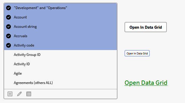
$ActionButtonLarge("OpenDataGrid", "p0", "Open In Data Grid")
Expression Breakdown:
- "OpenDataGrid": Sets the button action (e.g., opening selected objects in the data grid).
- "p0": Sets the Source filter component.
- "Open In Data Grid": Sets the button Name.
Implementing Buttons and ActionLinks into a Matrix
ActionLinks and buttons can be embedded within specific columns of a matrix to provide row-level functionality.
-
Right-click a header inside the matrix and select add calculated column or edit calculated column.
-
In the expression editor, set the web rendering option to Html.
- Options available: Normal, Html, Link.
-
Write the button or ActionLink expression into the parameter field.
- Specify what the button will do and what title/lable it should have.
-
Press ok and save the application.
Results:
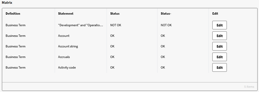
Expression example
$ActionButtonLarge("Open", "p0", "Edit", @rowSource)
Expression Breakdown
- "Open": Sets the action (opening the object in a form).
- "p0": Sets the Source filter component.
- "Edit": Sets the button name.
- @rowSource: Specifies the data source to the selected object in the filter component (p0). This makes it possible to edit a selected object directly from the matrix while having multiple selections.
Customizing ActionLinks
The visual properties of an ActionLink, specifically color and fontsize, can be customized by appending additional parameters to the expression.
Signature:
$ActionLink("Action", "Source", "Name", @Null, @Null, "CSS String")
Example:
$ActionLink("OpenDataGrid", "p0", "Open Data Grid", @Null, @Null, "color:green; font-size:23px")
- @Null, @Null: Placeholder parameters required to reach the style argument.
- color:green: Sets the link color.
- font-size:23px: Sets the link fontsize in pixels.
Create a button to a Specified URL in an Application
When you want to embed a redirect button in an Application.
Embed a static HTML page
| Create a button HTML file on the server | HTML File source code: |
| Add the button to the Application | |
| Verify |
Color Condition
Specifies, with an expression that evaluates to true or false, the text color. If the expression evaluates to true, the text gets the corresponding color.
The conditional expression part @Value is a shortcut to avoid repeating the content expression for every condition. Thus, for the statement @Value > 800 to work, the content expression must return a number (so that it may be compared with 800).
Note!
The expressions are evaluated in the order they are added. The first expression that is evaluated to true, will change the text-color.
Subsequent expressions are ignored, i.e. the list of expressions works as a switch statement.
If no expression is evaluated to true, the default text color (specified in the Display Settings) is used.

© 2025 Inorigo AB. All rights reserved.