3. Creating A Structure
Once you are confident in the answers to these questions, you can proceed with creating the application structure.
General Advice & Considerations
Things to keep in mind when building an inorigo® application:
Prioritize
Decide what is most important for the target user. Aim for one primary use case per view, so each application view has a clear and focused purpose.
Reduce Complexity
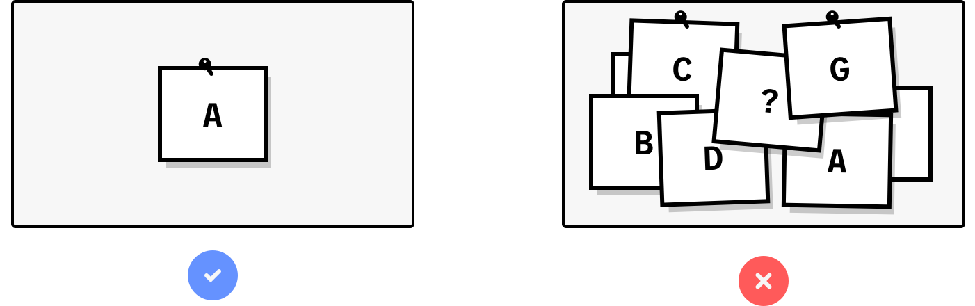
The more choices the user has to process, the longer it takes. Do not overwhelm users with information. Remove noise and redundant details. Keep the number of components low. Use tabs or separate applications when necessary. Use natural, unambiguous language.
Consider the flow
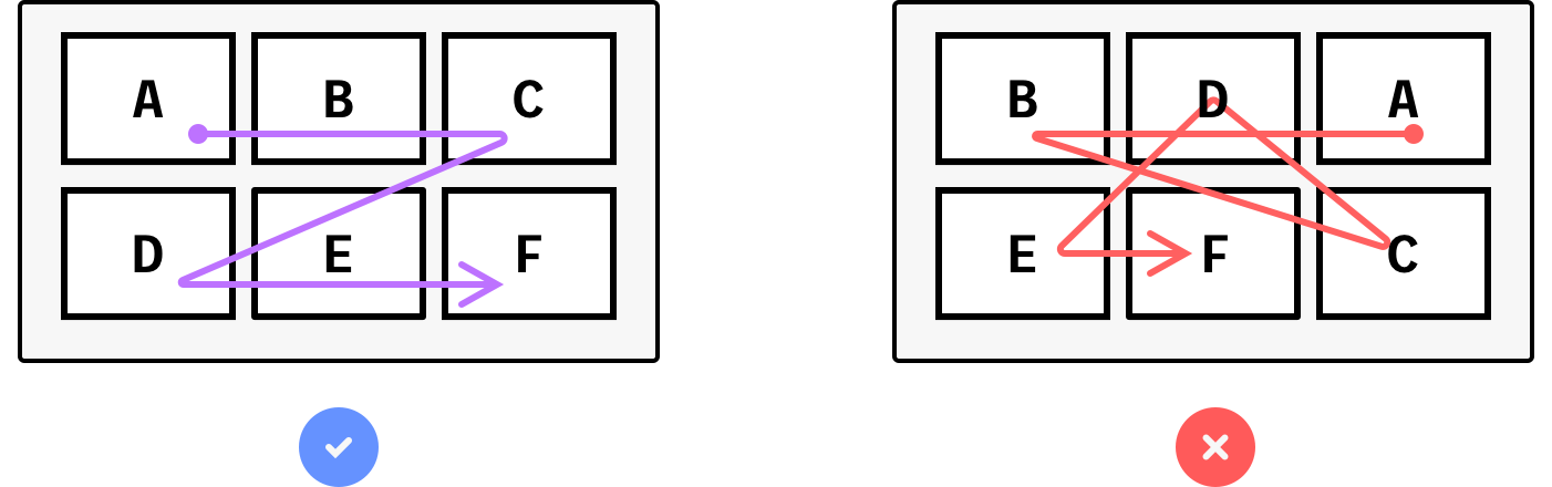
Design with the natural order of the task in mind. The flow should typically go from top left to bottom right, similar to reading. The starting point is normally in the top left.
Establish visual hierarchy
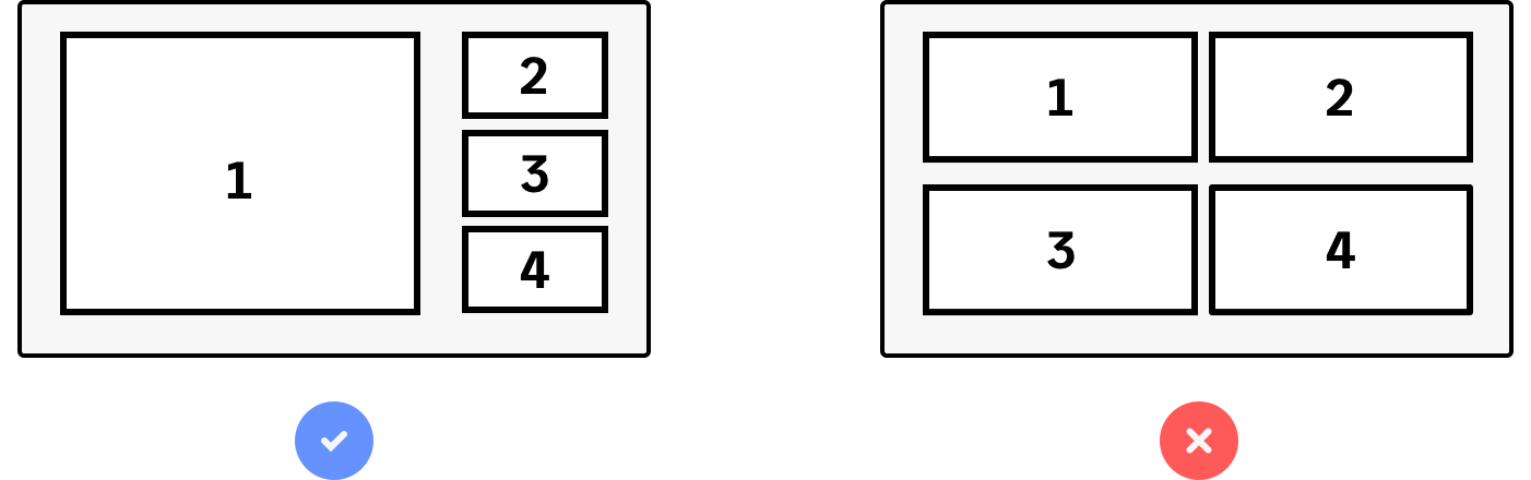
Make the most important information or component stand out. Use size, grouping, and contrast to emphasize priorities. Group related components together. Apply color contrast where appropriate.
The Application Grid
The application grid is built into the Application Builder to support alignment and layout on the application canvas. Components snap to the grid in the Application Builder.
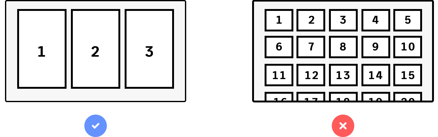
The grid consists of 12 flexible columns. Components are placed within these columns, which scale horizontally with the browser window. Neither columns nor components have a fixed width.
A component can span any number of the twelve columns. For most components, a minimum width of two columns is recommended, as content may become unreadable if the width becomes too narrow.
Grid Height and Component Sizing
The base grid height is fixed at 8 px. This also defines the minimum margin between components, both vertically and horizontally.
Components have a minimum height of 88 px and can be scaled in increments of 96 px (88 px + 8 px margin). This ensures alignment and supports creating a clear visual hierarchy.
Component height does not scale with the browser window. The canvas height is unlimited, and there is no restriction on the number of components placed vertically. If components extend beyond the visible area, a vertical scrollbar will appear.
Outside the grid, surrounding the canvas, there's a fixed 16 pixel outer margin where components can't be placed.
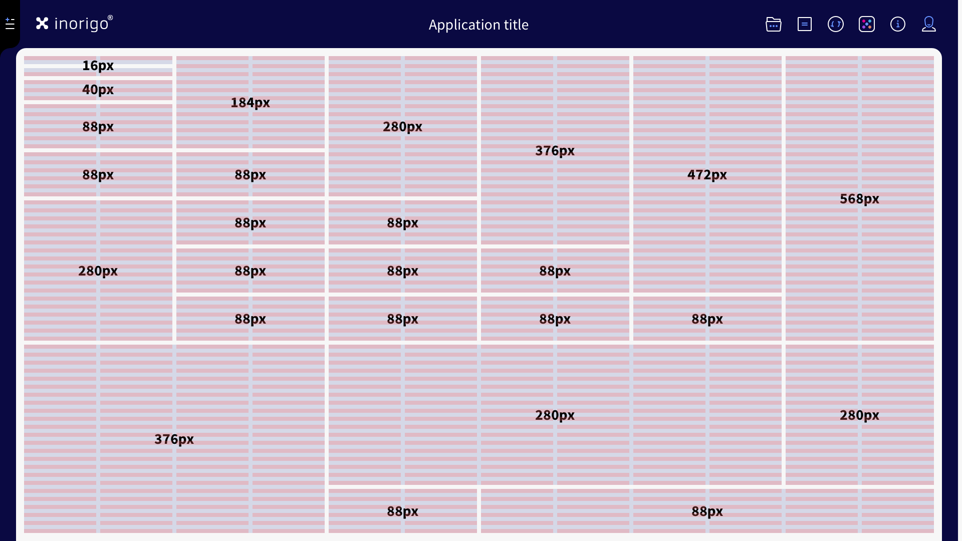
Recommendation: Make the components at least 2 columns wide, otherwise it is likely that text labels will be cropped or content unreadable.
Number of Components in a View
Favor fewer, well-structured components over many. Each view should contain only the components necessary to support its primary use case.
If many components are required, organize them carefully to maintain clarity and avoid overwhelming the user. Use structure and distribution to ensure the layout supports the user’s goals, even when handling complex overviews.
Minimize Cognitive Load
Users can only process a limited amount of information at a time. A significant part of their attention is spent decoding the view before they can focus on the actual content.
Reduce the effort required to understand the layout. The less energy spent on interpreting the interface, the more efficiently users can work—and the more user-friendly the application will feel.
Fitting Components Within an Application
When reducing the number of components is not possible without compromising usability, consider the following options:
Split the application into tabs
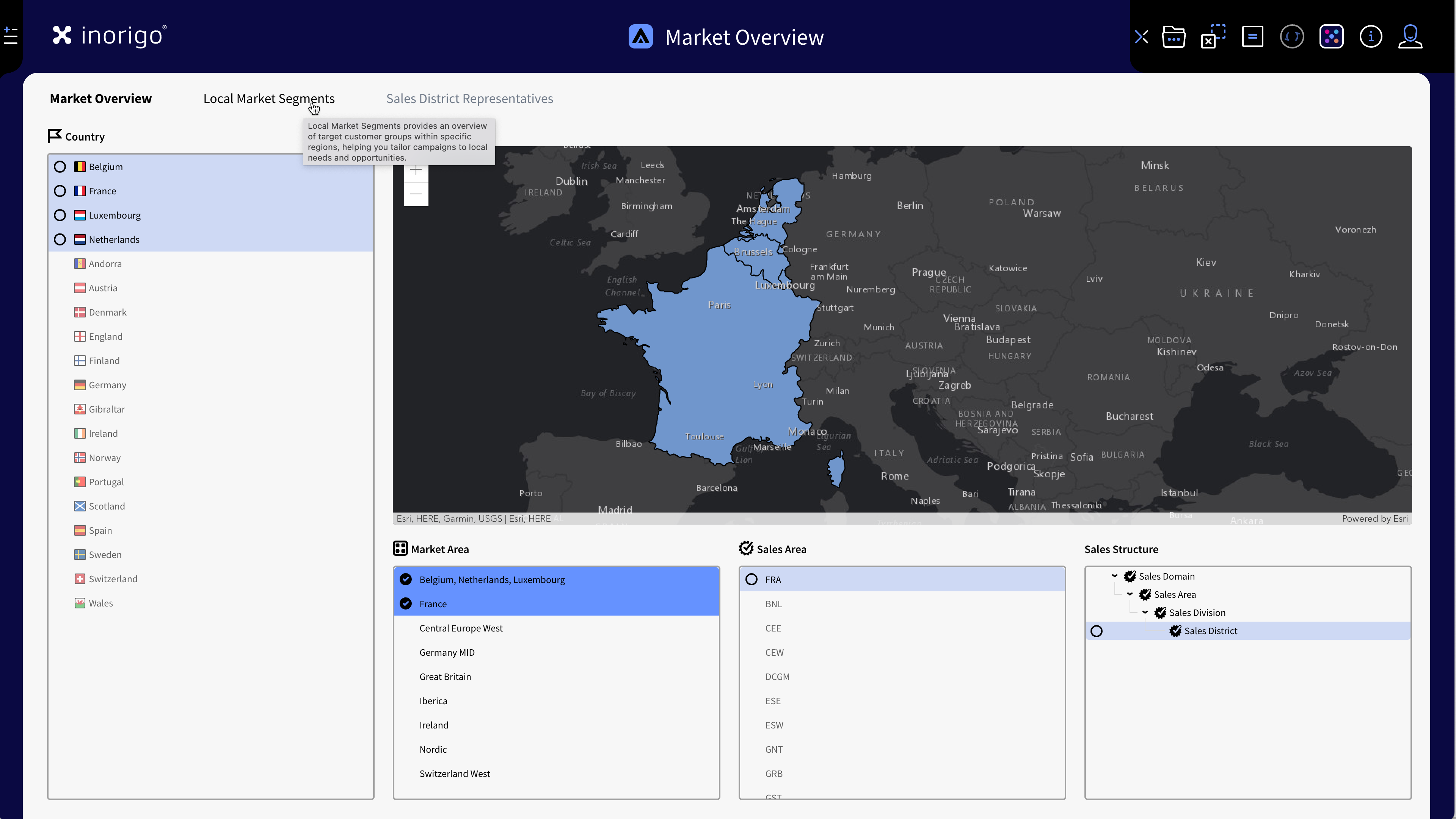
Example of an application with related, but different use-cases divided over three tabs.
Group related components into separate tabs or even into separate applications. While users may believe everything should be visible at once, splitting content across tabs often makes the application easier to work with. Users generally overestimate their ability to multitask and process large amounts of information.
Recommended approach.
Splitting Application into Panels
Panels can divide the canvas either vertically or horizontally. Each panel can also contain its own tabs.
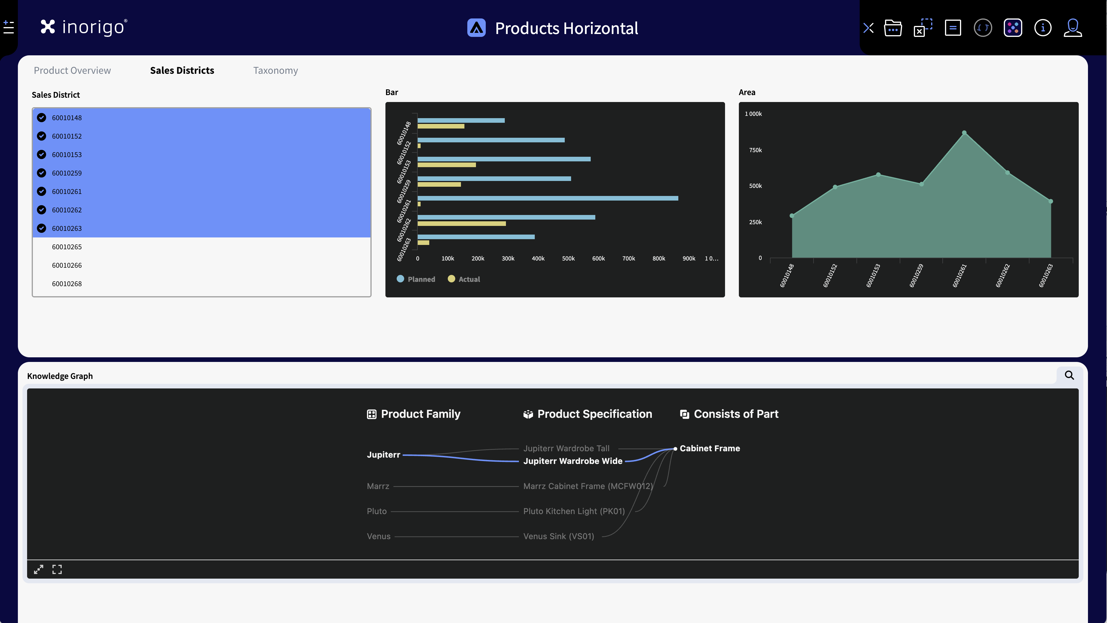
Example of two Horizontal Panels: Note that that users will read the layout "top to bottom" when using vertical panels. In the above image, the top panel has 3 tabs - changing tab does not affect the bottom panel.
- Horizontal panels: Any number of horizontal panels can be added. Their height adjusts automatically to the height of the components. Users read vertical panels from top to bottom.
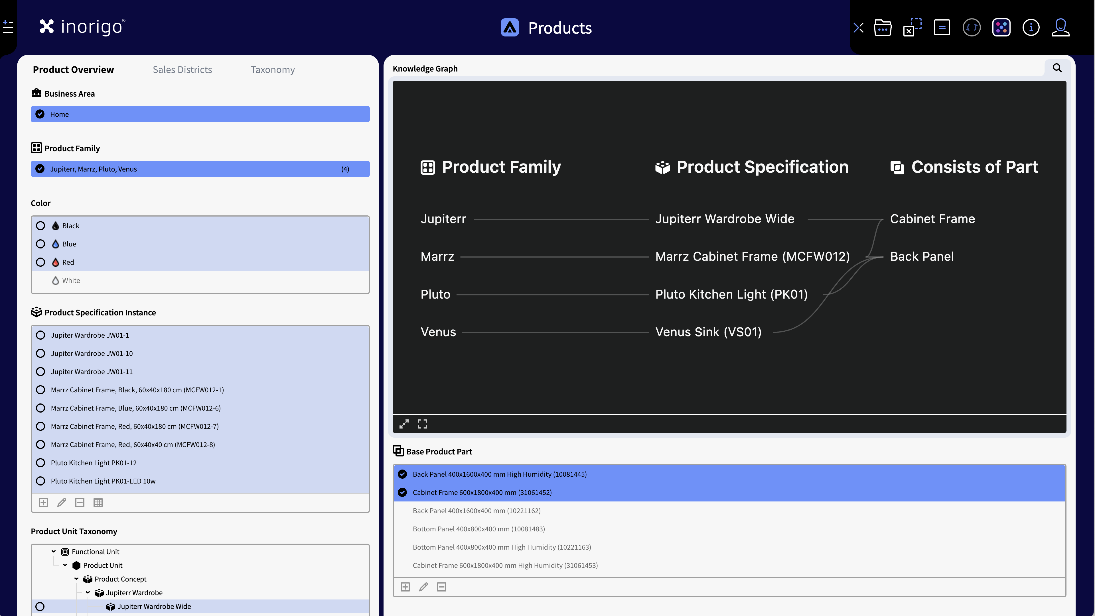
Example of an application with two Vertical Panels. 4 columns in the left panel and 8 in the right, to accommodate for the graph.
- Vertical panels: The 12 grid columns are distributed between the panels. The minimum width of a panel is three columns. The entire application scrolls as one; individual panels do not scroll. The panels can contain tabs. Users read vertical panesl from left to right.
Stack components vertically
Allow the application to scroll. Since inorigo® runs in a browser, scrolling is the expected behavior. It is better to provide components at usable sizes than to shrink them to fit everything into one view. Be aware that the browser window height and display resolution will vary from user to user anyways: There's no way to predict exactly how many components will fit vertically.
Avoid shrinking components
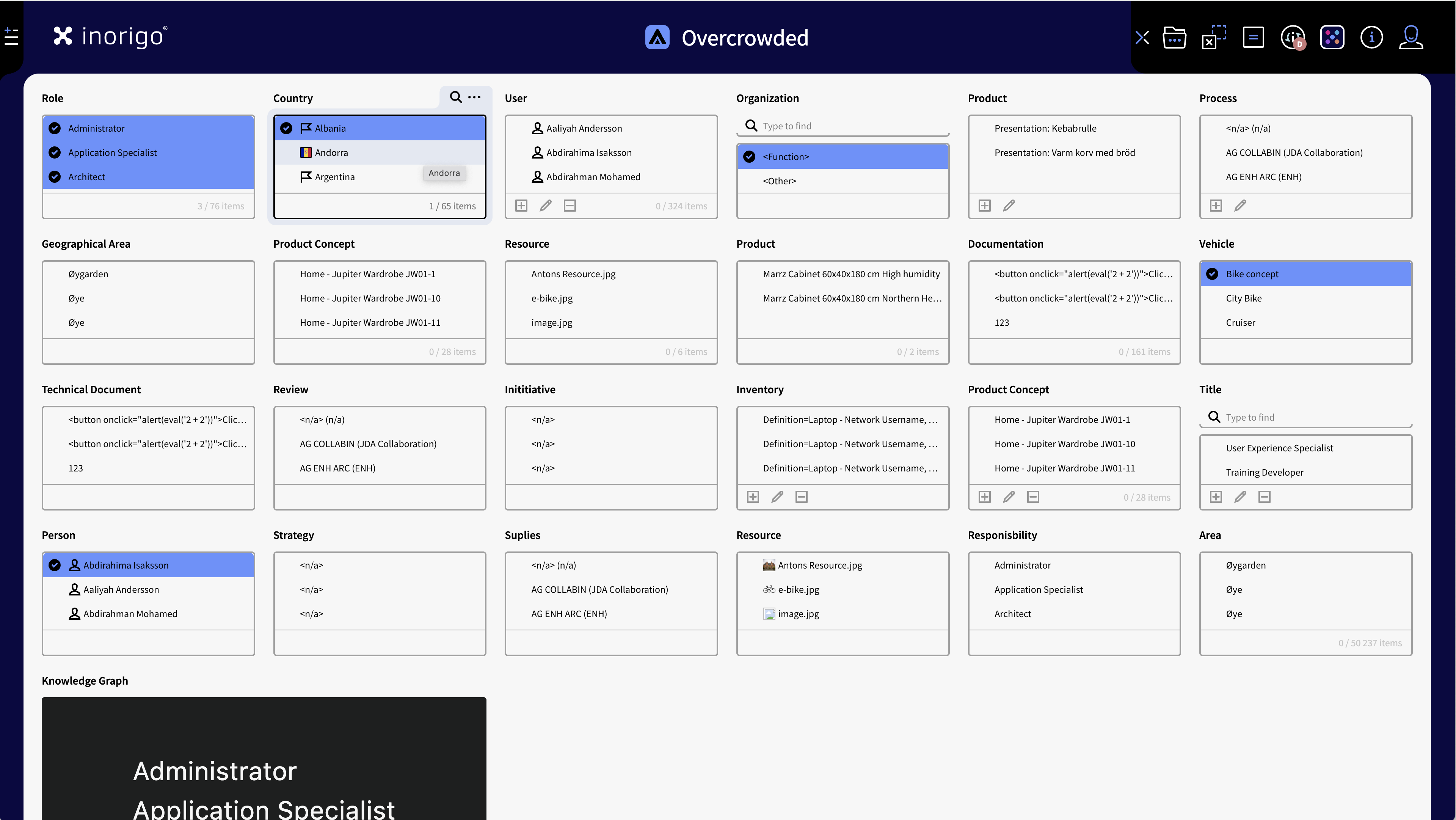
A "bad example": Besides that there is too many components in the same view; A component where "only 3 out of 65" items can be shown at a time is a guaranteed bad user experience.
Do not reduce components to a point where they become unusable. Small components increase cognitive load and reduce readability. Long lists in small components are very impractical. Use compact component variants (such as filters) instead of forcing minimum sizes.
Dealing with few components
Bad example: The component is oversized for its content.
An application with very few components may feel empty, but do not stretch components unnecessarily just to fill space. Adequate sizing with whitespace is preferable, unless larger components directly improve readability (for example, displaying long labels or large images).
© 2025 Inorigo AB. All rights reserved.