4. Distributing Components and Creating a Flow
The size, position, and spacing of components affect how an application is read and understood. Use layout to guide the user’s attention and create a natural flow.
Leverage natural reading patterns
Most users scan content-heavy pages in a Z-pattern: top to bottom, left to right. This mirrors how a book is read and is common across Western cultures.
Organize components to support this instinctive gaze path. Even though inorigo® applications differ from books and webpages, the same principle can be applied to create a clear and natural flow.
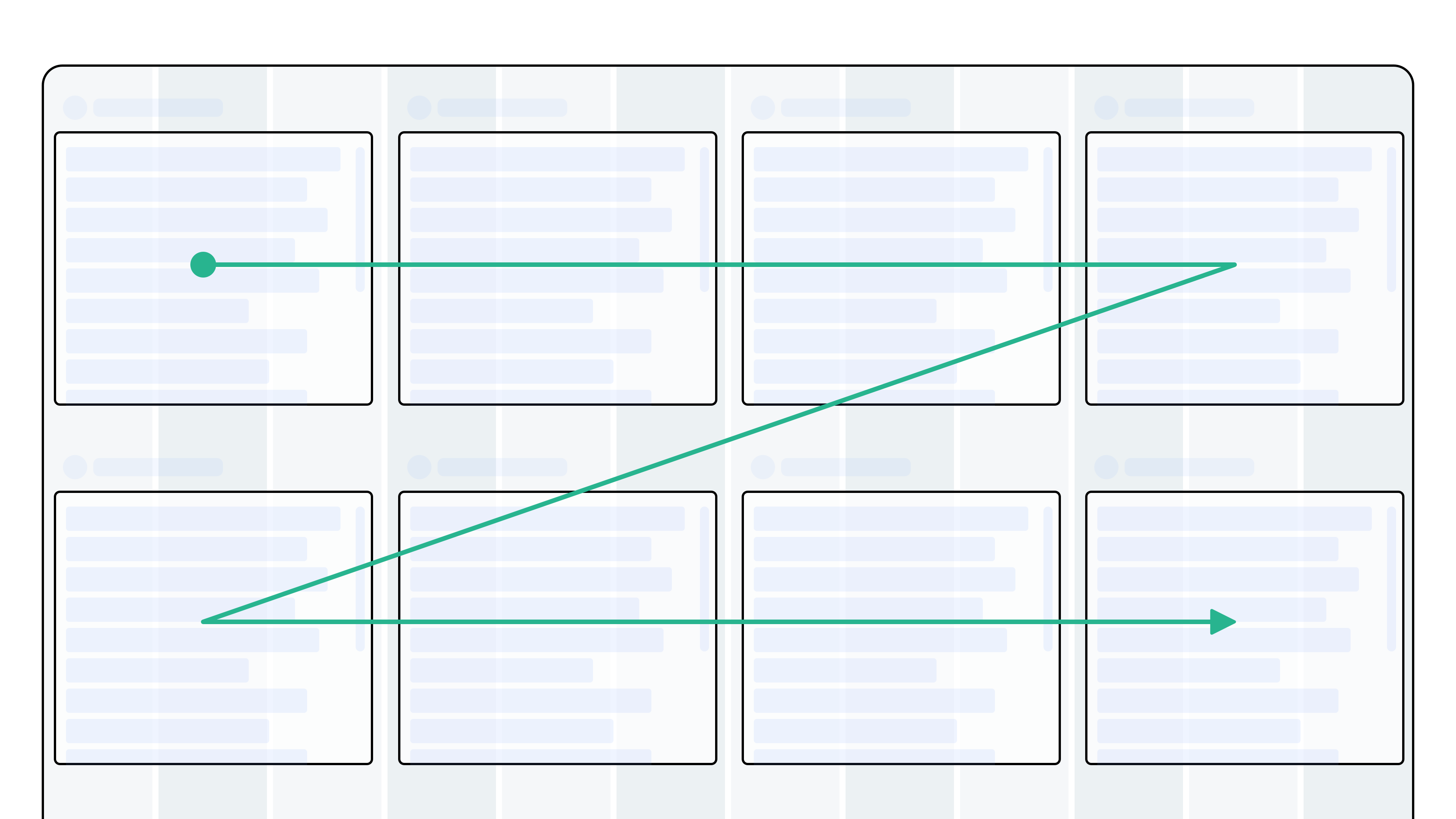
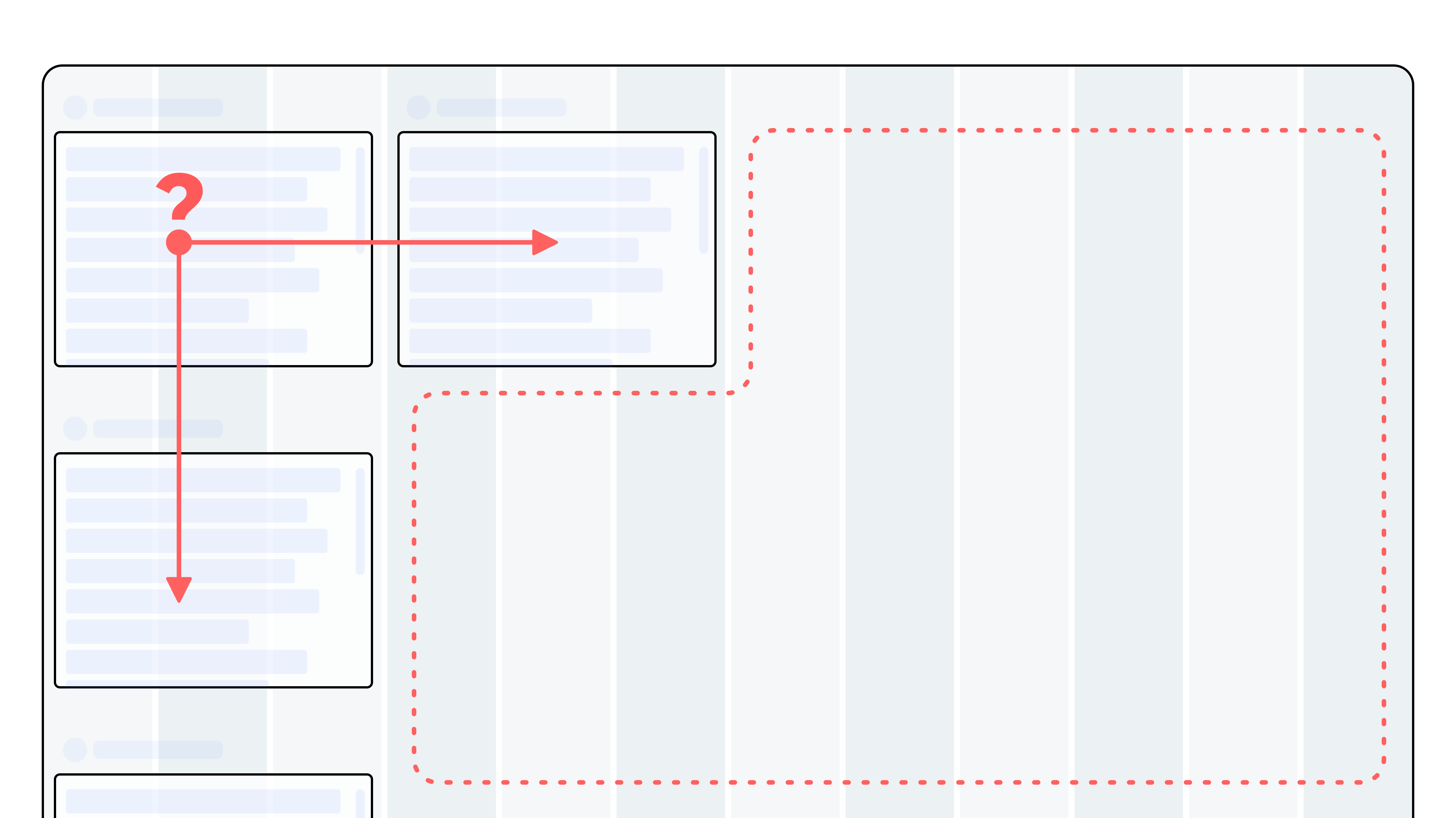
Do: Place components in the order users typically engage with them. Start with the most important or common entry point in the top left. Arrange components into even rows that are easy for the eye to follow.
Disrupting the natural flow
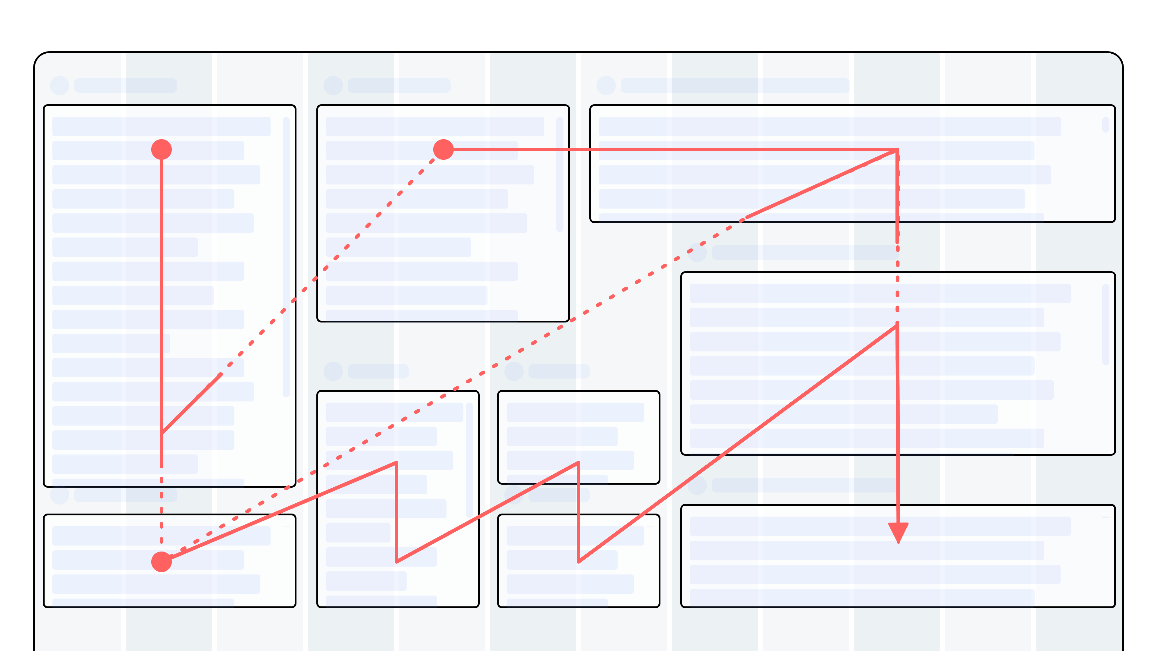
Don't: Disrupt the natural reading flow by placing key components in inconsistent positions or breaking rows with irregular spacing.
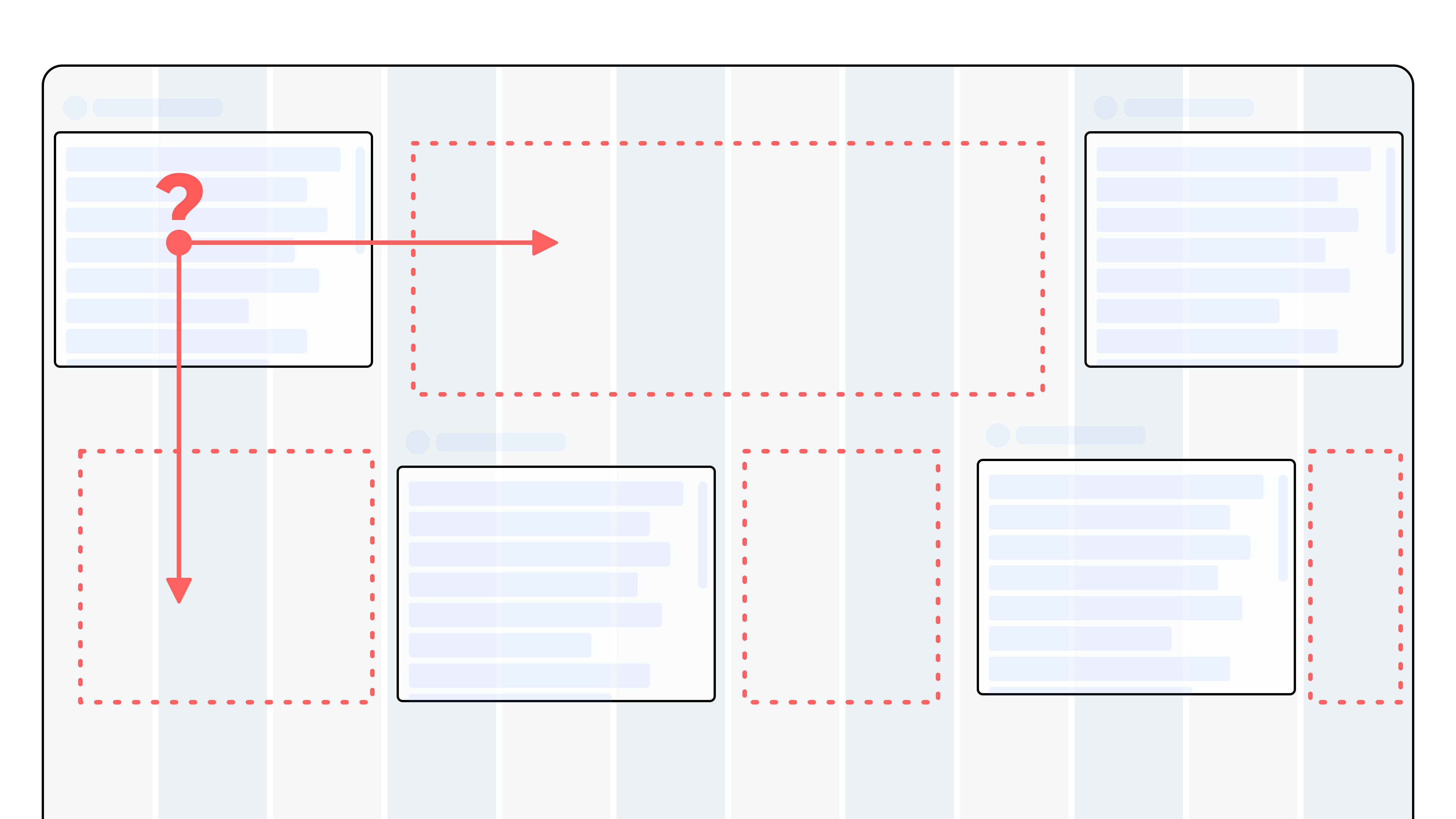
Mixing components of different heights
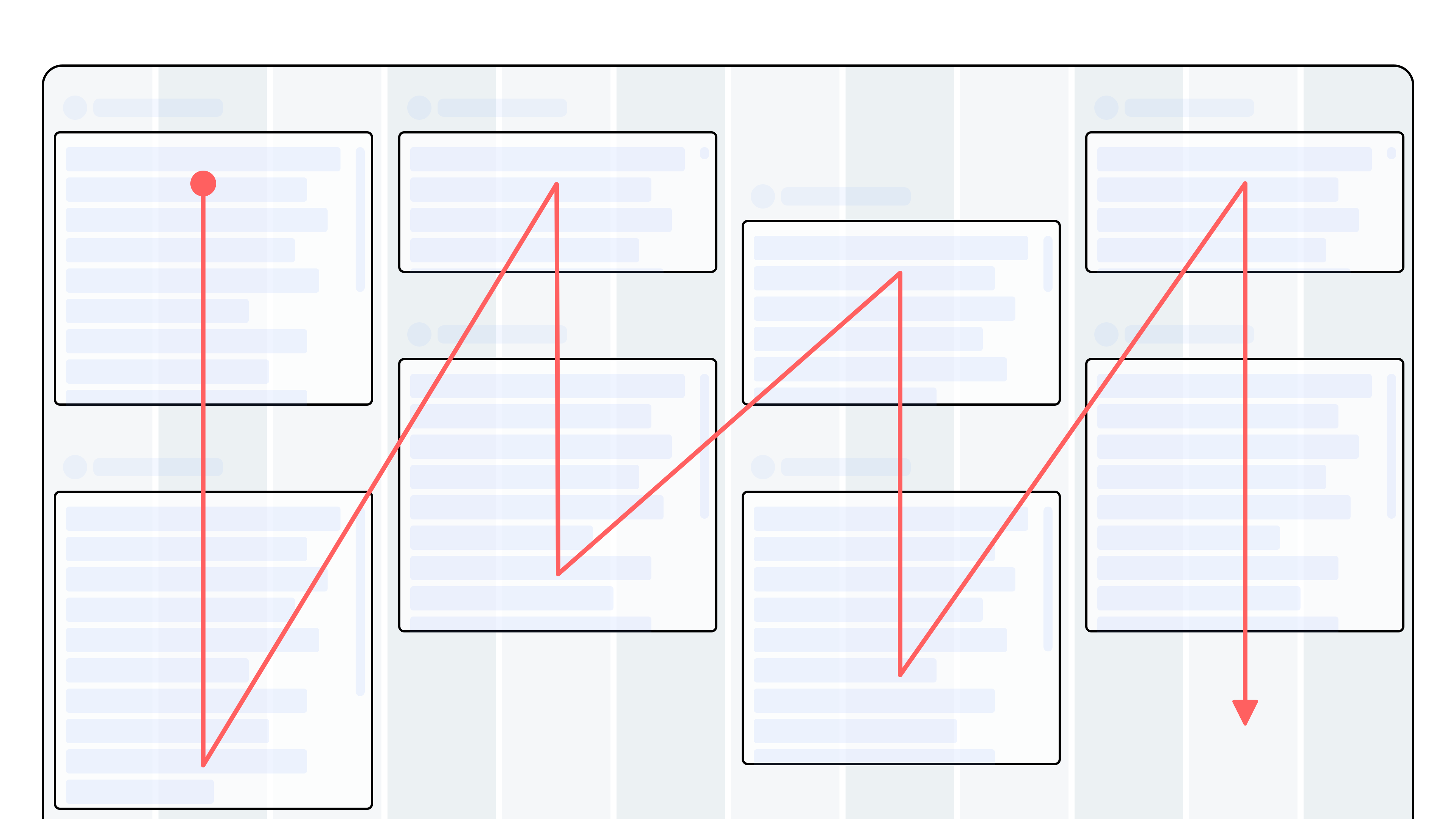
Be Aware: Distributing components of varying heights across the canvas can create an unintended top-to-bottom reading flow, making the application harder to navigate. This approach can also be applied deliberately to create a vertical flow when it supports the application’s purpose.
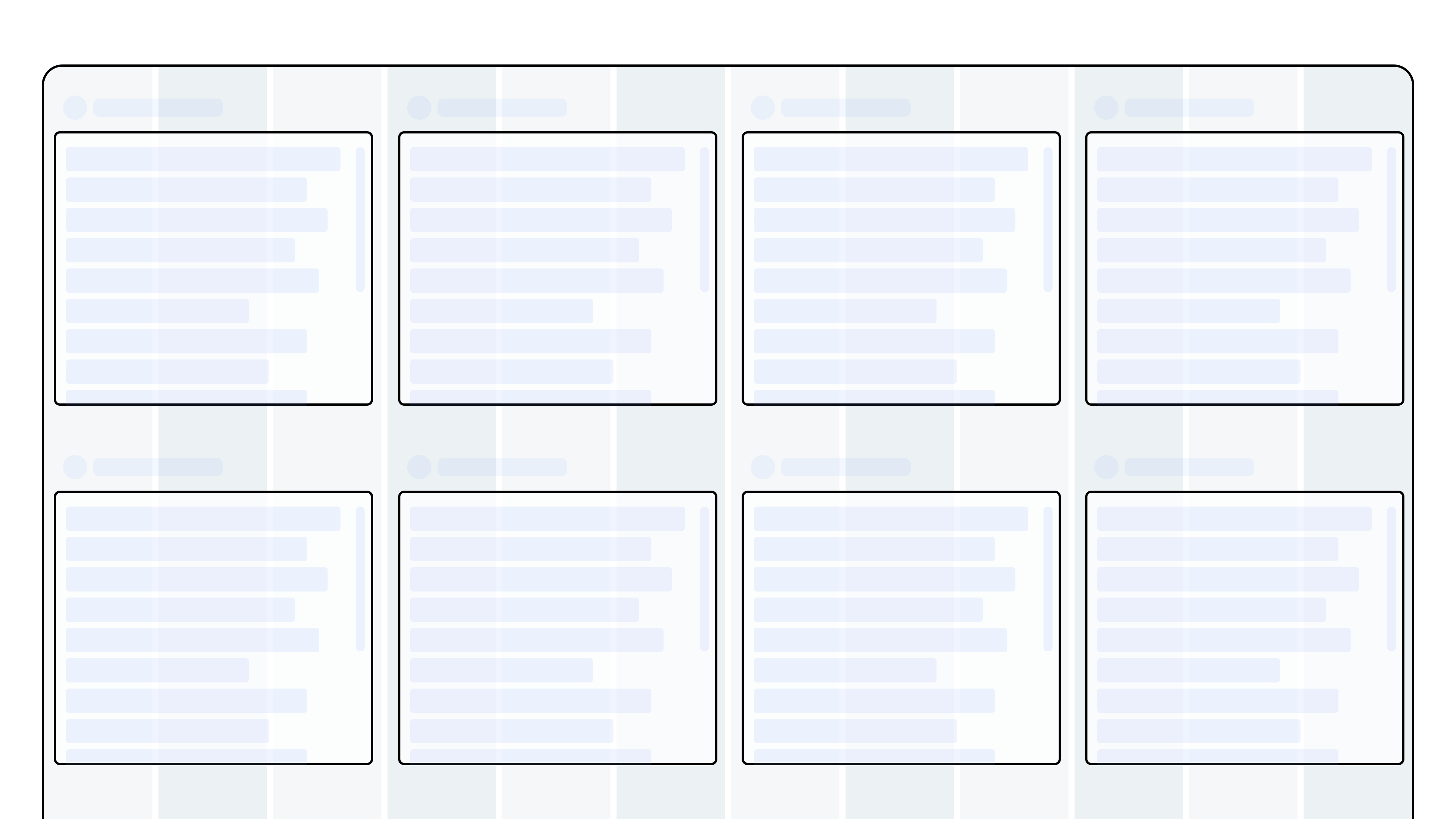
Create rows
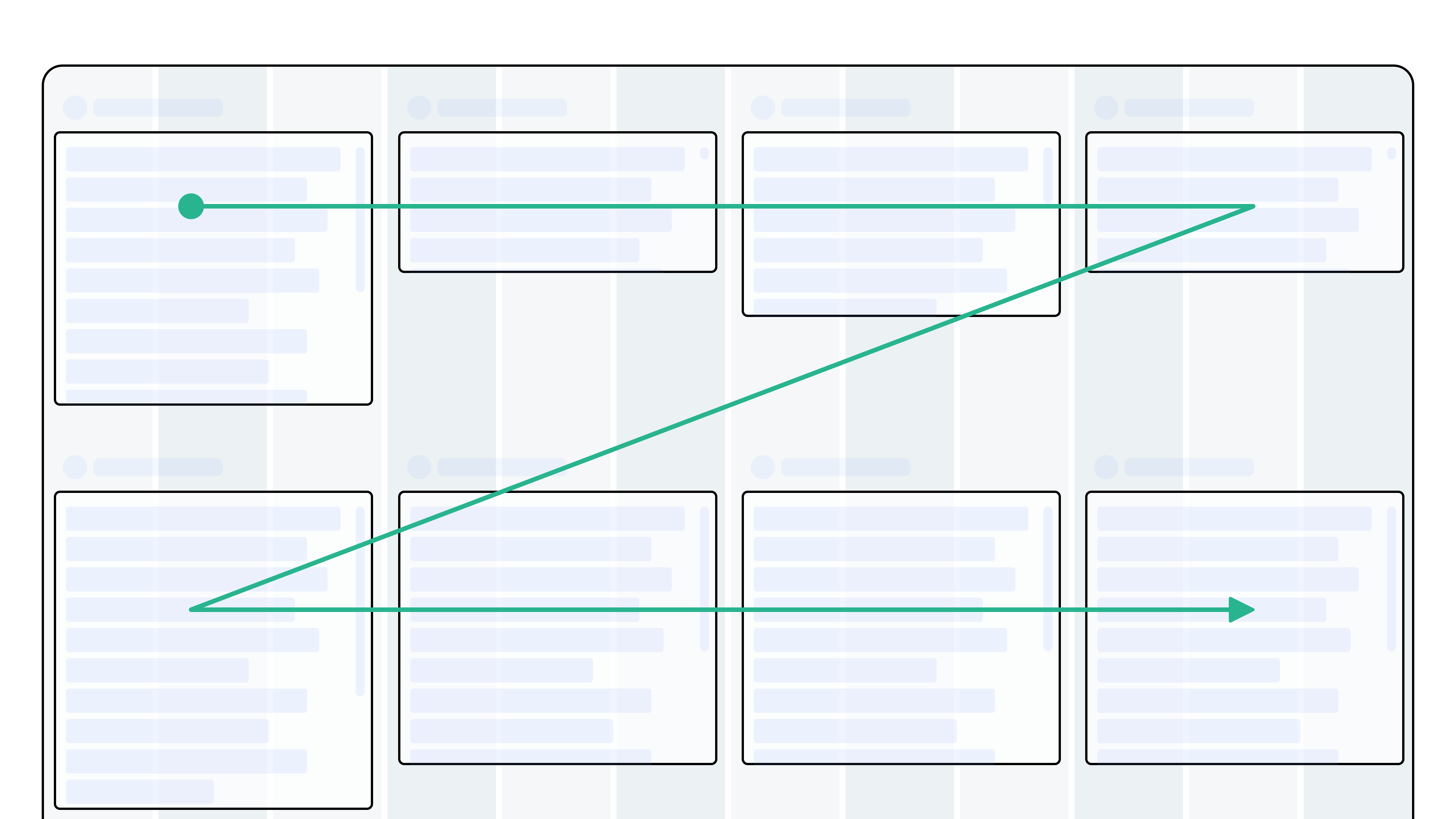
Do: Using the same components as in the example above: Distributing the components so they create two distinct rows creates a natural Z-pattern flow and makes the application easier to scan.
Empty layouts
Sometimes an application doesn't need a lot of components, this can cause it to feel a bit empty. Here's how to deal with those situations.
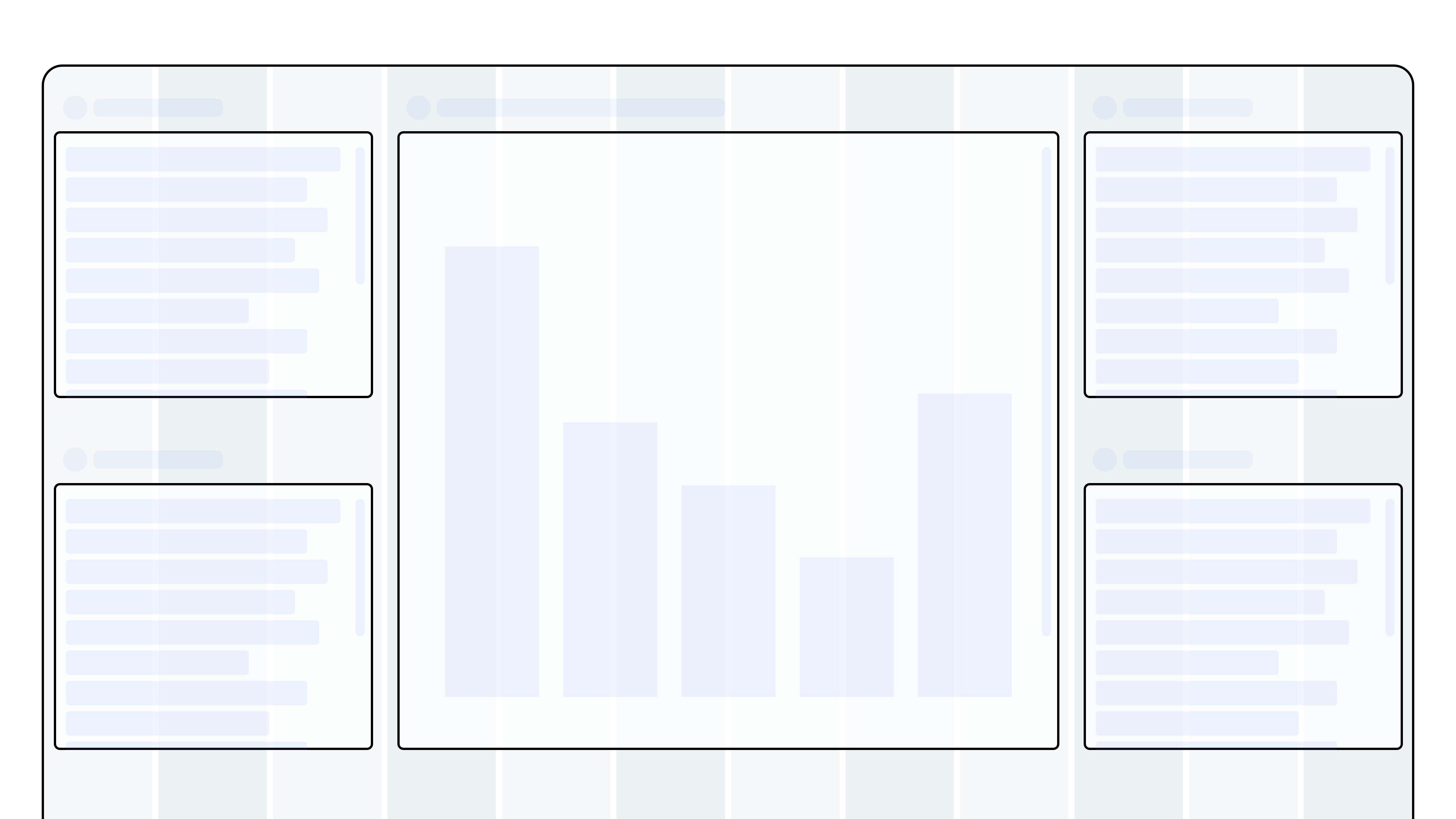
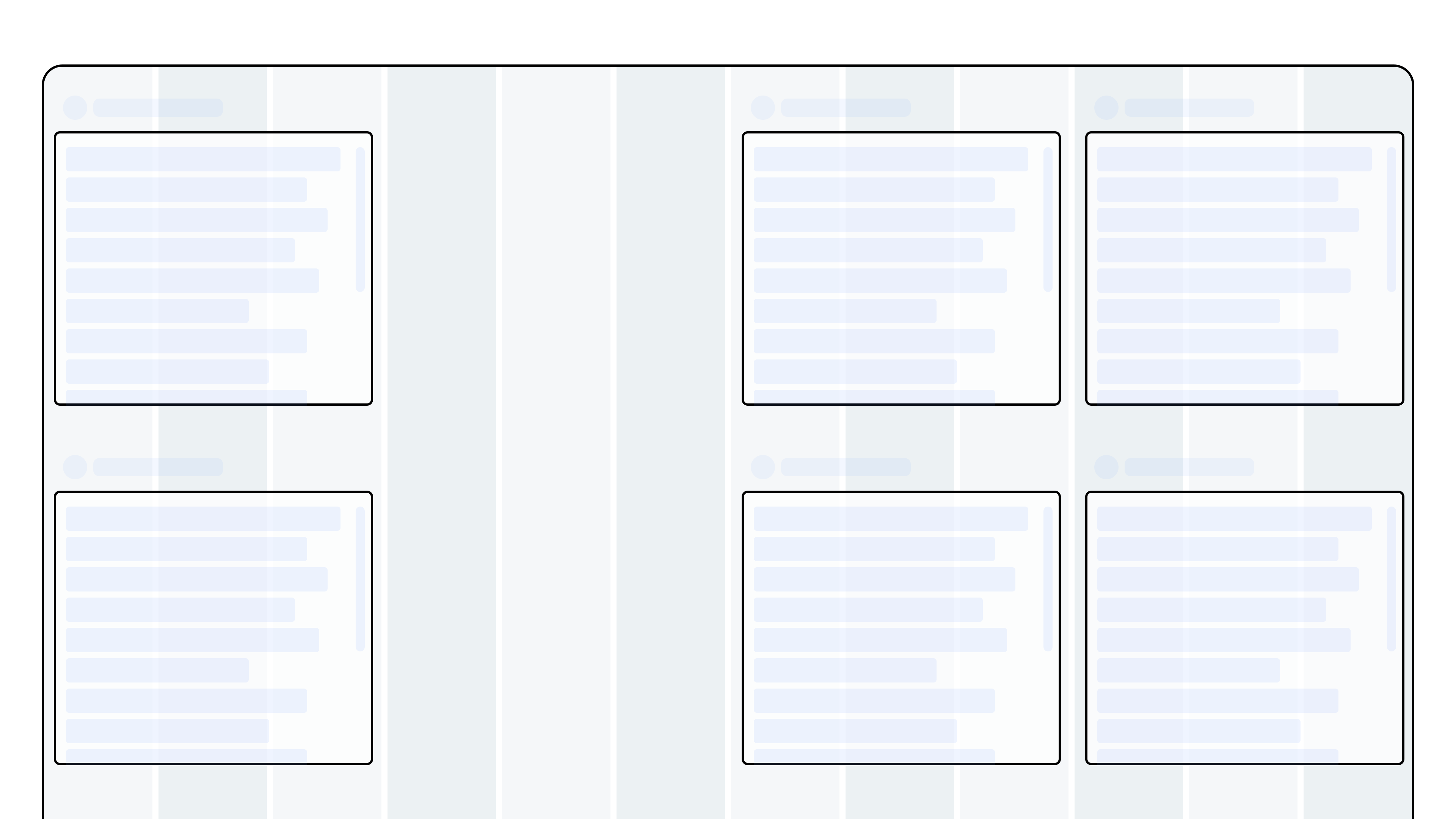
Don't: Distributing the components in columns creates excessive empty space, especially on large displays, and makes the canvas harder to read.
Don't: Place components in isolated or irregular positions. This disrupts the flow and makes the layout harder to follow.
Use contrast to guide the user
Contrast draws attention and creates hierarchy.
Our eyes are naturally drawn to elements that stand out. Components with higher contrast will appear more important. Use contrast deliberately to emphasize what matters most.
- Too little contrast → everything looks equally important, making it harder to know where to focus.
- Too much contrast → everything competes for attention, which also makes it harder to focus.
Be intentional with how you use size, color, and proximity to direct attention.
Size contrast
Size makes components look important.
You can use size both to emphasize or de-emphasize a component.
Do: Use larger components to emphasize importance and make them more noticeable.
Be Aware: The large component will grab the user’s attention and be seen as the most prominent – regardless if it actually is.
Be Aware: If all components has equal size, they will be perceived as equally important.
Color contrast
Color attracts attention.
A common technique to emphasise an item and make it stand out from its context is the use of colour.
inorigo's® result components comes in a “dark mode” by default that allows them to be more distinguishable from the selection components. If you want to make a result component less prominent you can use the light version that blends better with the other components.
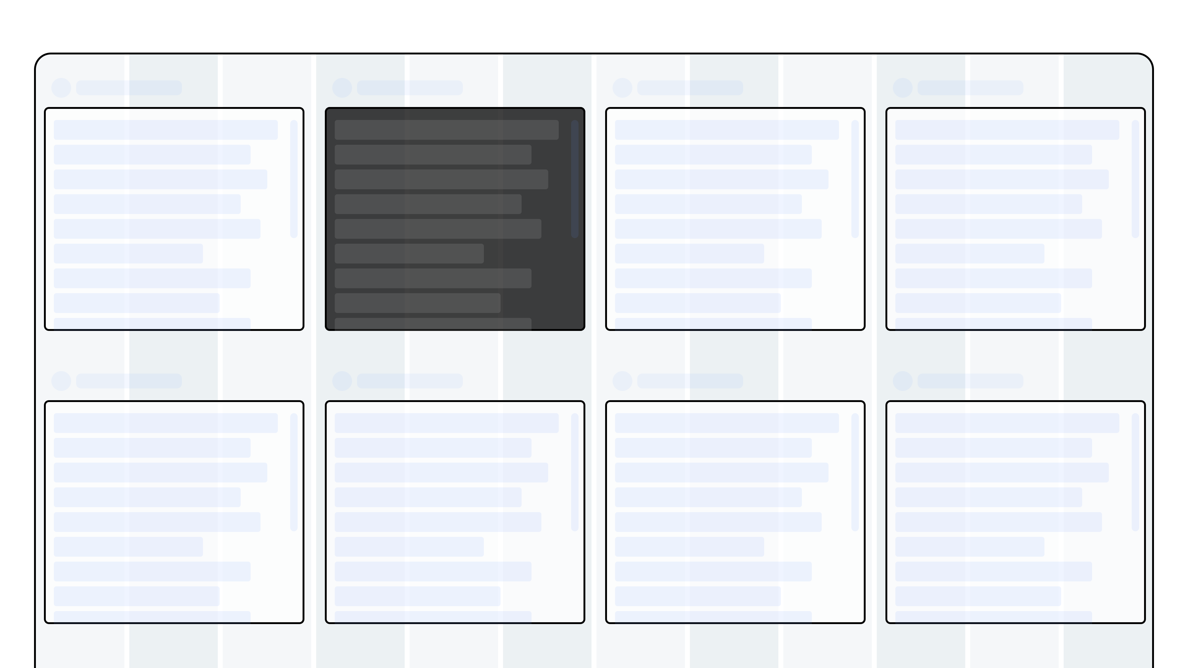
Do: Use color to highlight important components. A component with dark background will stand out from the other components.
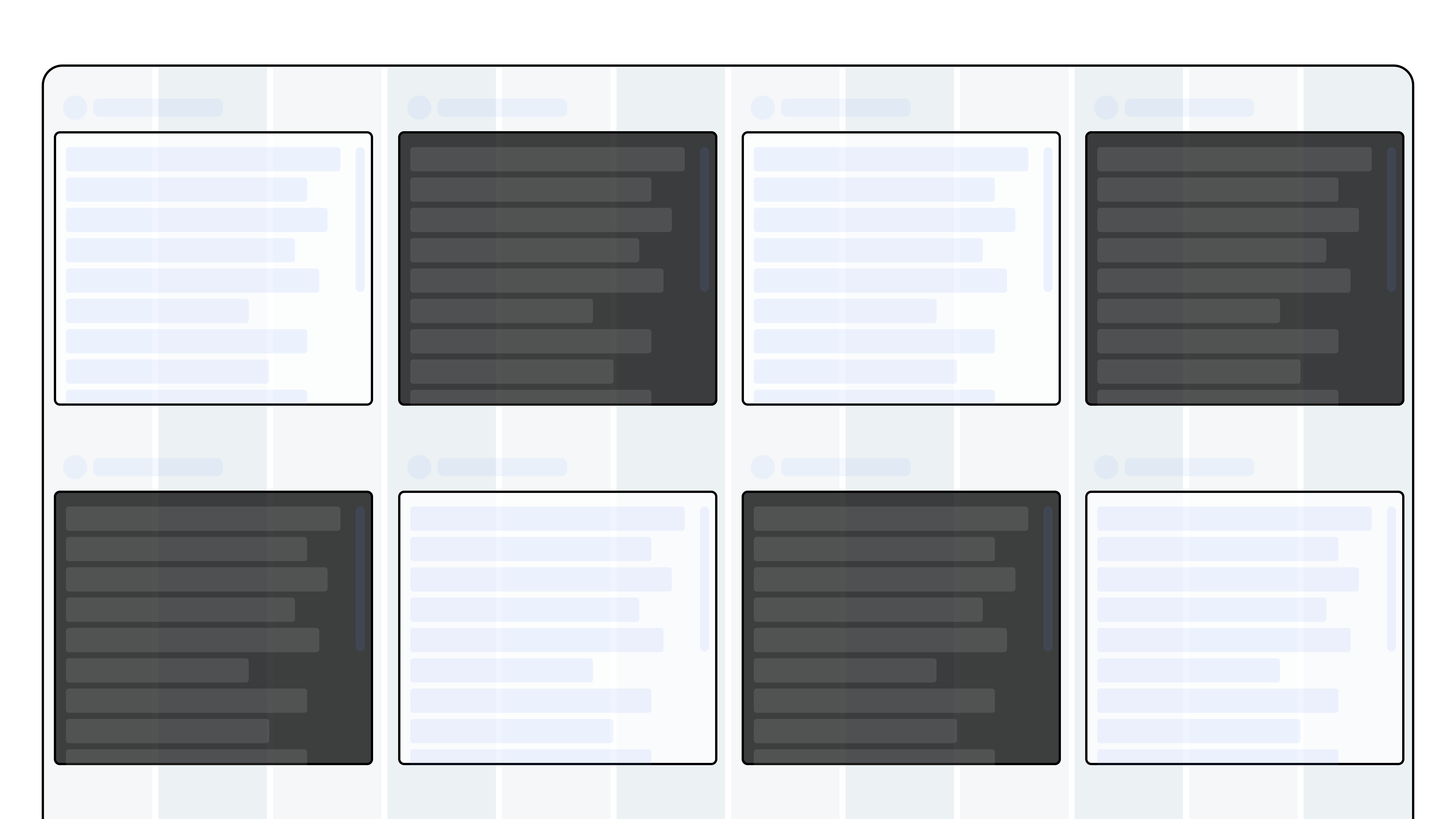
Don’t: Overuse strong color contrasts. If too many components “demand attention,” the effect is lost and the less prominent elements may inadvertently stand out instead.
Proximity contrast
Space defines groups.
Use the position and white space to visually group the components.
Do: Use spacing to visually separate groups of components. Leaving empty columns or using panels helps create clear groupings and reduces visual noise.
Don’t: Crowd components together or place unrelated items without spacing. Without proximity contrast, the view becomes harder to scan.
© 2025 Inorigo AB. All rights reserved.