5. Icons & Colors
About Icons
Icons provide visual cues that help distinguish components and data objects within an application.
inorigo® includes a wide range of icons that form part of its visual language. These icons can be grouped into categories, each serving a specific purpose in supporting clarity and recognition.
System & Toolbar Icons
Also known as functional icons, these are used in the interface for common actions such as Search, Menu, Delete, and Sort.
Common icons that can be found in the application components and Inorigo® tools and modules.
System icons are global within inorigo®, almost always monochrome, and not customizable. Some are used without accompanying text labels. Typical sizes are 16×16 px or 24×24 px.
Examples of toolbar icons. Toolbar icons can be accompanied with a describing label in some contexts.
Toolbar icons appears in the different applications, tools and modules of inorigo®, though not customizable they are typically affected by the theming. They have a selected/press state and are then shown with a back-plate.
Core Icons
Core icons represent fundamental information units, relations, references, and attribute types. They also include file types handled by inorigo®, such as knowledge sets and various resource types.
The core icons are almost always abstract by nature. They are foremost used in the metagraph builder but may appear in applications too together with the other model icons.
Core icons are 16×16 px, typically monochrome, and invert when displayed on a black background. They are an integral part of inorigo’s® visual language and cannot be customized.
Model Icons
Model icons represent definition nodes, instance nodes and attributes across different domains.
Example of different model icons: Person, Role, Agreement, Site etc.
inorigo® provides icons for the most common domains and objects, such as Person and Organization. However, it is not possible to cover every model object or domain. Before introducing a new icon, always verify that no existing icon already represents the same concept. This ensures consistency and a shared visual language across projects and domains.
Recommendations for model icons:
It is highly recommended to use monochrome icons (with a few exceptions, such as for flags or representing an actual color). Monochrome icons can be configured to automatically invert as needed, to work on both light and dark backgrounds.
Though inorigo® supports other formats, SVG format is reccomended to ensure they scale and look crisp. Model icons are commonly shown in lists as 16×16 px.
Do: Keep the icons as simple as possible. always design for the smallest size to ensure legibility.
Don't: Avoid colors unless it is crucial. Note that icons can appear on different backgrounds - like a selected list item which can be set by a theme. This may cause a color icon to become illegible.
Don't: Avoid logotypes or other branded symbols. Besides that they rarely work in small sizes, you may infringe on brand guidelines of the client.
The icons provide by inorigo Definition icons are solid (black), while instance icons use a 2 px stroke.
Principle of Using Icons
Icons distinguish, text describes.
The primary role of icons is to help users quickly distinguish items from each other. The eye can recognize symbols faster than it can read text labels, which makes icons effective for scanning and navigation.
However, icons are poor at conveying meaning on their own. Decoding the meaning of an icon is harder than reading a label, and interpretation can vary depending on context, prior knowledge, or cultural background.
Do: use icons to support recognition and make scanning easier.
Don’t: rely on icons as the main carrier of information.
Some icons are universally understood and may be used without text labels (for example, Search or Delete). These should be limited to actions that are frequent, familiar, and consistent across applications.
Never assume users will identify or understand an icon without context. Icons representing abstract or related concepts are especially difficult to differentiate. For example, using only icons to distinguish between Employee, Manager, and Consultant in an HR domain would create unnecessary confusion.

Arrows are one of the most generic and overused symbols. Without a context an arrow conveys very little information.
About Colors
Color is useful, but not universal.
Colors can carry meaning and are often used to signal urgency, warnings, or status. However, perception of color is subjective and influenced by cultural context. What is clear in one setting may not translate in another.
Users Experience Colors Differently: Be aware that around 10% of men of Northern European descent have red–green color blindness, making these colors difficult or impossible to distinguish.
For most users, distinguishing between a few primary colors is straightforward. But subtle differences—such as grey versus black, or light blue versus turquoise—can be difficult to see, especially in small icons or when placed side by side.
Use Color with Caution
Color should support, not dominate.
Relying solely on color to convey information is ineffective—you will quickly run out of usable distinctions. In components such as filters, colored icons may also conflict with highlight and selection colors, reducing clarity.
Overusing color often makes a view appear messy or even childish. For these reasons, inorigo® icons (for most part) should remain monochrome.
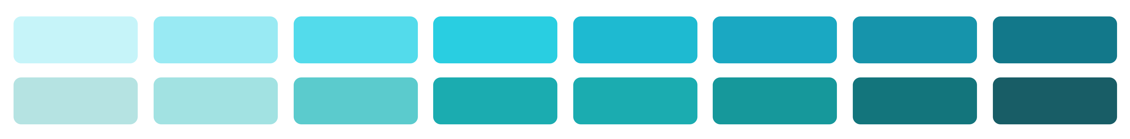
How many shades of blue-green could you easily distiguish from each other? Now imagine these in a list of small icons.
Don’t: Use colors that cannot be clearly named (e.g. light blue, orange, dark green). If a color is hard to describe with a distinct name, it is likely too subtle or too similar to other shades.
Avoid Icon Overload
Too many icons create noise instead of clarity.
Overusing icons increases cognitive load and makes applications feel cluttered or stressful. The more information shown at once, the harder it becomes to identify what is relevant. Do not place icons everywhere just for the sake of it.
Research shows that users often overlook icons entirely unless they are actively looking for them. With fewer icons, each one has a greater chance of being noticed and useful.
If icons neither help distinguish items nor add meaning, they are redundant. For example, a list of items with identical icons is no more helpful than a list without icons—but it adds unnecessary visual noise.
Do: Place an icon in the component title to help users distinguish one component from another.
Don’t: Use identical icons for every item within the same component if all items are of the same type—these icons are redundant and add clutter.
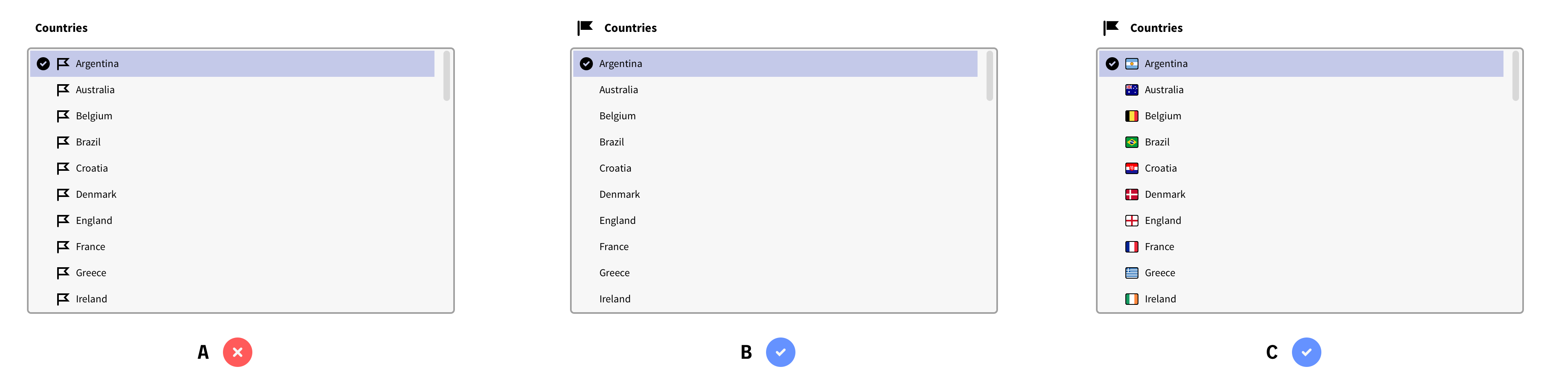
A) The icons become redundant and adds to the visual noise of the application as a whole.
B) An icon in the Component's title can make it easier and quicker to distinguish from other components.
C) The distinctivly different icons in the list makes it easier and faster to find the right item.
Other Uses for Icons
Icons can support recognition and scanning.
For education and recognition
When an item reappears across multiple views or applications, an icon can help users recognize it in different contexts. This may also extend beyond digital contexts, such as printed manuals or even markings on hardware.
To improve scanability
Icons can make it easier to distinguish between components when scanning a view. Use icons in component titles rather than inside the components themselves to improve clarity.
© 2025 Inorigo AB. All rights reserved.