Metagraph Builder
The Metagraph Builder is a web-based module for designing the metagraph model, where concepts, relationships, classifications, attributes, and rules are defined.
This Resource hub article is a stub. If you need further support regarding the subject, contact the inorigo® helpdesk.
Overview
Metagraph Builder aims to replace the older Java-based Model Builder.
Metagraph Builder is in continuous development and will get new features over time. The old Model Builder and the new Metagraph Builder will coexist and work together indefinitely. Some features will be exclusive to the respective tool. Testing has been focused on modeling the types Resource, Instance nodes (Associations) & Definition Nodes (Association Definitions), and we recommend using other types by this date.
Working with Metagraph Builder
Saving your work
When you work in Metagraph Builder, actions like creating a new node or editing an entity's details are only performed locally in your browser. They are not saved to the database until you explicitly choose to save.
As soon as there are unsaved edits, a counter appears on the Save and Log icons in the toolbar to show how many unsaved changes exist. Pressing Save commits all changes, and pressing Log opens a panel that lets you view all queued actions on a timeline before saving. Nodes that are unsaved will be shown on the canvas with their name in italic and an asterisk [*] symbol.
Context Menus
Right-clicking (CTRL+Click) an entity opens a contextual menu with several actions. Some actions are available only from the context menu.
The Toolbar
The Toolbar, located at the top of the Metagraph Builder, contains common actions (like creating new nodes and save) and buttons to control the interface (by toggling different panels on or off). In addition, it shows which project is currently active and provides access to universal inorigo® functions such as the launcher menu, help, and login.

The Metagraph Builder Toolbar
Hotkeys
| Hotkey | Description |
|---|---|
| CTRL + S / ⌘ S | Save |
| CTRL + L / ⌘ L | Toggle Log panel |
| CTRL + B / ⌘ B | Toggle Library panel |
| CTRL + P / ⌘ P | Toggle Project panel |
| CTRL + I / ⌘ I | Toggle Canvas panel |
| CTRL + D / ⌘ D | Toggle Details Panel |
Creating A New Node
From the Toolbar
There are two ways to create a new node from the Toolbar.
- Press the Definition icon [+] to create a new Definition Node.
- Press the New… icon to open a menu with all available data types, and select one from the list.
From the Canvas
When hovering the [+] icon on a node on the canvas you will see a menu from which can create a new subclass (the bottom icon) – or parent node (the top icon).
Pressing the arrow icon on the node lets you create nodes through other relations (dependent on your environment). You can, for instance, create a new node that is implemented as an attribute of the selected node, or create a technical documentation resource.
Creating a new node will automatically open the Details Panel, where you can edit the new entity's details.
New nodes are automatically added to the active project.
New nodes are not automatically saved. You need to name it in the Details panel first, and then save it.
Creating a Relation between two nodes
Creating a subclass: You can connect two nodes by dragging the top plus icon from one node on the canvas to the desired parent node. This creates a "classifies, is a kind of" relation: The node you dragged to will "classify" the one you dragged from.
Creating a new parent: If you drag the bottom plus icon to another node, it will make that node the parent. The node you dragged to will be "a kind of" the one you dragged from.
Selections
Selections in Metagraph Builder are synced across the panels. That is, if you select one or more nodes on the Canvas panel, the same entities will be selected in the Project, Library, and Navigator panels. In addition, the Attribute panel, Detail, and Log panel will show the details for the selected entity.
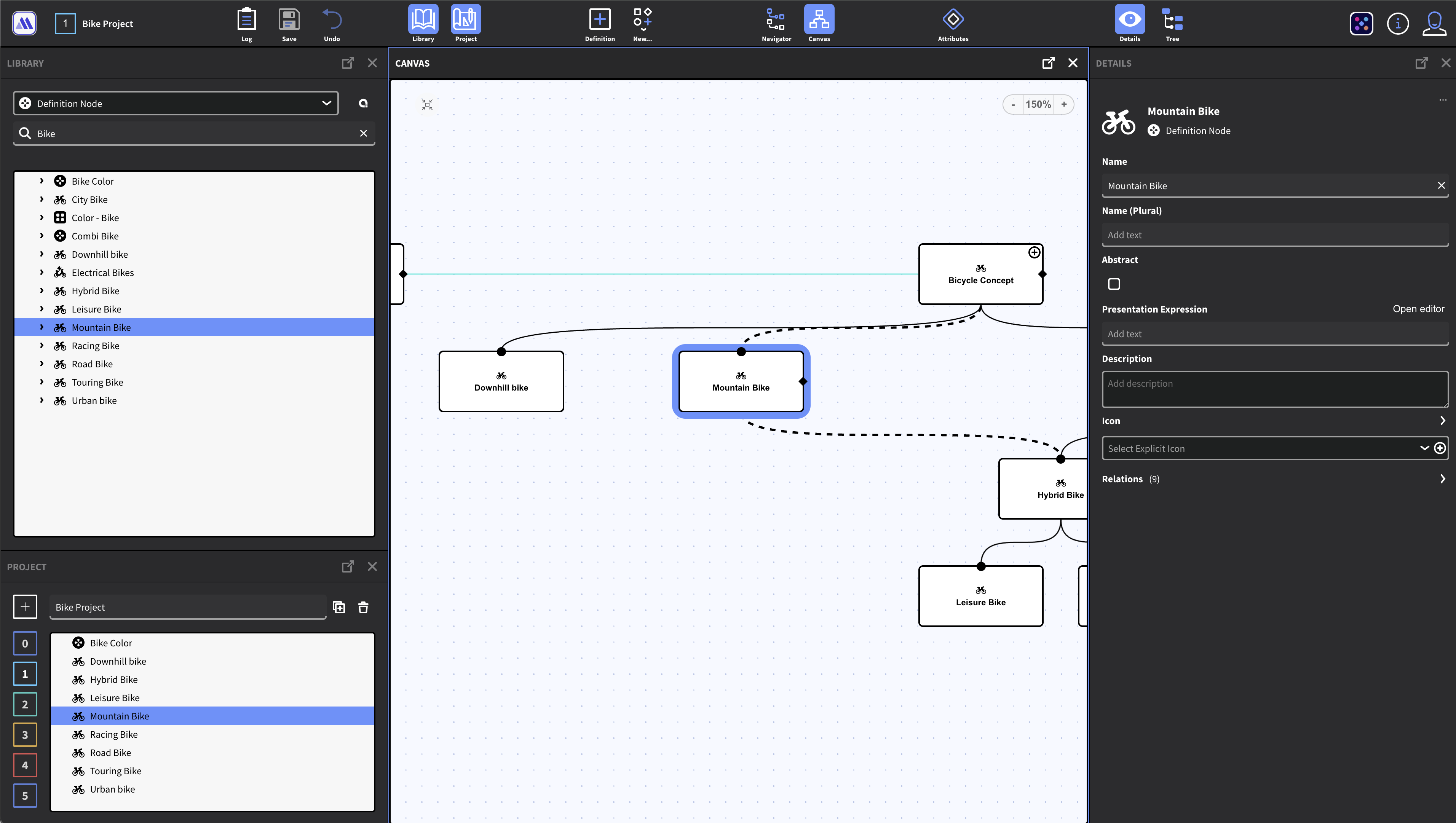
The selection is synced between the panels.
The Panels
The Metagraph Builder interface consists of several panels, each serving a specific purpose, which can be toggled on or off based on the user’s work mode and preferences from the Toolbar. Panels can be closed with the [x] button in their respective header.
Open in new tab
The panels can be opened in a new browser tab by pressing the "open icon" in their respective header. Tabs and panels are synced across the current session, meaning that selections you make in one tab may be reflected in tabs with the same panel opened.
The Project Panel
The Project panel (CTRL+P) can hold any number of projects. A project is a collection of nodes - a subset of the model that you are working with.
- Projects are assigned a Number (Starting with 0), and you can name the current active project in the panel.
- The active project is always visible in the toolbar.
- To toggle between projects, simply press their number in the panel or the toolbar.
- Projects are automatically saved.
- You can duplicate a project and its content by pressing the duplicate icon next to its name.
- You can delete the active project from the Project panel. Note that the nodes are not deleted, only the project itself.
- The nodes in the project are visible in the Canvas and Navigator Panel
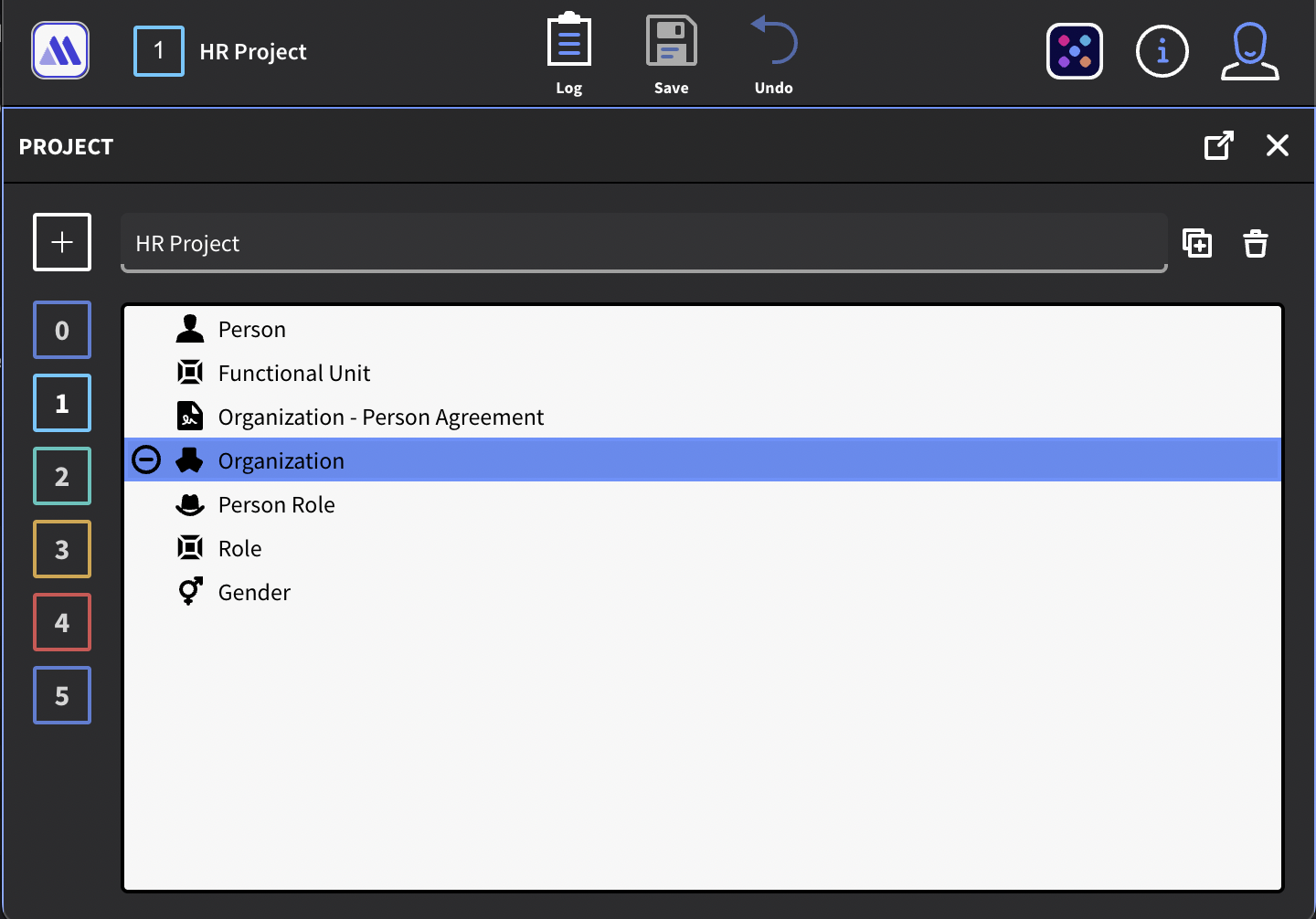
Project Panel and Projects in Toolbar
Adding Nodes to the Project
In the Library, Navigator, or Canvas, any node that is not in the project will show a "plus" ⊕ icon when hovered or selected. Pressing the icon adds the node to the project. You can also double-click a list item to add it to the project.
You can add multiple nodes to the project by selecting more than one entity and right-clicking. From the context menu, select Add to project.
Removing Nodes from the project
To remove a node from the project, press the "minus" ⊖ icon that appears when hovered or selected.
You can remove multiple nodes from the project by selecting more than one entity and right-clicking. From the context menu, select Remove from project.
The Library Panel
The Library panel (CTRL+L) is where you will find all data entities of the model. It is configured to show one data type at a time - by default, Definition Nodes. The dropdown list lets you change to another data type. Note that the current version of Metagraph Builder does not support legacy data types like Generic Unit and Generic Type.
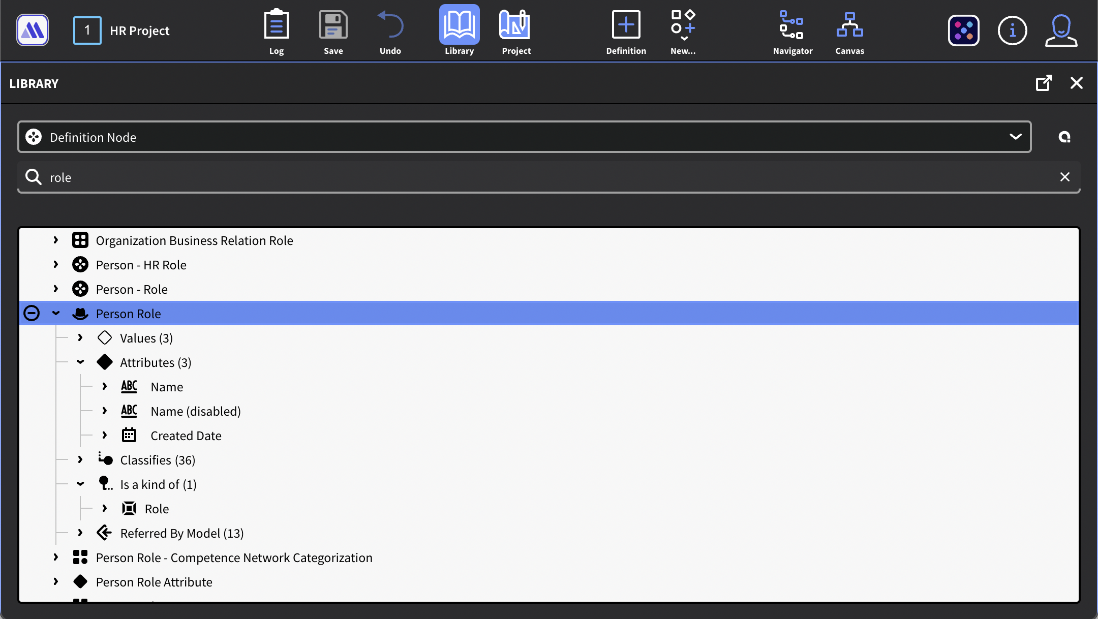
The Library contains all entities of the inorigo® model
Working with the Library
The library shows entities alphabetically in an expandable tree list. By pressing the arrow next to an entity, you can expand it to see any values, attributes, relations, and references associated with it. Note that the tree is recursive, and so there's not necessarily a definitive end to a tree, as it might loop dependent on the structure.
Filter the Library
You can use the Search field to find the entity you are looking for. You can also use a Query to make a more advanced filter by pressing the "Q" icon next to the Data Type dropdown. For more information on how to create queries, check the section on the Query Editor.
The Navigator Panel
The Navigator Panel is a structured tree component that allows you to view and explore the entities in your currently active Project. It works similarly to the Navigator in the old Model Builder.
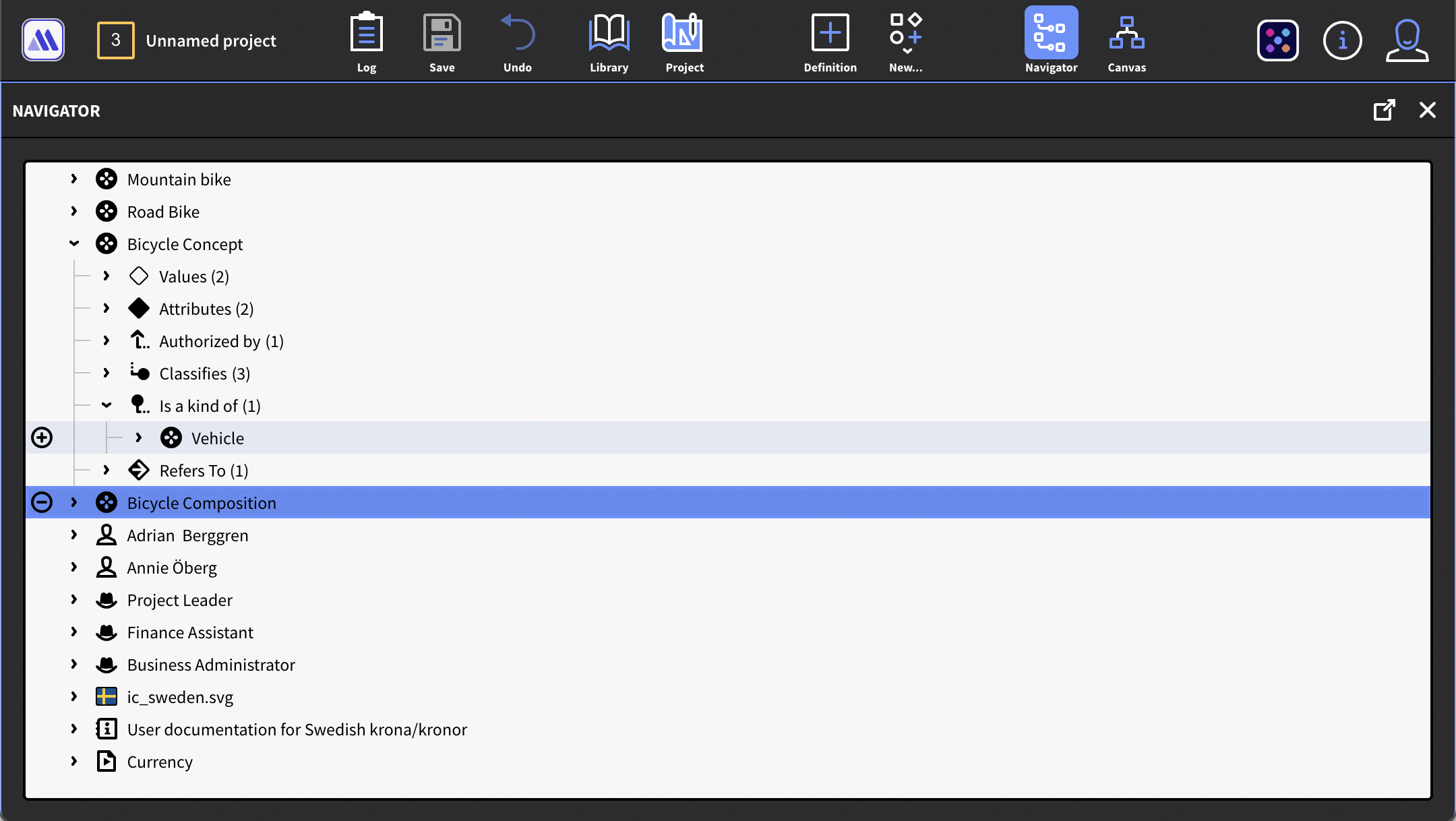
The Navigator Panel allows for navigating the project in a tree list.
Working with the Navigator Panel
The Navigator Panel complements the Canvas, letting you see the nodes and explore the model in different ways.
As you expand the tree, you can add or remove objects from your Project by pressing the "plus" ⊕ or "minus" ⊖ icons.
Note that the tree is recursive, so there's not necessarily a definitive end to a list, as it might loop indefinitely depending on the structure.
The Canvas
The Canvas visualizes selected portions of the model as a metagraph diagram of nodes and edges. All entities in the project will be shown as nodes on the canvas, but nodes added to the canvas are not automatically added to the project. (This is so that you don't accidentally mess up your project by expanding a node with a large number of sub-nodes.)
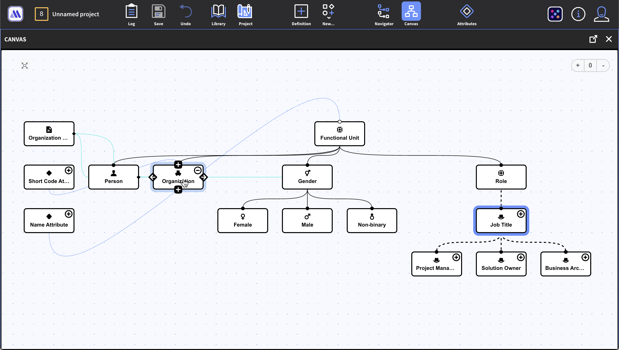
The Canvas shows a metagraph diagram of nodes and edges from a selected portion of the metagraph model
Working with the Canvas
You can navigate the Canvas by dragging the canvas background. Use the scroll wheel or trackpad to zoom in and out. You can also use the Zoom-tools embedded in the canvas. There's also a button that centers the view.
As of the current version, the nodes are automatically placed on the canvas – there's no manual layout. Yet. (This is planned for a future release.)
Removing Nodes from the Canvas
You can remove a node from the canvas by
- Selecting it and pressing backspace on your keyboard
- If the node is in the project, you can remove it by pressing the ⊖ icon
- Right-Click and select Remove from Canvas from the context menu
Node Actions
Entities on the canvas are shown as Nodes. Hovering over a node reveals additional actions.
- The plus/minus icon ⊕ / ⊖ icons add or remove the node from the current project.
- Hovering over the Plus icon at the top of the node allows you to create a new parent node, either through classification or implementation.
- From the same menu, you can select to show/hide any parent nodes by clicking the checkboxes.
- Clicking or hovering over the Plus icon at the bottom of the node allows you to create a new child node, either through classification or implementation.
- Clicking or hovering over the Left Arrow icon allows you to show/hide any nodes that Refer to the selected node (Referred by model)
- From the same menus it is possible to create a new node connected through it through a custom relation.
- Clicking or hovering over the Right Arrow icon allows you to show any nodes that refer to the selected node (Refer to).
- From the same menu, you can create a new Handbook or User Documentation for the node.
- From the same menu, you can create a new node that is implemented as an Attribute on the selected node.
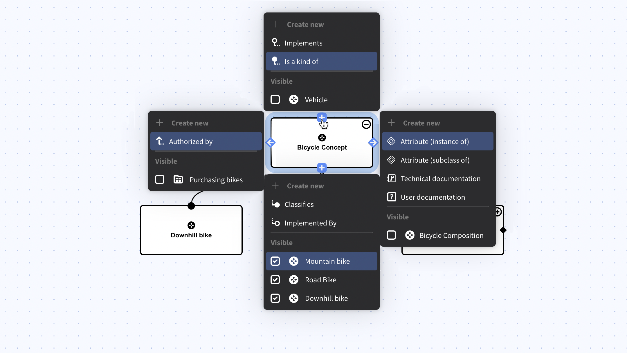
Example of menus that will appear when clicking or hovering on the node's icons
Hiding & making nodes Visible on the Canvas
You can explore the connections from a node through the Node Action context menus.
To add a node to the canvas, simply check it from the Visible section of the menu. To hide it, just uncheck it again. You can also right-click the node and select Remove from Canvas.
Note that nodes added this way to the canvas is not automatically added to the active project. To add a node to the project you must always use the ⊕ icon.
Edges
Edges show how the nodes are connected. By selecting a node, the edges become animated, making it easier to follow the edge on the canvas.
- A Black Edge indicates a classification (Classifies/Is a Kind of relation)
- A Green Edge indicates an implementation (Implements/Implemented By relation)
- A Purple Edge indicates a relation (Consist of/Is a part of, Contains/Included in).
- A Grey Edge is shown between the Definition nodes and their Instance Nodes. And references. Grey edges cannot be selected.
- A Blue Edge is shown when a relation is selected (by clicking on the edge)
Selecting Relations
Edges that are relations (Classifies/Is A Kind of, Implements/Implemented by, etc.) can be selected by clicking on the edge. The mouse cursor will change into a pointer cursor when hovering over a selectable edge.
When a relation is selected, the Detail Panel will show its details, just like a node.
Disconnecting a Node
To disconnect a node, i.e., removing the relation, right-click on the edge (relation) that you want to remove. From the context menu chose Disconnect.
It is also possible to select one of the nodes that you want to disconnect, and in the Details panel, expand the section that says Relations, locate the type of relation you are looking for, and then delete it by pressing the trash can icon.
The Details Panel
The Details panel is a contextual panel – that is, it will always reflect the details of the currently selected entity. The Details panel allows for editing the details, such as the name and icon of the entity, as well as other attribute values.
When selecting multiple entities, the panel will show the details of all side by side.
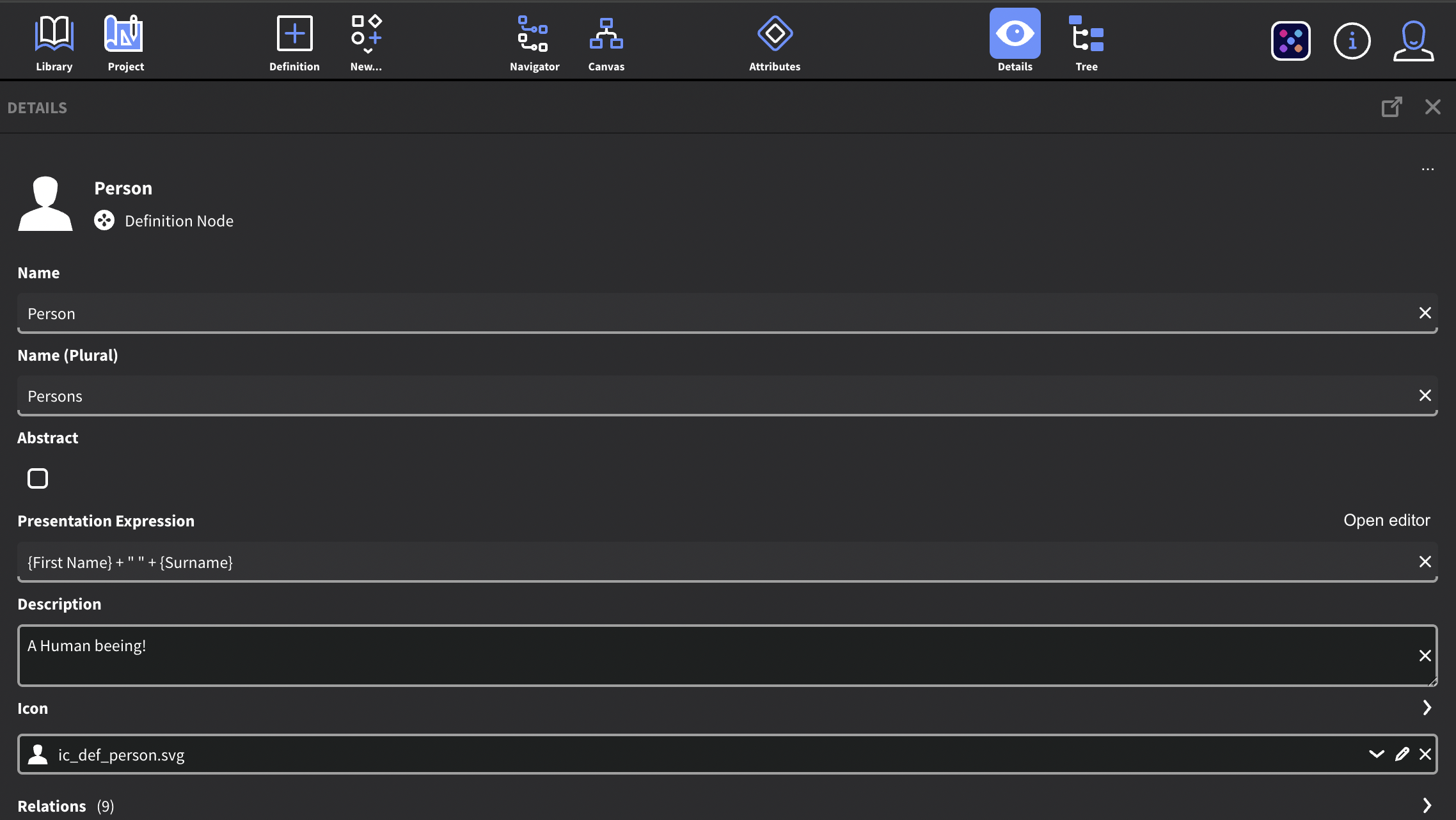
The Details Panel shows the details of the currently selected Entity
Abstract Checkbox
When this checkbox is selected, you will not be able to create Instance nodes from the Definition Node.
Presentation Expression
When creating Instance Nodes, this is where you will define how they will be displayed in inorigo®.
By default, Instance Nodes without a presentation expression are shown with their inorigo® ID.
It is common to use the Name attribute as presentation, but with expressions, you can string together a presentation from multiple attributes and add custom values to the presentation.
You can open up the Expression Editor by pressing Open Editor. Learn more about expressions.
{Name} presents the instance with the value of the Name attribute
{First Name} + " " + {Surname} would combine the attribute First Name and Surname into a Presentation String. The (" ") adds an blank space between the two attribute values.
{Project Name} + " " + $MONTHNAME()+ " " + $YEAR() would combine the attribute Project Name with the Date and Month of its creation. E.G. "Project Omega May 2025".
Icon
Allows you to set an explicit icon for the entity. Icons are inherited, just as any attribute, through classification. By pressing the down arrow [⌄] you can browse all available image resources.
To upload a new image resource, press the ⊕ icon. A dialog will open where you can upload a new image resource.
To edit an existing icon, first select the icon from the list and press the pen icon.
Invert on Dark: In the Resource Type dropdown, you can set the type to Invert on Dark, this will invert the colors in dark mode, so that a black icon appears white on a dark panel.
You can set the icons for Subclasses, Instance Nodes, and Implementers by expanding the Icon section. To do so, press the expand arrow [⌄] next to the label that says "icon".
Best Practices:
For most list inorigo® displays a 16x16 px icon, it is good to keep in mind that images with many details and colors will not look great when scaled down.
It is recommended that:
- The icon is designed with smaller sizes in mind.
- The icon is monochrome/black. This ensures legibility on different backgrounds.
- The icon is in .svg format as vectors can scale without quality loss.
The Attribute Panel
The Attribute panel is a contextual panel – that is, it will always display the attributes of the selected entity.
When selecting multiple entities, the panel will show the attributes of all selected entities in the order they were selected.
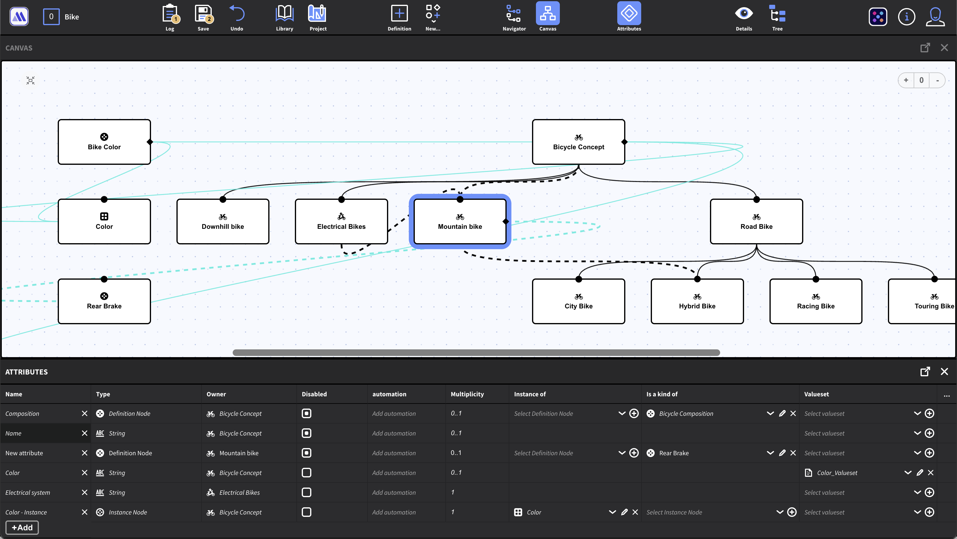
The Attribute panel shows the attributes of the currently selected entity
Adding Attributes
You can add attributes by pressing the + Add button at the end of the list. By default, the attribute type is set to String.
Attribute Type
An attribute may, for example, be a simple string or integer (primitives), but may also point to other information units.
Note: Once an attribute has been saved, you cannot change the Attribute Type.
Attribute Columns
By default the panel shows a number of columns with the properties for each attribute, such as the Name, Type, Owner and Multiplicity. You can customize which attributes should be visible by pressing the […] icon and checking/unchecking the boxes from the menu.
Multiplicity
Multiplicity refers to how many values an attribute can or must hold.
| Example | Description |
|---|---|
| 1 | Exactly one value (mandatory single value) |
| 0..1 | Zero or exactly one value (optional) |
| 0.. | Zero or more values |
| 1.. | One or more values |
Attribute Inheritance
The attributes on a parent Definition Node are automatically inherited by its children through the classification structure. (Is a Kind of/Classifies relation)
Attributes that are inherited are displayed in italic in the list.
Inherited attributes may have a different name than the attribute from which it was inherited. You can rename the attribute by clicking its name.
You can right-click a cell in the attribute list and select Attribute Inheritance… to get a dialog where you can trace the inheritance of an attribute. The dialog also lets you edit and override an attribute.
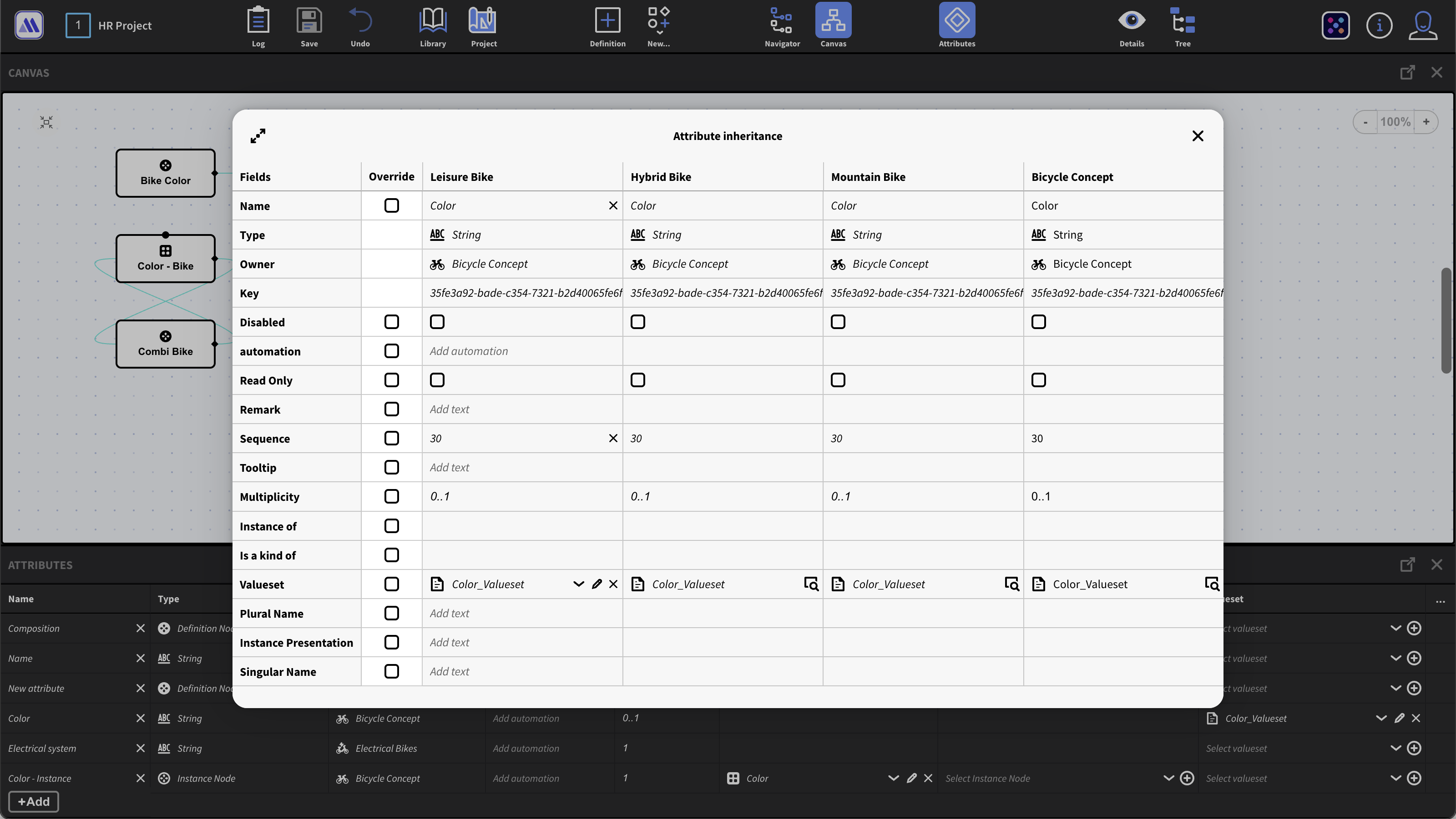
From the dialog, you can trace how an attribute has been inherited through the classification structure
You can disable an inherited attribute. To do so, first enable the Disabled column from the […] menu and check/uncheck the option.
Valueset
A valueset is a list of attribute values from which the user can choose when an instance node is created. (or many values, depending on the multiplicity of the attribute). From the valueset column, you can select any pre-existing valueset from the dropdown.
To create a new valueset, press the ⊕ icon in the valueset cell. In the dialog, you can name the new valueset, select the type, and add values.
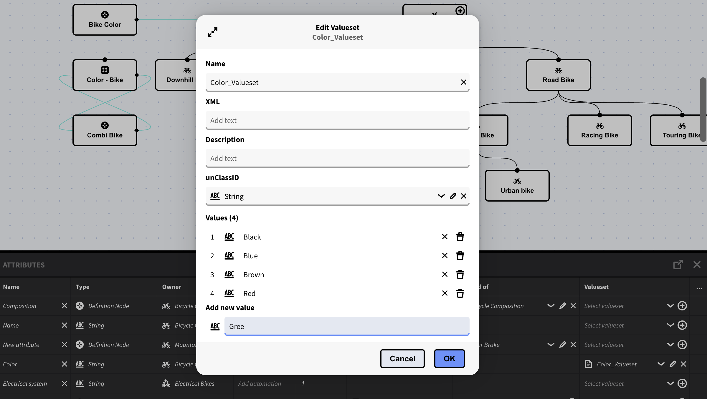
The valueset dialog can be opened from the valueset column
Attribute Order
The Attribute panel lists attributes according to their sequence. This order is also reflected in how the attributes will be displayed in other lists in inorigo®. To change the sequence of the attributes, first add the sequence column from the […] menu if it is not visible. Lower sequence numbers have precedence over higher numbers.
The Tree Panel
The Tree panel is a contextual panel – that is, it will display a tree structure based on the selected entity. The Tree panel can be helpful when you want to quickly navigate through or explore the structure of a single entity.
The Log Panel
The Log Panel lists all actions and edits, - chronologically in a timeline, that are ready to be saved.
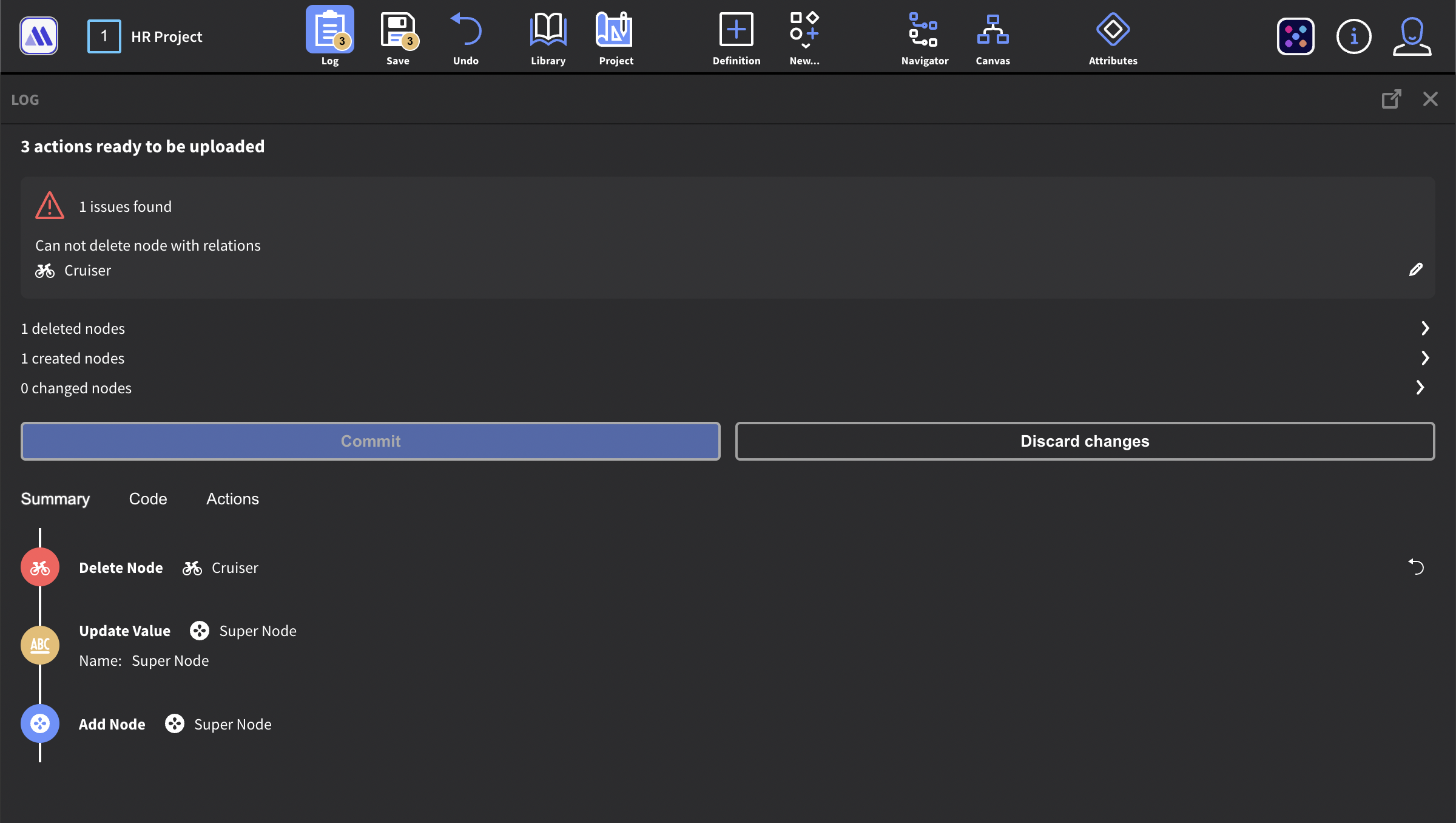
The log timeline colors can be helpful to quickly identify what type of action will be committed on save
- A blue circle behind the icon indicates that a node was created.
- A yellow circle behind the icon indicates that a value was edited
- A red circle behind the icon indicates that a node was deleted.
The Log panel also lists all issues - and lets you address those by pressing the pen icon.
You can undo the last action taken by pressing the ↩︎ icon next to it.
How Metagraph Builder will differ from its predecessor
Metagraph Builder has inherited many great features from Model Builder, primarily those focusing on modeling. It features a canvas to visualize the inorigo® model, and improves understanding and interaction. The web technology makes it more accessible, compatible, quicker, and adds support for more types of devices. Some Model Builder features however, will move to other places in the inorigo® platform, where they fit better.
Features that will not be inherited from its predecessor
We want Metagraph Builder to excel in Modeling and focus on just that. Therefore, the following features within the Model Builder will not be found in Metagraph Builder.
- Methods
- Context handling
- User preferences, system settings, Locale
- Chat support
- User permissions (will be handled by Right Manager instead)
- No file handling (will be handled by File Manager instead)
Features that have not yet been implemented
Some feature has yet to be implemented in the Metagraph Builder but are candidates for a later release:
- connect panel
- input matrix
- constraints
- Dependency management/Dependency Warnings
- Bookmarks (will be integrated in project later on)
- Handling of type Process Domain types
- Full language support (har partial today)
- RelationSpecifiers are not fully supported
Roadmap
The priority is to make it intuitive to model and understand the model using an interactive metagraph diagram.
Some upcoming features
-
Shared projects
-
Panel realignment and resizing
-
Improved Canvas - manual layout for nodes
-
Simplify model in the model diagram
-
Easier ways to connect nodes ontology or taxonomy-wise
…And many more
© 2026 Inorigo AB. All rights reserved.