Applications
inorigo® applications are web based solutions, that through a set of components, allows users to interact with the metagraph model and view, export and import data. Applications can vary widely in complexity, appearance and usage and are often tailored to full-fill specific needs.
This Resource hub article is a stub. If you need further support regarding the subject, contact the inorigo® helpdesk.
Overview
Application Distribution
An inorigo® Application may be viewed in several ways on the web, such as:
- In the inorigo® Workbench
- In the inorigo® Portal
- embedded with HTML on a web page, intranet or SharePoint site
Application Anatomy

Layout anatomy of an application: Title (1), Toolbar (2), Sidebar (3), Sidelines (4)
Applications in the Workbench
An application opened from the workbench will have Title, Toolbar, Sidebar and Sidelines components visible by default.
Applications in the Portal
An application opened from the portal will have Title, Toolbar and Sidelines components visible by default.
When adding an application to the Portal there are two options
Open in Portik: When enabled the app will open in the Portal environment, inheriting the logotype & background color from the portal's theme (Set in the portal admin settings).
Open in Current Tab: When enabled the application will open in the same tab as the portal, rather than in a new tab.
Display Modes
The app layout can be customized in runtime by applying Display Mode parameters to the URL.
Modes affect the Title, Toolbar, Sidebar and Sidelines components.
| Display Mode | Title | Toolbar | Sidebar | Sidelines | Remark |
|---|---|---|---|---|---|
| browser | True | True | True | True | This is how applications are opened by default from the Workbench (Same as Component legacy mode) |
| embedded | False | True | False | False | Default when an application is embedded in another application |
| portlet | True | True | False | True | Use this mode when displaying an application within an external application |
| stripped | False | False | False | False | Use this mode to only show the content of an application |
When these Display Mode parameters are added to the URL default display settings are overruled.
Apply the modes by adding
?displaymode=
to the URL, followed by the name of the mode.
Example:
…/public/verso/9b5efd39-92d3-cdbd-dbf9-a8fc00ae30a0?DisplayMode=Browser
Override
To override the default settings for each Display Mode simply supply separate parameters for each component.
Examples
…/public/verso/9b5efd39-92d3-cdbd-dbf9-a8fc00ae30a0?DisplayMode=Browser&Toolbar=False&Title=False
…/public/verso/9b5efd39-92d3-cdbd-dbf9-a8fc00ae30a0?Toolbar=False
Theming
Applications and the Workbench can be customized (to some degree), in order to align with a client's brand or environment.
A theme consists of a number of color variables for fonts, background and components. Some colors variables are generated from a single color.
Theming is accessed from the System Management and require adequate administrator rights.
The selected theme affects the Workbench, applications and appearance of (some) modules and tools for all users of that environment.
Theme & Portal Settings
It is possible to design and apply an unique theme for the Portal. You can set the theme of the portal under System Management > Config > ui.theme.portal
When adding an application to the Portal, the application will by default inherit the Portal's portlet colors and logo (which are customized from the Portal's admin settings)
if Open in Portik is toggled On in the application's settings the application will get the theme set in ui.theme.portal (see above)
If Open in Portik is toggled Off, the the application will instead be opened in the Workbench and get the active Workbench theme.
It is possible to apply a specific theme to an application by adding ?=theme to the apps URL, followed by the ThemeID like such:
Selections
Filter Components are commonly built by creating a linked tree structure, where one Filter Component is added to the application by linking from another Filter Component. You can read more about this under Application Builder.
Explicit & Implicit Selections
When there's nothing selected in a filter component you can click on any entity to make an explicit selection (anywhere on the list item). Selected entities are shown with a checkmark icon ✓ in front of it, and the item's background color is highlighted (Using the explicit color from the active theme).
The explicit selection of an entity in one component will also result in the implicit selection of all entities that have a connection to the selected entity in any linked component. Implicit selections are not selected per say, but shows allows users to view the relationship between units – and show how the entities that are eligible for expanding the selection.
Implicit selected entities are shown with a radiobutton icon "○" in front of it, and the item's background color is highlighted (Using the implicit color from the active theme – which is a brighter version of the explicit color).
Unselectable entities
Entities that are not eligible for selection in will be dimmed (grayed out).
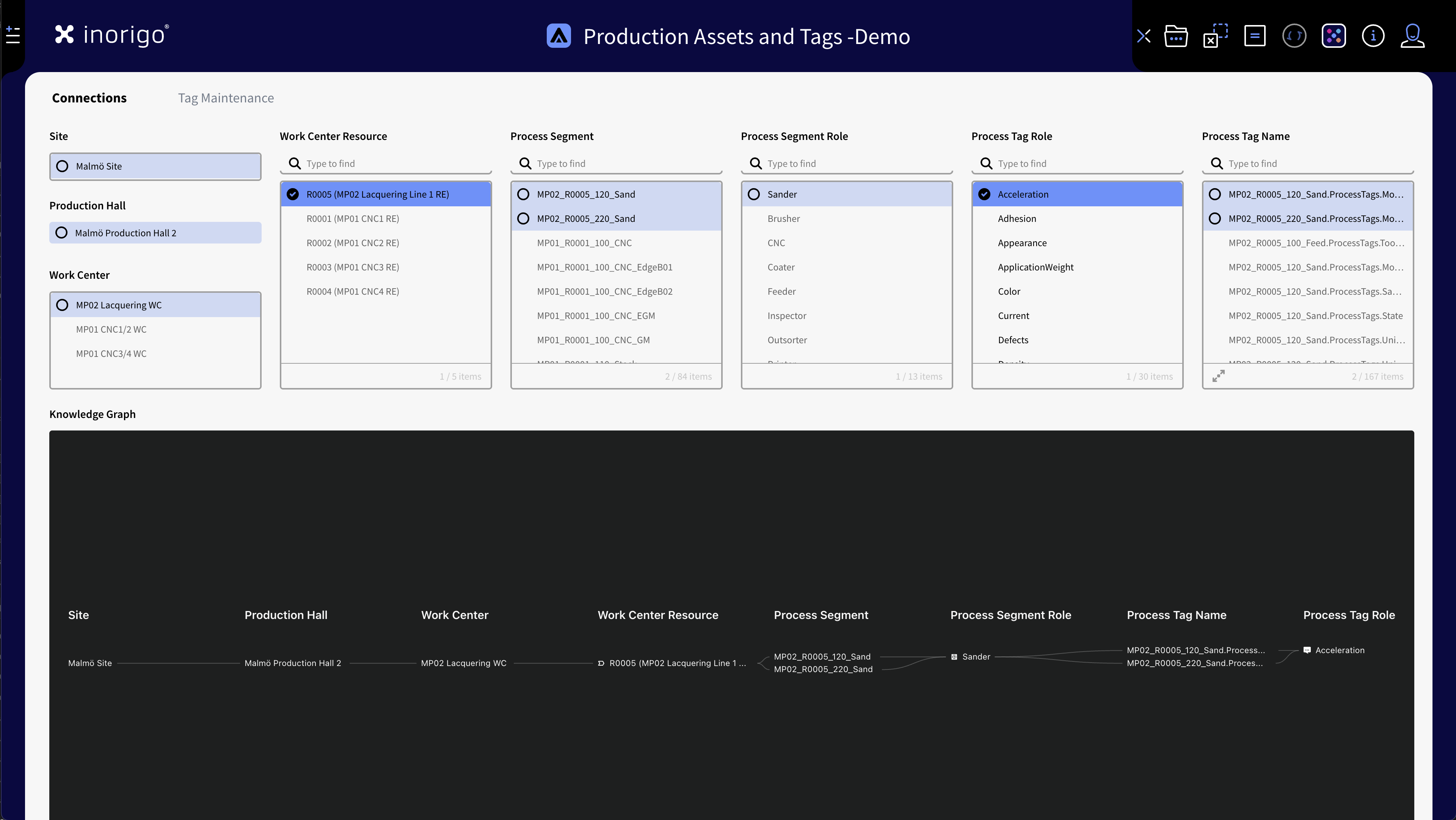
App showing explicit and implicit selections
Highlight Connected Entities
To determine what entities are connected to what when there's multiple selections, you can hover the mouse over an explicit or implicit selected entity. The connected entities becomes bold while all other becomes dimmed (grayed out). This is a quick way to distinguish connected entities without having to make a new selection.
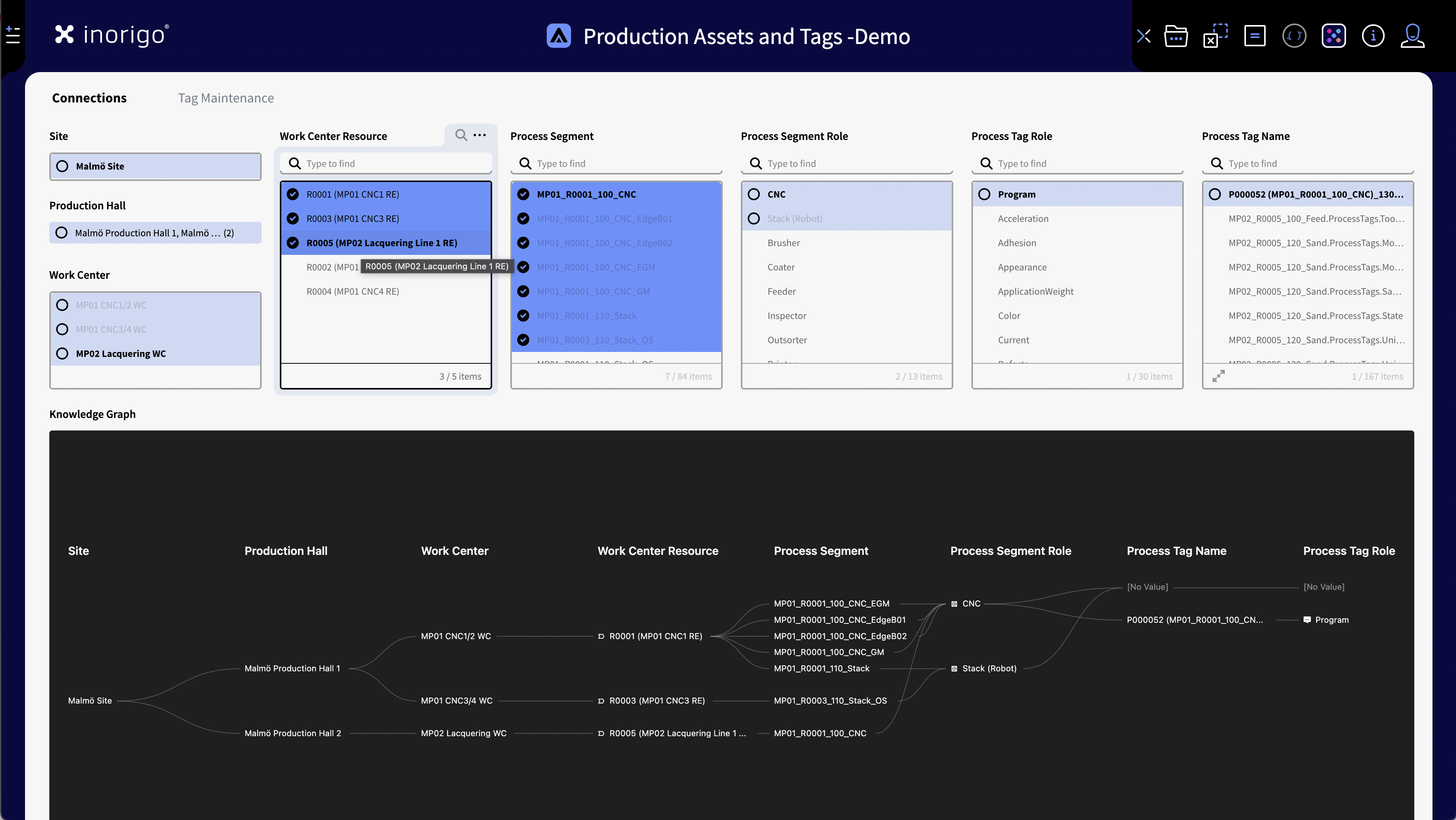
When multiple entities are selected it can be hard to distinguish which are connected: by hovering over a selected item connected entities becomes bold.
Deselect & Clear Selection
A secondary click on a selected entity will deselect it. Note that you can click anywhere on a list item - not only on the checkmark icon.
To clear all selection in an application use the clear selection icon in the toolbar as shown above.
You can also use Ctrl +k (PC) or ⌘ K (Mac) to quickly clear the selection.
Selection Modes
There are two user options how the selection should behave.
Note that these options are not available when opening an application from the Portal and "Open in Portik" is enabled. Selection Modes can be found under the File menu in the tool bar.
Extend Selection (default)
When enabled, within a filter component, any subsequent selection after the first one, will add to the current selection.
Replace Selection
When this option is enabled, within a filter component, any subsequent selection after the first one, will reset the current selection. (It is possible to make multiple selection using shift key)
Saving & Loading Selections
You can save a selection state to recall it later and even share it to your team.
Start with making a selection in the desired filter components. In the File Menu located in the tool bar select Save Selection, Name the selection and if the application contains tabs you may choose which tab that should be opened when the selection is loaded.
By checking the Make available for Team checkbox, anyone with access to the application will be able to load the selection, otherwise it is only available for yourself.
To load a selection go to the File menu once more and locate the selection you want to recall. Selections that are shared within the team are found under the Shared Selection sub menu.
Saved selections can be edited, deleted and you van also create a link to the application that can be shared with a selection loaded.
Restrict To Selection
Visible If Restrictions is enabled in the Application's Setting. When pressed, based on the current selection; all incompatible (non-selectable) items in linked filter components become locked. This hinders reseting a selection by mistake, for instance if Replace Selection is enabled.
Restrict to selection is also available in the right-click menu if enabled in the application's settings.
Remove Restrictions
To remove a restriction, right-click the restricted item and select Restrictions › Remove as Restriction, or use the Remove Restrictions icon in the toolbar.
Remove Restrictions is also available in the right-click menu if Restrictions is enabled in the application's settings.
Calculate
inorigo® applications update result components (like for instance a graph or map) by default whenever a selection is made. This can be turned off to enhance performance.
Automatic Calculation On
Enabled by default. When a selection is made in a filter component all connected result components are automatically updated to reflect the selection.
Automatic Calculation Off
When toggled, result components are not affected by any selections in the application until Automatic Calculation is turned on again.
© 2025 Inorigo AB. All rights reserved.