Portal
The inorigo® Portal is a landing page that gives inorigo® operators access to selected applications, data, and resources.
Overview
The inorigo Portal® provides an organized entry point to the workspace.
Key Features:
- Customizable Content: Tabs, content, and structure can be customized by an admin. This includes the categorization of apps and data, the ability to set icons, and a News/About page.
- Themable: The Portal’s theme, including the logo and background, can be customized to align with the client's brand. The theme will be inherited by inorigo® applications opened in the Portal.
- Personal & Contextual: The Portal surfaces the operator's recent applications and bookmarks, so they can pick up where they left off.
- Smart Search & Filter – The search and filter function lets users quickly find and navigate to content and apps.
Search
The search is located in the "Jumbotron" section of the Portal. When the page is scrolled up, the search field will be docked in the header so it is available.
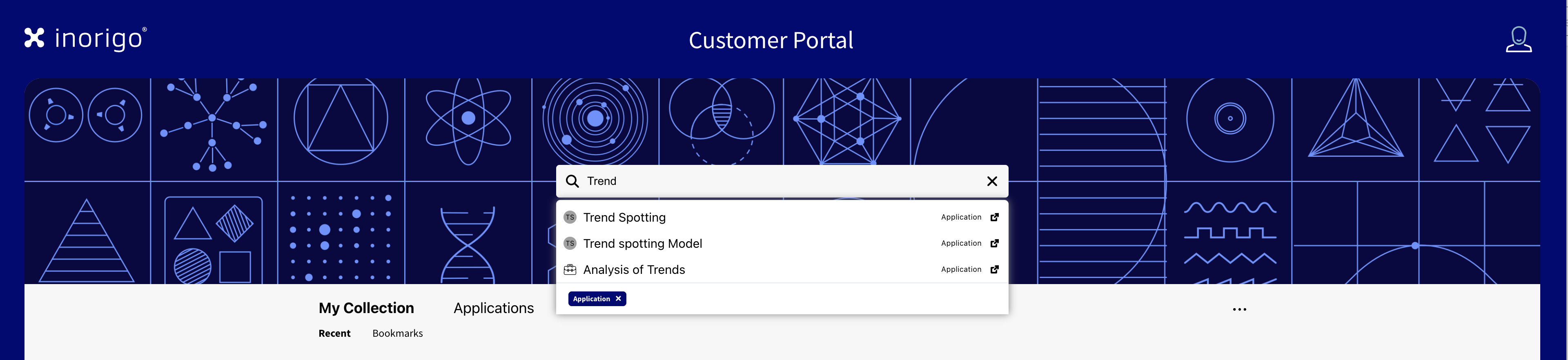
The Search allows users to find any app or entity made available through the Portal's configuration. A query requires at least 3 characters. It is possible to filter by one or more categories directly in the search by first entering a forward slash "/" and selecting a category from the list.
Cards
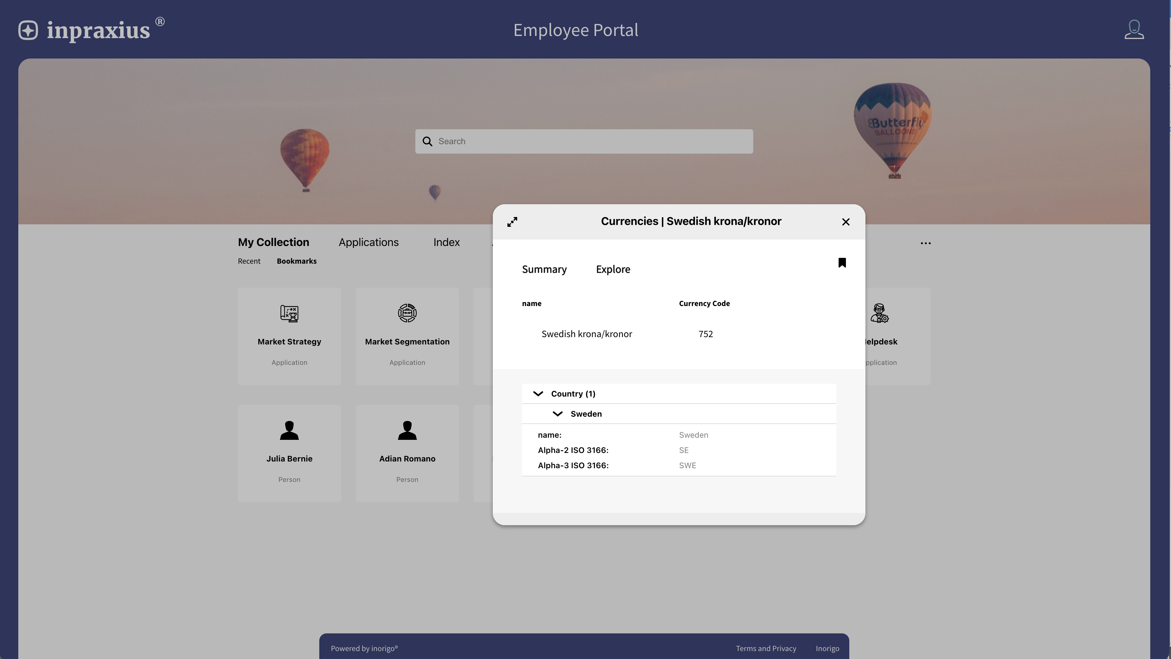
Content is displayed as cards, which can represent an inorigo® application, an external URL, or an inorigo® entity. Cards for inorigo® entities are configured through Knowledge sets. When selected, a dialog opens with the entity’s details.
Portal Tabs
The Portal features a landing page with four tabs. The content and themes of these tabs are customizable, and they can be renamed according to the client's preferences.
My Collection
The My Collection tab contains a grid of cards for the user's items; they can be sorted by recent or bookmarked. To Bookmark an item, press the icon in the top right corner of the card. Recent items can be cleared from the […] menu.
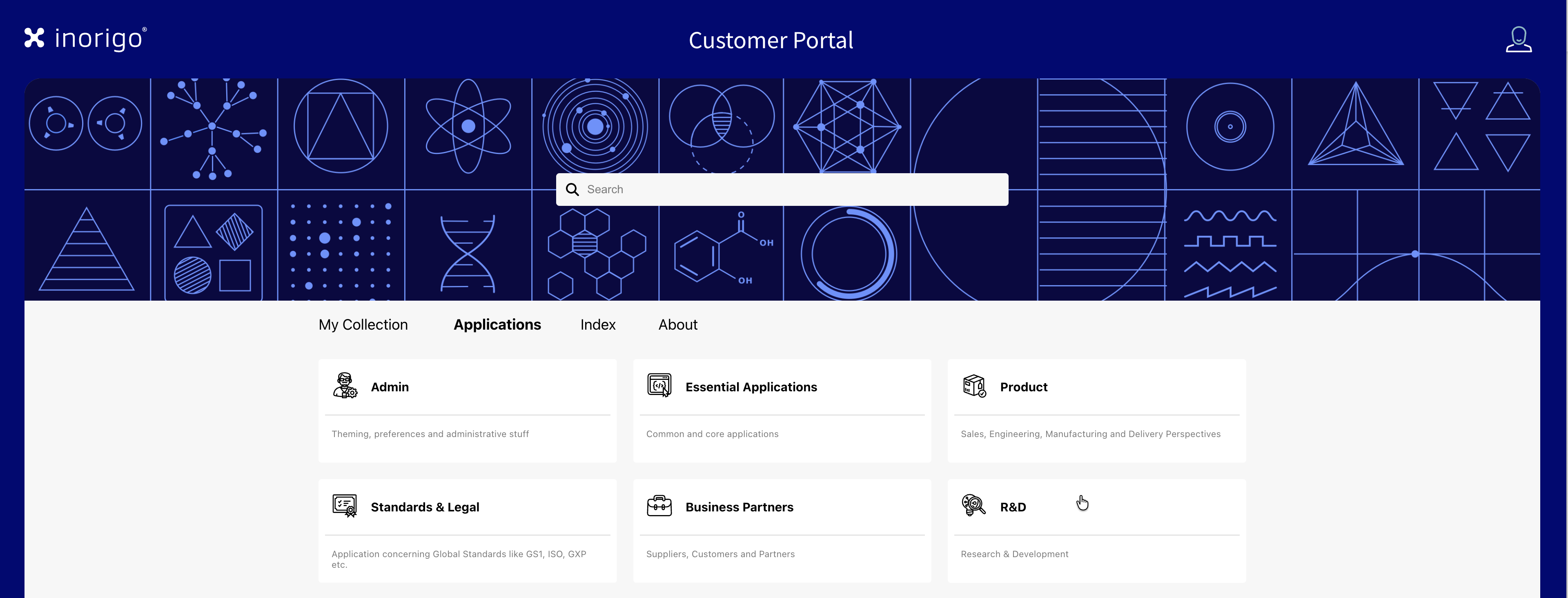
Applications
The Applications tab organizes applications and content in custom categories, "groups", set up by an administrator. You may have any number of categories, and each may have a subcategory.
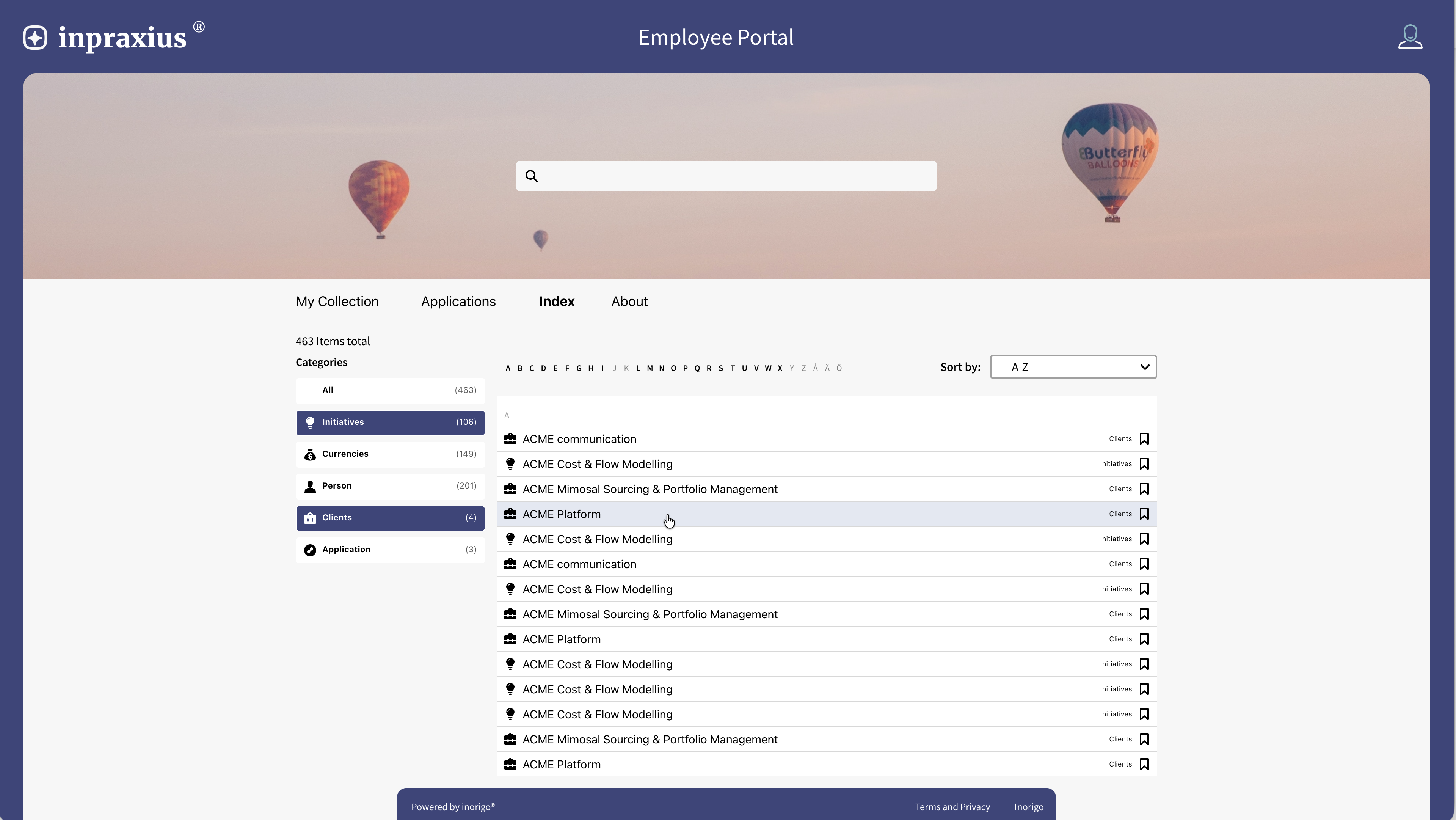
Index
The Index tab lists all the content in the Portal. It is possible to filter the list by category and sort it alphabetically or by type.
About
The About tab serves as a surface for general information and news. An administrator can post updates, which are shown chronologically.
Portal Configuration
To set up the Portal, add /admin to the Portal's URL.
You will also need proper permission and a password to access the admin pages.
To save the changes made in the Portal Settings, press Save on the current tab.
The admin section consists of 7 tabs for configuring the Portal.
Base
For customizing the basic settings of the Portal, including its name and terms of use.
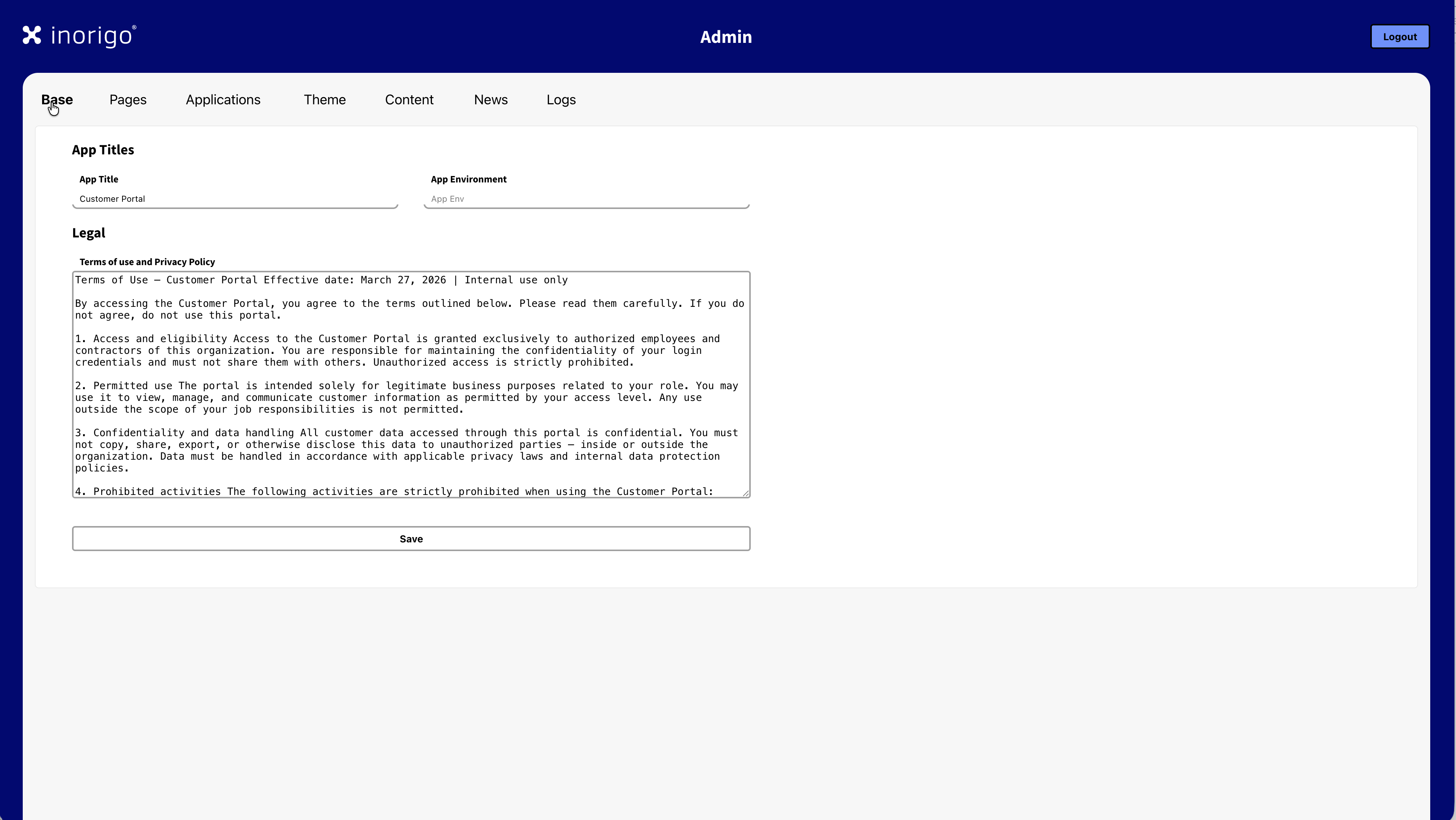
App Titles
App Title
Sets the name for the Portal; this is the title shown in the Portal's header.
App Environment
When a title is set, it is displayed in a thin, red banner above the header. This can be utilized to help distinguish between different Portals or to display a temporary message to all Portal users. By default, it is empty.
Legal
Terms of Use and Privacy Policy
Let's you set up Terms of Use and Privacy Policy for the portal. This is shown as a link in the footer component, which opens a dialog displaying the content.
Pages
For customizing the Portal's Tabs and the text displayed on the About / Home page.
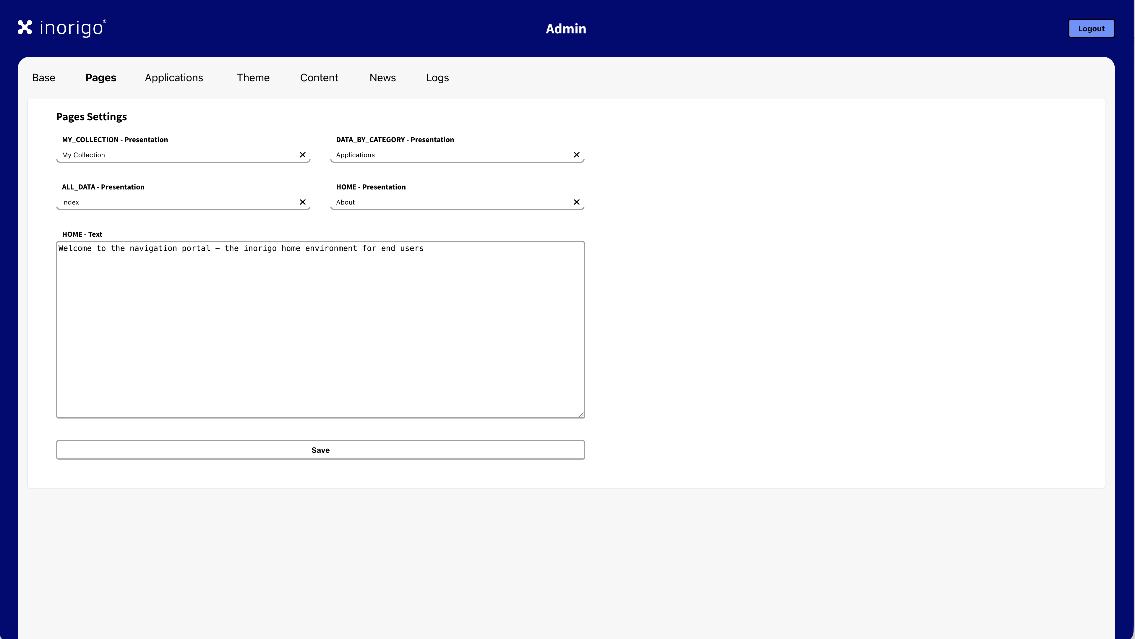
Pages Settings
MY_COLLECTION - Presentation
Sets the name for the first tab of the Portal. i.e., the landing page. This tab contains the user's bookmarks and recently opened items. By default, this is set to My Collection.
DATA_BY_CATEGORY - Presentation
Sets the name for the second tab of the Portal. This tab contains the custom categories for items and applications set up by the Portal admin. By default, this is set to Applications.
ALL_DATA - Presentation
Sets the name for the third tab of the portal. This tab lists all entities available to the user, organized by category. By default, this is set to Index.
HOME - Presentation
Sets the name for the fourth tab of the Portal. This tab contains a section for displaying text, such as general information, and posting updates or news. By default, this is set to About.
HOME - Text
Let's you customize the initial text shown on the fourth tab.
Applications
Allows customization of the categories and their content shown on the third tab of the Portal.
Adding, Editing or Deleting a category
To add an item press the Add Category item at the bottom of the list, this will open a dialog where you can set the name, a brief description, and upload a custom icon for the category. The size for the icon is 32x32 px, .svg format is recommended. If you don't upload an icon, inorigo® will generate an icon using the first two initials of the category.
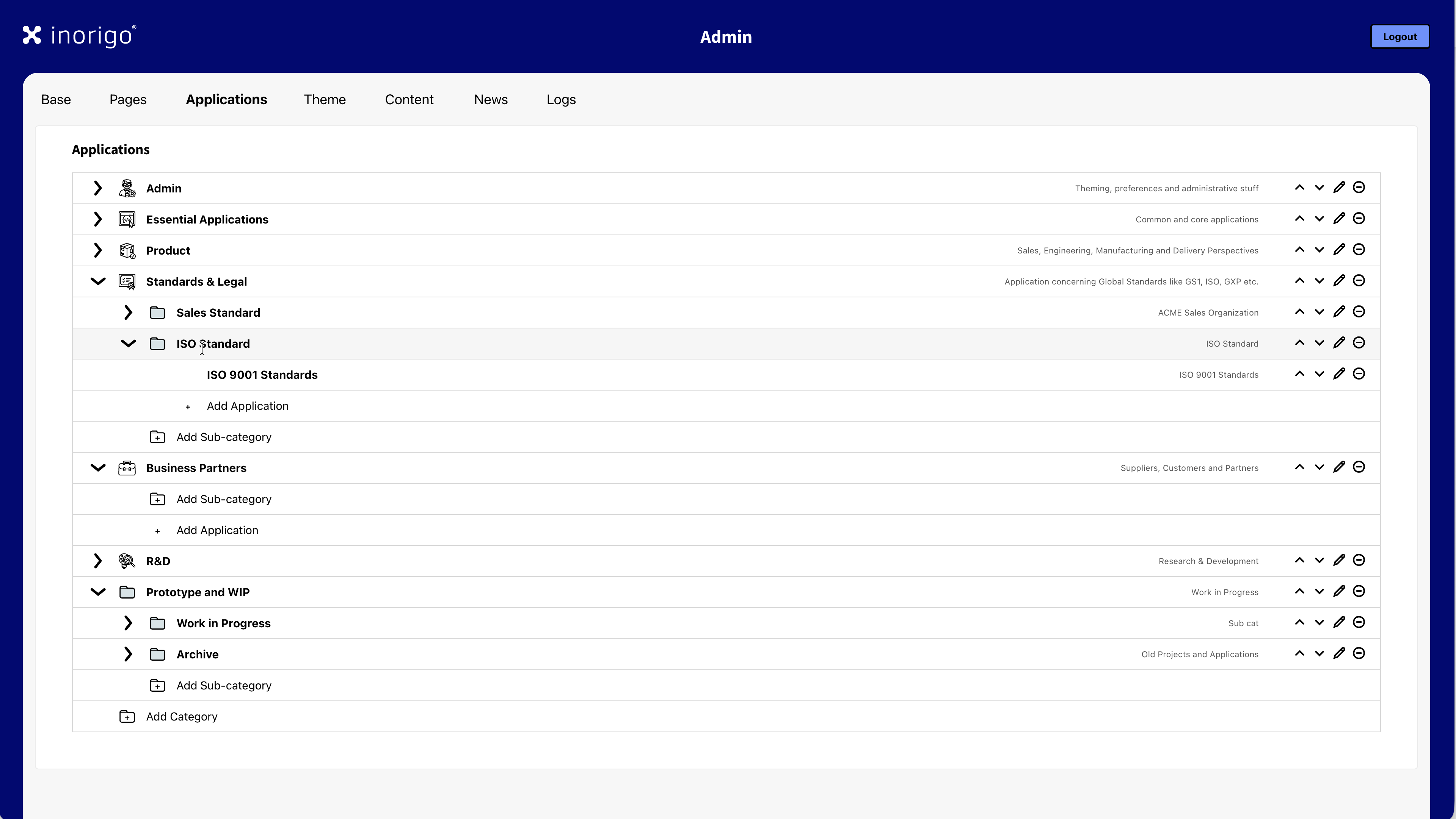
To edit a category press the pen icon.
To delete a category press the minus icon. ⊖
You can change the order of items by clicking the up or down arrows on the item. Items are ordered from left to right within the categories.
Adding, Editing or Deleting an Application
You can add a link to any URL: an inorigo application or an external webpage. To add an application press the Add Application (+) item in the category where you want it to appear. An application can appear in multiple categories, but you will have to add them individually.
In the dialog you can set the name, a brief description, and upload a custom icon for the application.
Enter the link for the application in the URL-field. If you don't upload an icon, inorigo® will generate an icon using the first two initials of the application.
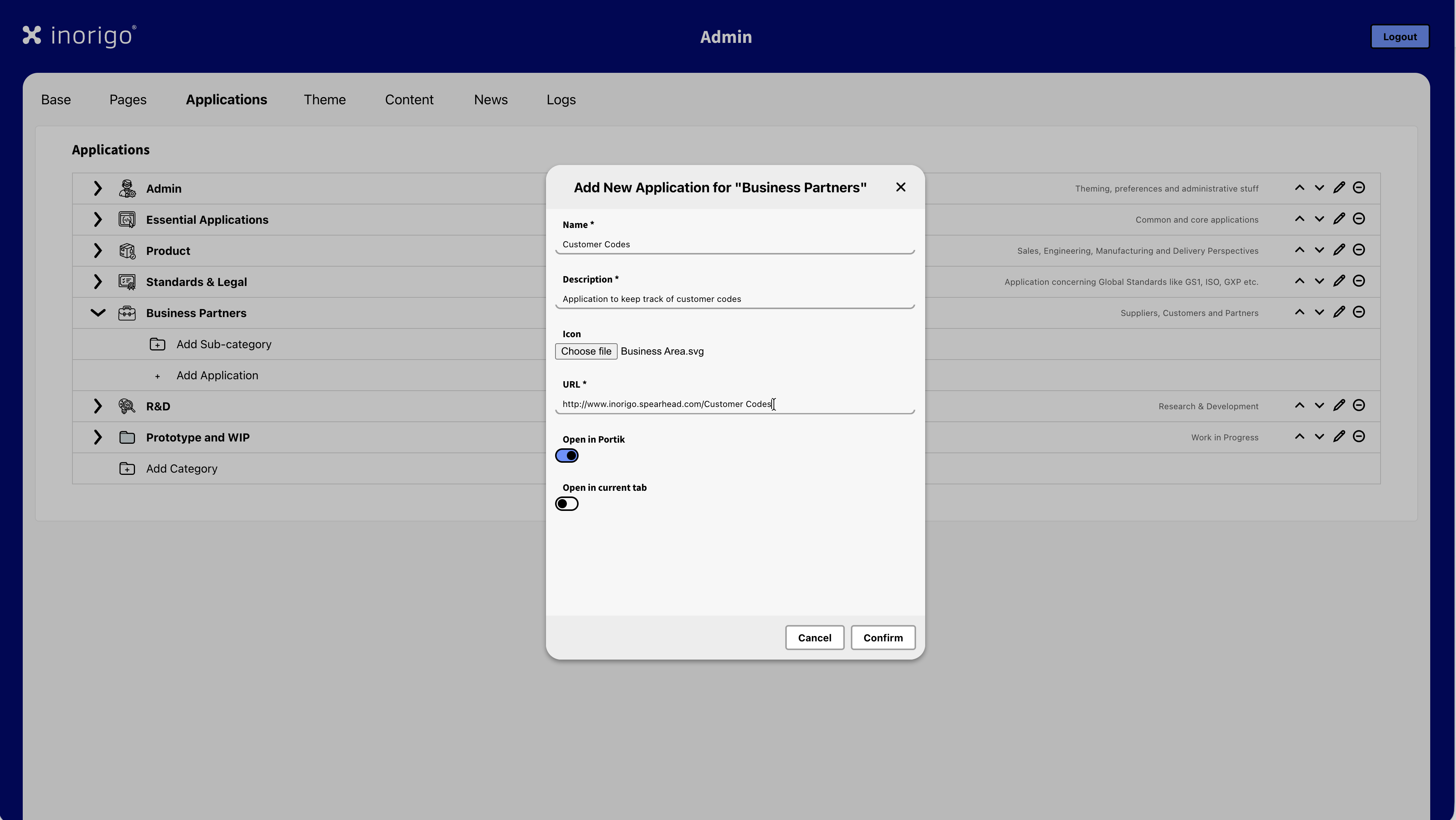
Open in Portik
Portik is an inorigo® term for the frame or chrome that surrounds the content of the portal and application. This includes the logotype, title, toolbar, and icons.
This option is toggled On by default. A linked inorigo® application will open with the Portal's Portik, incluing its theme and logotype. inorigo® applications opened with Open in Portik will be limited to the basic toolbar icons: Automatic Calculation, Clear Selection and Update.
Note: that currently the icon color and icon's accent color is set by the workbench theme (configured in the workbench theme settings). For best result the workbench theme and portal theme should be matched.
When Open in Portik is toggled Off, a linked inorigo® application will instead be opened in the Workbench, with the workbench's theme and toolbar, including the inorigo® launcher menu and side panel. The functions/icons available for the application can be customized in the settings for the application (Application Builder).
Note: In order for an user to open an application in the workbench, the user must have the apppropiate rights.
Display Modes
You can change how an inorigo® application appears when opened by modifying its URL with a Display Modes.
To learn more about the available display modes check out Display Modes under the Applications section.
Linking External Webpages
When open in Portik is toggled On, a link to an external webpage will open within the Portal's Portik, including the Portal's title, but the only available item in the toolbar will be the user menu icon. This option is useful when you want an external page to feel like it is embedded in the Portal, and it allows for navigating back to the portal by clicking the logotype.
When open in Portik is toggled Off, a link to an external webpage will open as normal.
Open in current tab
When this option is toggled On, the linked application or webpage will open in the active tab. When toggled Off the linked application or webpage will open in a new browser tab.
To edit an application press the pen icon.
To delete an application press the minus icon. ⊖
Theme
Theme allows for customizing the look and feel of the portal, and as any applications that are opened from the portal (default setting – see the Applications section above). You can read more about best practices for theming and customization in the UX-Guidelines in the tutorials section of the Resource Hub.
Logotype
You can customize the Portal's logotype by uploading a png. image.
The max size is 500kb. For best result the logotype should have 192px height including vertical clear space.
Consult the customer's brand guidelines to apply their logo correctly. If the logo isn't customized inorigo®'s logo will be used instead.
Note: When Open in Portik is off, the logotype cannot be customized.
Jumbotron
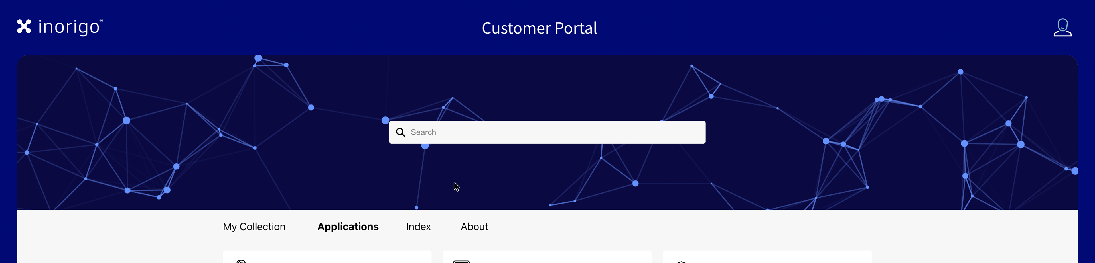
The Jumbotron is the large image or animation on the Portal. It contains the Portal's Search Field.
By default a generated backround with animated particles is displayed, which can be customized to align with the theme.
Particle Type
There's two particle animations to chose from, Portal and Workbench.
Background Color
Sets the backround color of the particle background
Particle Color
Sets the color of the particles rendered on the background.
Image
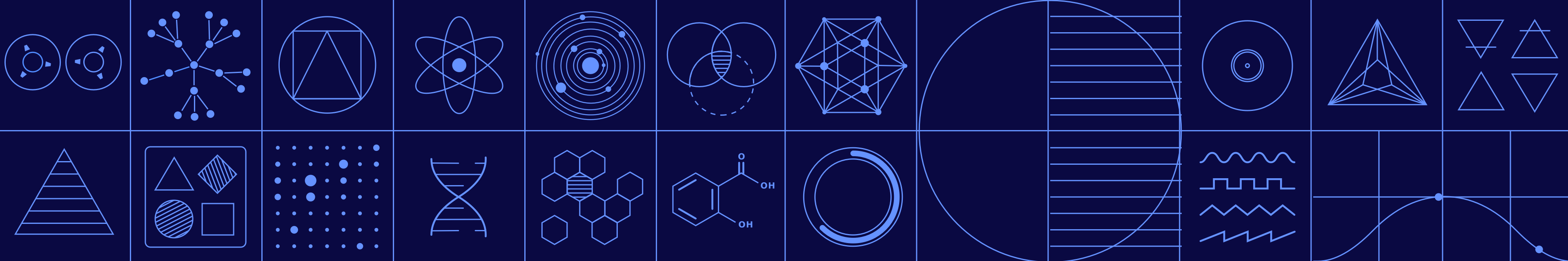
Example 1 of Jumbotron Image

Example 2 of Jumbotron Image

Example 3 of Jumbotron Image
The particle animation can be exchanged for an image. jpg and png is supported.
The max size is 500kb. The image should be 1920x320px minimum, or 3840x640px – for best results.
Note that the image will be cropped depending on the target's browser and screen resolution. It is therefore recommended to use images with abstract or landscape motives. Avoid images with people and details that might be otherwise cropped or concealed by the portal's search field. Avoid using text or logotypes.
Categories
Allows for customizing the appearence of the categories shown on the third tab of the Portal "Index".
These Categories works as filters for the list, and it is possible to select more than one.
Selected Background
Sets the background color of the selected category.
Selected Text
Sets the text color of the selected category.
Force Colorless Icons
When toggled On, icons for the categories will appear monochrome. inorigo® will automatically set the icon as either white or black depending on the background color to ensure legibility.
Content
The Content tab allows you to set which entities users can interact with in the portal.
The content is configured through inorigo's® Knowledge Sets.
Applications
Applications added through the Application tab, will automatically available and categorized as Applications.
Note that this also includes links to external webpages.
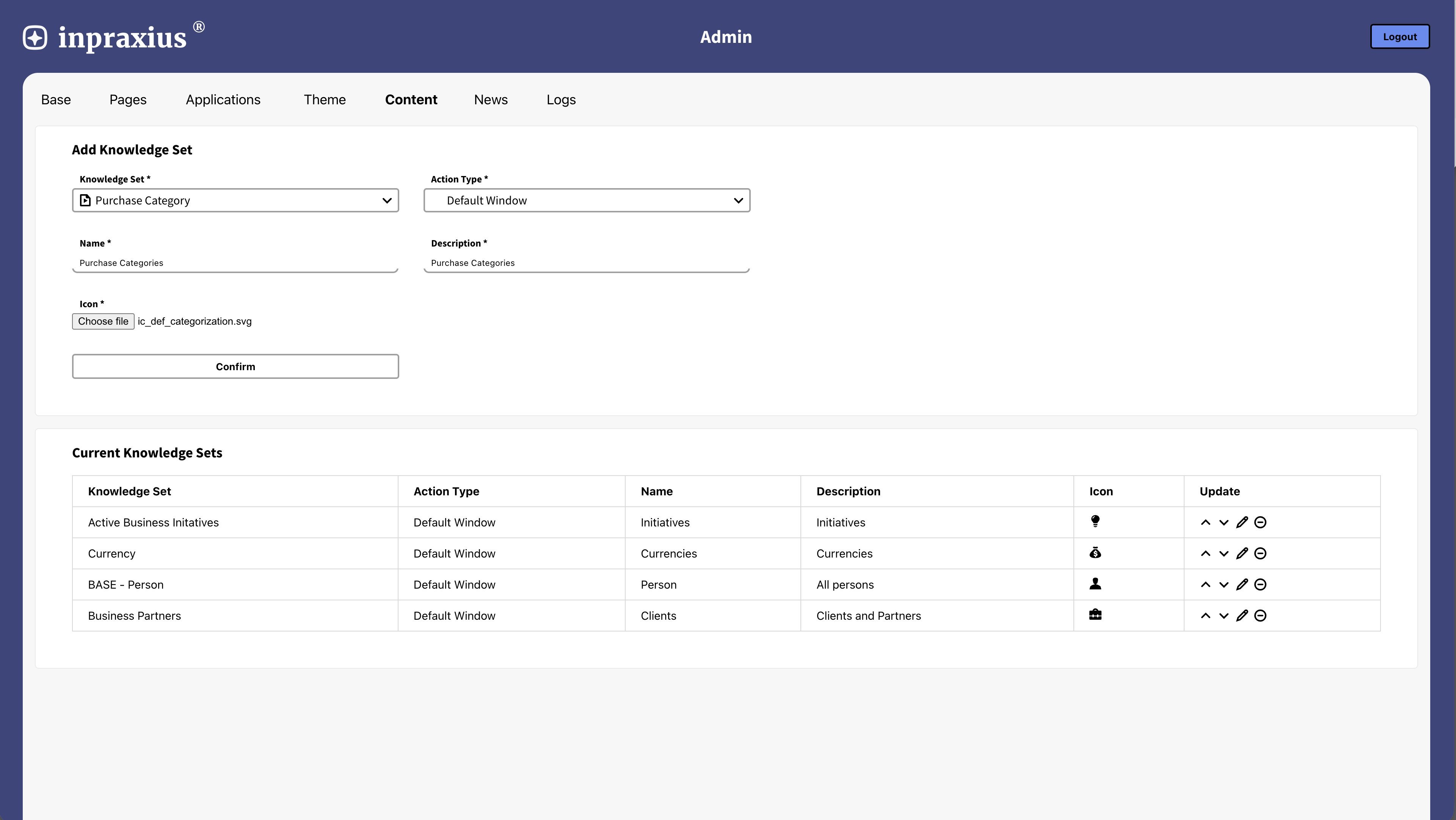
Add Knowledge Set
The dropdown contains all available Knowledge Sets for the inorigo® instance. The portal will use the Data Type of the Knowledge set to determine the entity.
Example: To add all entites of the instance "Person" you must first create a Knowledge Set with the Data Type 'Instance' and a filter to find the entities with the Defintion Person.
Action Type
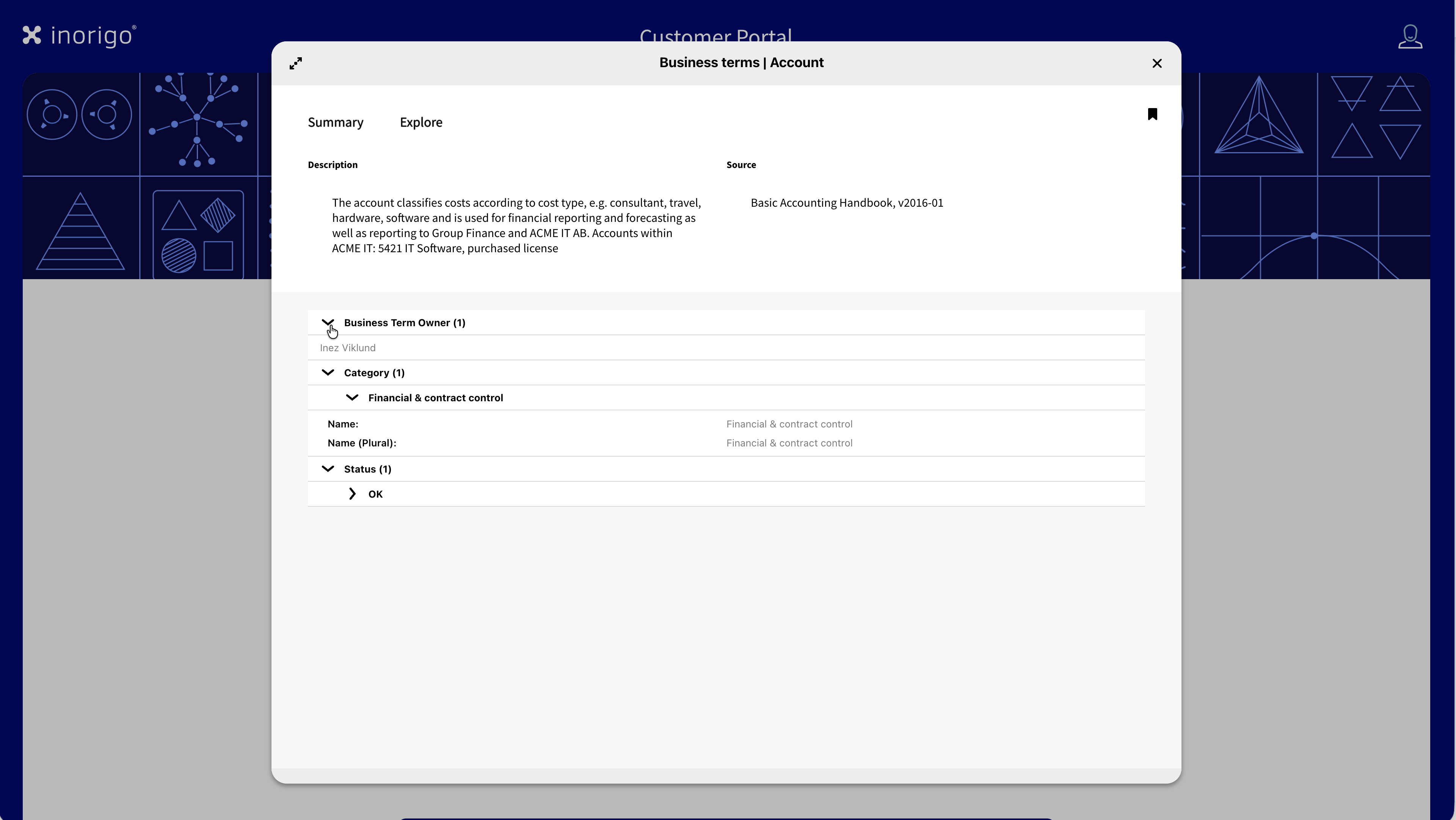
Default Window is the standard setting. When a user opens an entity/clicks a card it opens a dialog with the details about the entity. The Portal reads the underlying Knowledge set structure and sorts its fields into two categories: attributes (the properties of the entity, shown at the top of the dialog) and connections (related entity, shown as an expandable tree below).
In the knowledge set, the selected columns from the base query becomes the attributes.
Everything else becomes a connection. Fields named ID, presentation, or name are never shown directly. URLs, email addresses, and phone numbers are automatically turned into clickable links.
URL is a simpler mode. Instead of opening a detail view, clicking the card takes the user directly to an external page. This requires a field named URL to exist somewhere in the knowledge set. inorigo® finds it automatically and turns the whole card into a link.
Name
Sets the name of the category.
Description
A short description of the type of entity. This text will appear on the card of the entity.
Icon
It is mandatory to upload an icon for the entity type. This is show both on the cards and in the category under Index. The icon should ideally be 16x16px or a .svg.
News
Create News
The news section allows an administrator to post news or updates. Each News consists of a Title and Body.
News are sorted chronological. As of now, HTML is not supported.
Logs
The logs page contains all Server logs. To download the logs as a .txt file, simply press the Download Logs button.
© 2026 Inorigo AB. All rights reserved.