Model Builder
inorigo® Model Builder is a developed to enable capabilities to define, and populate information models. Information models are built up in a context by information units and relations between those units.
The Model Builder is eventually being replaced by the inorigo® Metagraph Builder, and in the mean time both modules will co-exist and be supported. Some legacy features will only be supported by Model Builder, while newer features will only be implemented in the Metagraph Builder.
Overview

Launch Model Builder
Windows
inorigo® Launcher is used to Launch the Model Builder and Application Builder Modules. Upon first use, download and install the inorigo® Launcher. User Menu > Help > Download Launcher
Once the Launcher has been installed, access Model Builder through the workbench. inorigo® Launcher will automatically download and install the necessary Java files to your computer.
Troubleshooting
– Nothing happens when I click the Model/Application Builder icon in Workbench
Ensure that your browser and operating system permits inorigo® Launcher to start from your browser.
Other Operating Systems
Java Webstart is used for all other operating systems.
Navigator
All changes are instant in the navigator, there is no need to save when making a change. When working in the navigator and someone else is making a change you can instantly see your navigator being updated with the new data.
There is no need to make an update to see the changes made.
Top Menus
Top menus allows managing fundamental features in the application, such as creating a new unit and saving it. Further functions are for example the ability to change context, language and handle the application windows.
File
| Icon | Name | Shortcut | Description |
|---|---|---|---|
| Open | Shows a sub-menu that allows the user to choose what kind of unit to open. As the unit is chosen, the application search tab, with that unit pre-selected, is shown. | ||
| New | Shows a sub-menu that allows the user to choose what kind of unit to create. As the unit is chosen, a new information unit tab for that kind of unit is opened. | ||
| Save | Ctrl + S | Saves the current tab unit. | |
| Save All | Ctrl + Shift + S | Saves all units that are changed but unsaved (the ones with an asterisk (*) in the tab header). | |
| New | Ctrl + N | Opens a tab for a new unit of the same unit as the current tab unit. | |
| Delete | Ctrl + D | ||
| Copy | Ctrl + Shift + C | Copies the current tab unit. | |
| Reload | Ctrl + R | Reverts the current tab unit to the state of the last save. | |
| Bookmark | Ctrl + B | Adds the current tab unit to the bookmarks menu. | |
| Open by id… | Ctrl + O | Opens an entity identified by the unique Global identifier saved in the database. | |
| Switch User… | Opens the login window to allow the user to login as a different user. The current user is logged out. | ||
| Exit… | Exits Model Builder |
View
| Icon | Name | Shortcut | Description |
|---|---|---|---|
| Current Users | Opens a window listing all users (and the engine) running that same instance, together with the context the user is logged into. | ||
| Menu | Slides open the application menu tab. To close it again, click somewhere outside the menu or click the minimize icon in the menu header. | ||
| Search | Ctrl + F | Slides open the application search tab. To close it again, click somewhere outside the menu or click the minimize icon in the menu header. | |
| Bookmarks | Slides open the application bookmarks tab. To close it again, click somewhere outside the menu or click the minimize icon in the menu header. |
Tools
| Icon | Name | Shortcut | Description |
|---|---|---|---|
| Export to XML… | Exports the current tab unit navigator content to XML. Only those units explicitly expanded in the navigator are included in the export. This item is only enabled when a tab unit navigator is the current tab. | ||
| Clear Cache | Only available to administrators. Empties client- and server memory to enable reload of all units from the database. | ||
| Import and Export | Holds two sub menu items, Import… and Export… Import… allows the user to open a file to import data. The file to import must have been created by the inorigo® Model Builder Export… function below. Export… exports the current tab unit to a file. The alternative Export Entire Structure … includes all information surrounding the object, and the information surrounding the surrounding objects and so on. This may end up to be a lot of information; so much that the application may not be able to handle it. Therefore, use this alternative with caution! | ||
| Integration Log | Shows the log of all (Process domain) integration method jobs run, see inorigo® Integration Setup for details. | ||
| Integration File Manager | Allows you to manage files in the designated (file) integration directory, see Integration File Manager for details. | ||
| Task Execution… | Opens a window to execute tasks. | ||
| Administrate Contexts… | Opens the Administrate Contexts window. | ||
| Send Message… | Any user may send a message to any one or all of the other logged on users. Receiving a message, a user may choose to reply the sender only or reply all users. A message sent back and forth will appear almost like a mail correspondence, but will not be saved. The moment the message window is closed, the message information is lost. |
Modules
| Icon | Name | Shortcut | Description |
|---|---|---|---|
| inorigo® Application Builder | Ctrl+M | A shortcut to open the Application builder |
Window
| Icon | Name | Shortcut | Description |
|---|---|---|---|
| Close | Ctrl + F4 | Closes the current tab. | |
| Close All | Ctrl + Shift + F4 | Closes all tabs, including the current one. | |
| Reuse Current Tab | A unit tab opened after this menu item is chosen (checked) replaces the unit in the current tab, no new tab is opened. If the unit, that is to be replaced, is changed but unsaved, the application prompts the user to save or discard the changes before replacing it with the new one. |
Options
| Icon | Name | Shortcut | Description |
|---|---|---|---|
| Context | Shows a submenu with contexts to enable changing current context. | ||
| Navigator | Sets the navigator filter for the current user. The settings are stored as a user preference and will remain between sessions. Since v2.2 | ||
| Preferences… | Opens a window with the current user as a shortcut to changing current user preferences. NOTE, These settings will be deprecated or moved to another part of the platform. | ||
| System Settings… | Shows the settings for the context, client, system, computer and server. | ||
| Dependency Warnings | If marked The setting will warn the user if an object is being deleted och changed in any way that might affect other related objects |
Help menu
| Icon | Name | Shortcut | Description |
|---|---|---|---|
| inorigo® Model Builder Manual | Opens the Model Builder manual in the associated program. | ||
| inorigo® Application Builder Manual | Opens the Application Builder manual in the associated program. | ||
| inorigo® Web Manual | Discarded. To be removed . | ||
| What’s New | Opens the release notes for current inorigo® version | ||
| Report an issue | See Report Error for details. | ||
| inorigo® API | Discarded To be removed |
Side panels
Bookmarks
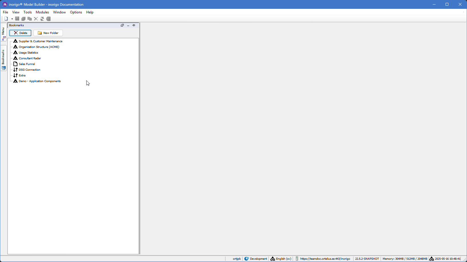
Bookmarks are shortcuts to units and search queries.
To add a bookmark, press the bookmark button in the toolbar, right click any unit and choose Bookmark this or simply drag the unit from any navigator (search result or unit navigator) to the desired folder and row in the bookmark tree. To re-sequence a bookmark, just drag it to its right position in the tree.
To open a bookmark, just double click on it.
Renaming or deleting a shortcut does not affect the unit itself. The shortcut is renamed by clicking anywhere on it to select it and then either clicking on it again, this time on the text, or by pressing F2 on the keyboard, to set the text in edit mode. To save the new name, press enter. Leaving the edit mode by clicking somewhere else reverts the name. Removing the entire name from a shortcut gives the shortcut the unit name again.
It is also possible to bookmark a search. Define the search in the search tab and press the button Bookmark… Name the search and press the Ok-button and the search appear in the bookmarks tab with a search icon.
If an attribute has the type External Link, you are able to open the link by pressing CTRL while left clicking on the editable field. If the entered value is an absolute file path, starts with “C:” for instance, it will be converted into a valid URL, e.g. file:/C:/path/to/file. If the value cannot be validated it will be underlined and red, otherwise it will be in blue, e.g. http://www.inorigo.com.
The link also has a different appearance in the navigator and by right clicking on the node you will be presented with the option to follow the link in your default browser.
You are also able to open external links from inorigo® Application Builder, however, the context menu functionality recognizes if the selected value is a string and a valid URL; if that is the case the user is presented with the option to open the URL in the associated program.
Search
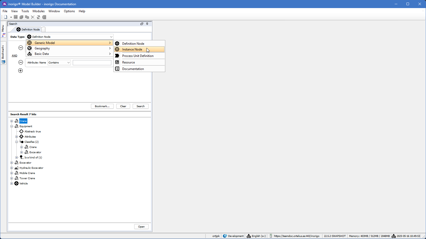
By help of the search panel you can specify which type of objects you want to find.
Menu
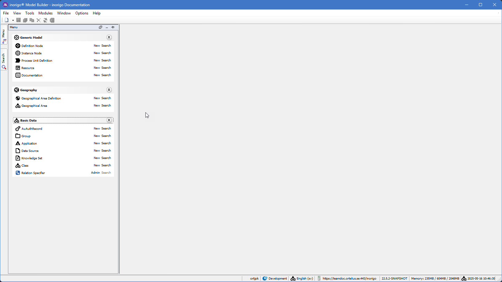
The menu panel shows the same items as the Search panel when expanded. The items in the Menu and search are configured by the Class item where both the menu items can be configured as well as the text keys, i.e. the item names, which can be presented in different languages. Two things to note:
- Class item: shown in the picture above. Do not tamper with the objects in the class item unless given proper training
- Relation Specifier: Do not tamper with the relations unless given proper training.
Object tabs
The tabs represent one specific inorigo® object like a specific Definition Node, Instance Node or a Resource. the tab itself contains sub-tabs which are described below.
\
Moving around and splitting tabs
By opening an Object it will be pinned an object tab. Watch the movie on how to move around, split and filter the navigator tab,
The most common object types are Definition Nodes and Instance nodes, and their Tabs differ which we will describe below.
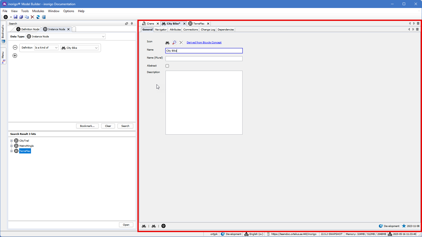
Tabs - Definition Node
General
The Default things on the General tab are
- Icon, which has a default setting. This can be changed, and bear in mind the all classified children will inherit the same icon as the parent, although you can override each Definition node's Icon anytime.
- Name is compulsory
- Name (Plural) does not have any impact on functionality except for presentation reasons.
- Abstract - Default is ticked. A ticked box means that no instances can be created from the Definition.
- Description is mainly used for documentation purposes.
Navigator
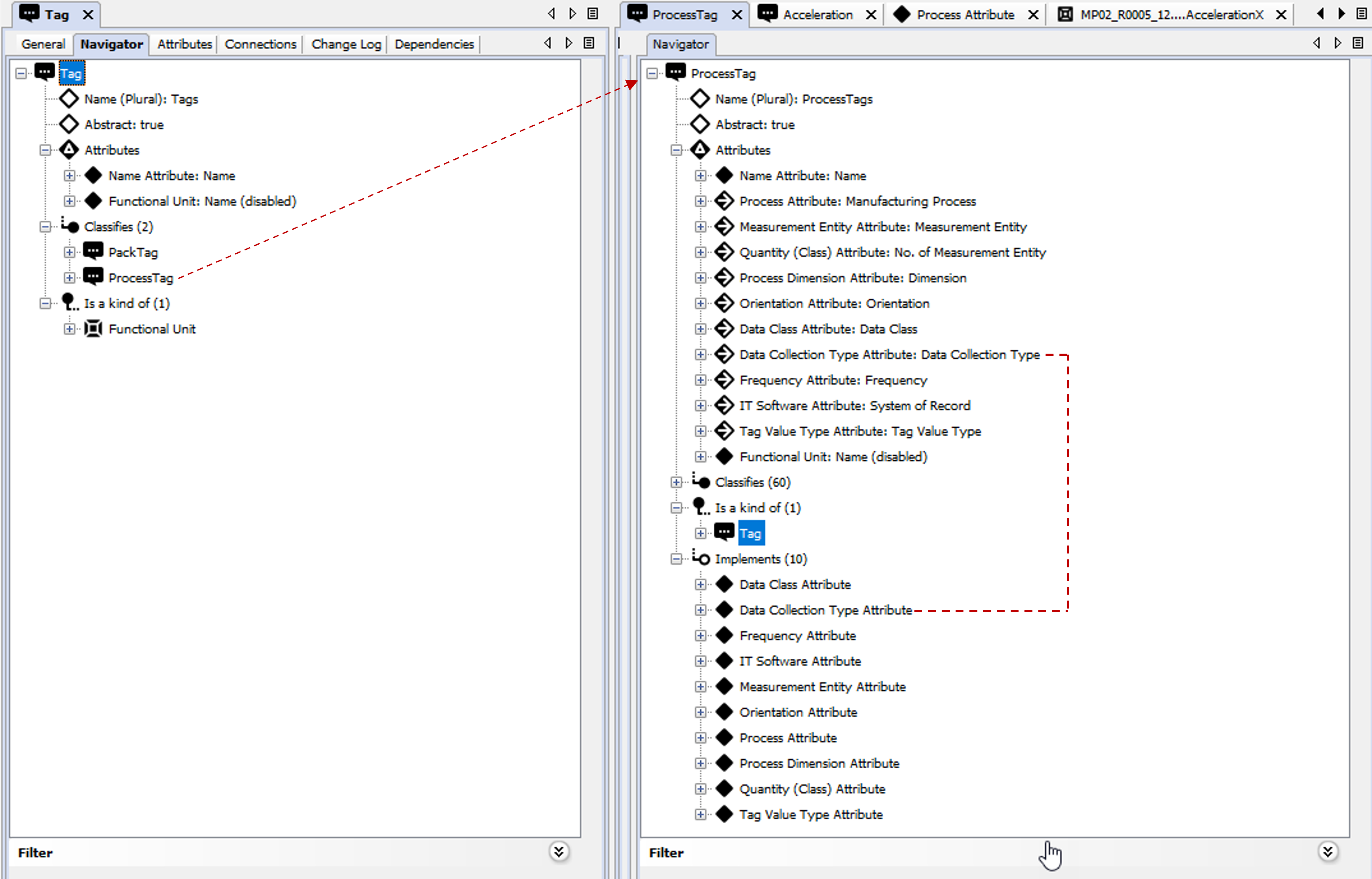
The navigator tree from a Definition Node point of view displays the following parts depending on what has been defined and connected on that object. In the example below there are two trees next to each other. To the left there is the TAG Definition Node and to the right the is the ProcessTag Definition classified by the TAG.
the TAG expanded tree shows the following sections:
The Name (plural) and Abstract true is taken from the General Tab and the Attributes are fetched from The Attributes TAB. If the Definition Node classifies other Nodes then a classifies relation will appear, and the same is valid if the Node has other relations like Consist Of, Contains and Implement.
Note: Every inorigo® relation has a two paired name like: Classifies-Is a Kind Of, Consist of-Is part of, Implements-Implemented By. Both names will appear, if valid, in the Navigator tree like in the example below. Since the Node TAG is classified by Functional Unit then it is shown as s a Kind of Functional Unit, so the tree can be infinitely expanded in the navigation tab,
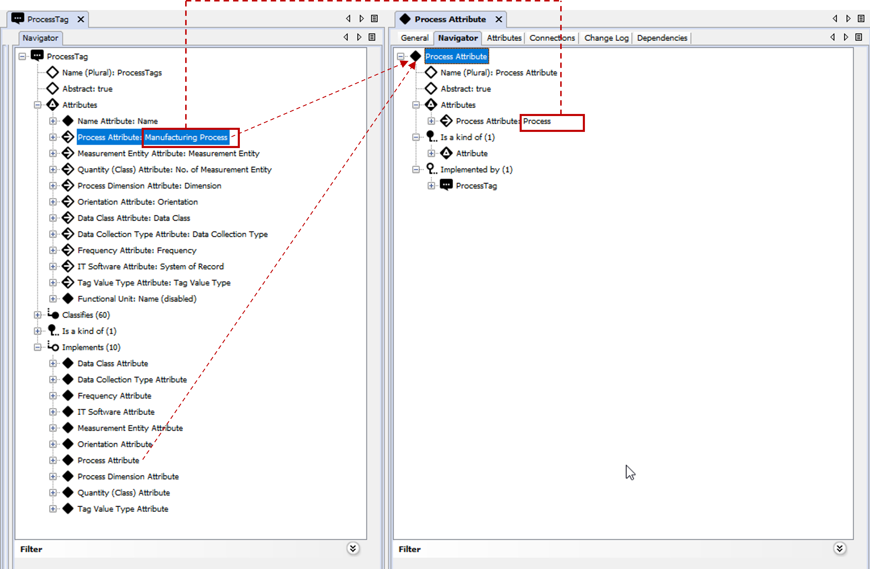
Looking at the ProcessTAG tree you will notice Other attributes than in the TAG. This is because the user added more attributes on that level. Notice the different icon on most of the attributes. The icon indicates that the attribute has been implemented from another classification structure, which is a common way to model.
The image below shows the implemented attributes in two places in the tree: both in the Attributes section and the Implements section. The attribute in the Attributes section shows the name of the attribute, i.e. Manufacturing Process, which means the attribute name on a process tag will be named “Manufacturing process” instead of “Process.” The attributes under the Implements section show which attributes were implemented on that specific node level.
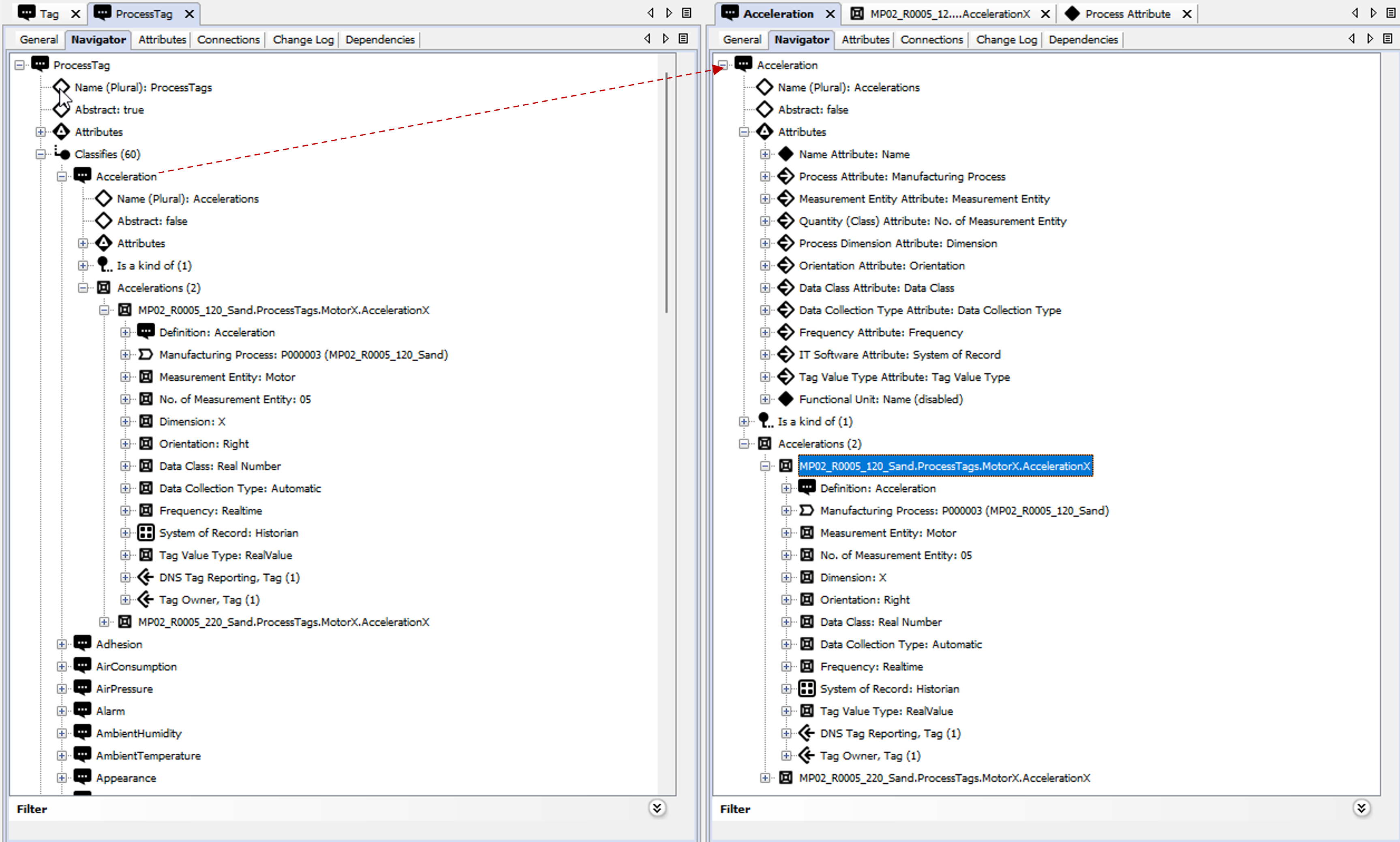
In the next image we have expanded the Classifies section And opened the Acceleration Object. Note that the Implements part is not shown since there are no Implemented attributes on the Acceleration Object. The implemented attributes though are displayed with the different icons.
Since we have allowed the Acceleration Object to create instances i.e. the Abstract: False the eventual instances are shown in the tree as well. In this example there are two instances of which one is expanded.
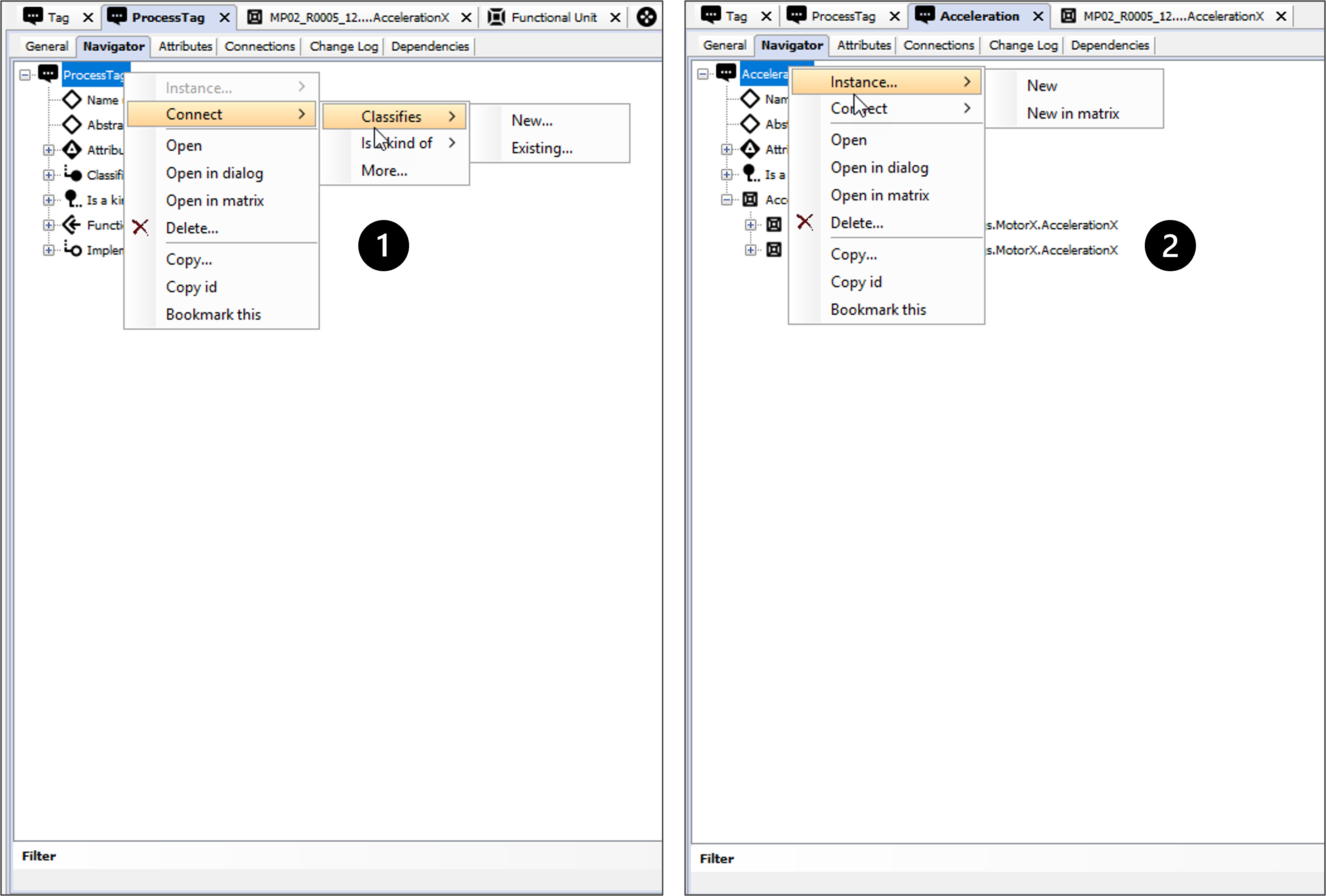
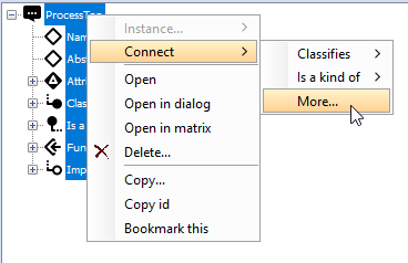
Defining, classifying and connecting Definitions from the Navigator tree:
By right clicking a Definition node in the tree you will open a menu like in the image below.
The Number 1 example shows the options when you want to classify another Node. with the options to Create a new Node or select an existing. Not that the Instance... option is Greyed out which means that the Abstract tic-box is set to true i.e. you are not allowed to create any instances based on the Node.
The Number 2 example shows the options in the Instance... menu. The matrix is explained in an different section.
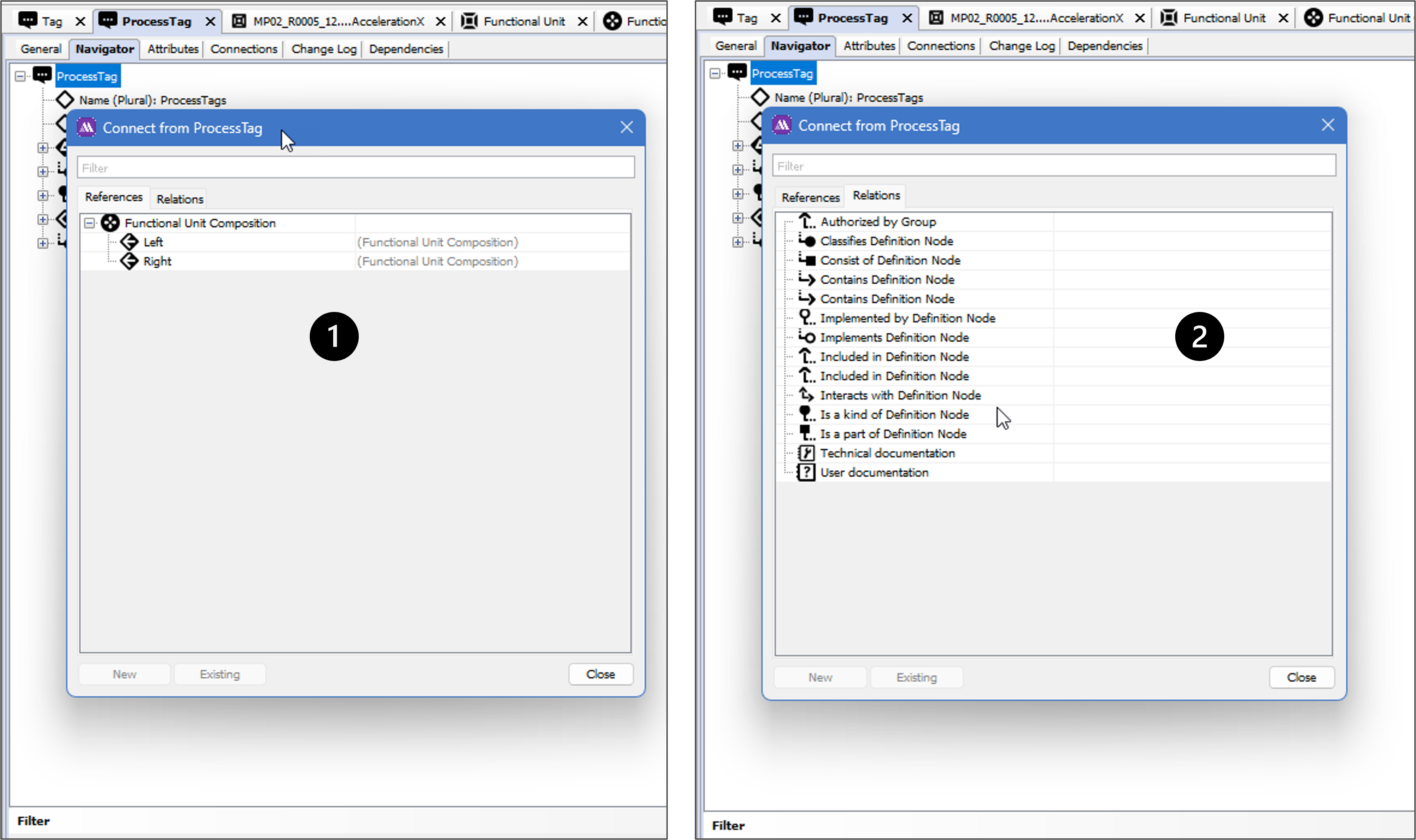
Creating References other relations from the Navigator tree:
By selecting the More... option you will open a dialog with two tabs.
Option 1, the References tab show any types of Hyper Nodes (relations) which have been created to connect Definition Nodes to other objects. In this example a Hyper node named Functional Unit Composition has been created on the Functional Unit level, allowing e.g. the Process TAG to Link to other Definitions like a many-to-many relationship. A note on the Functional Unit Composition is explained below.
The Option 2 lists the available Relations to which the Process TAG can be linked.
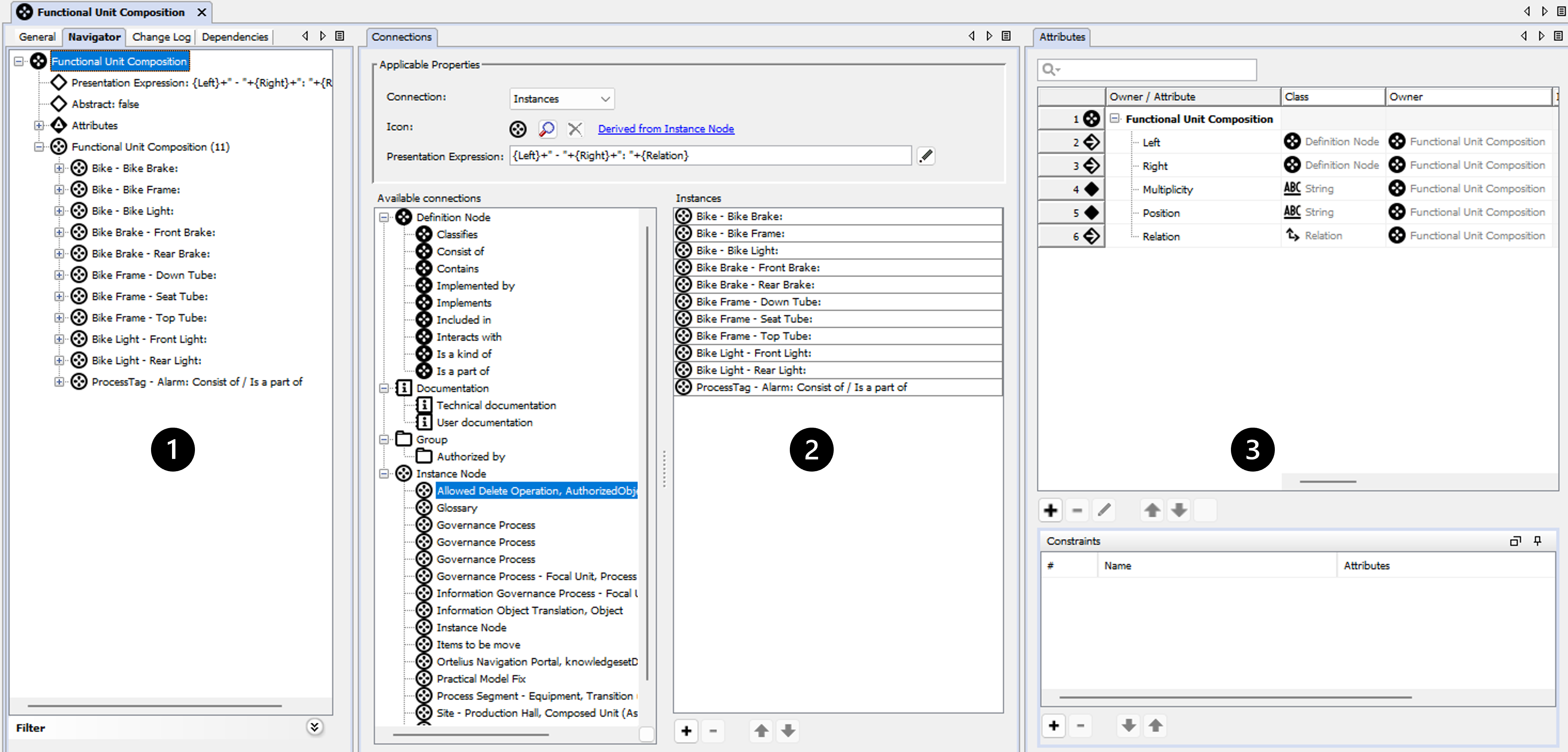
Notes on the functional Unit Composition Hyper Node
The Hyper Node has been created just like a Definition Node, with the exception of the Attributes connecting two Definition Nodes. In the image below we have split the Navigator, Connections and Attributes TABs .
The Navigator Tree Number 1 shows the created 11 created relations (instances). The Bike instances have been created by the Definition Node Bike which has been possible through the inheritance functionality, i.e. since Bike is also Classified as a Functional Unit and can then reuse the Functional Unit Composition Hyper Node .
The Connections Number 2 shows a sample of how to utilize the Presentation Expression for instances. More on that later in this section.
The Attributes TAB, Number 3, How the Functional Unit Composition has been Defined by help of the attributes. The Left and Right Attributes are the ones connecting One definition Node to another. By help of the other attributes it is possible to add more properties which can then be utilized by e.g. an Application.
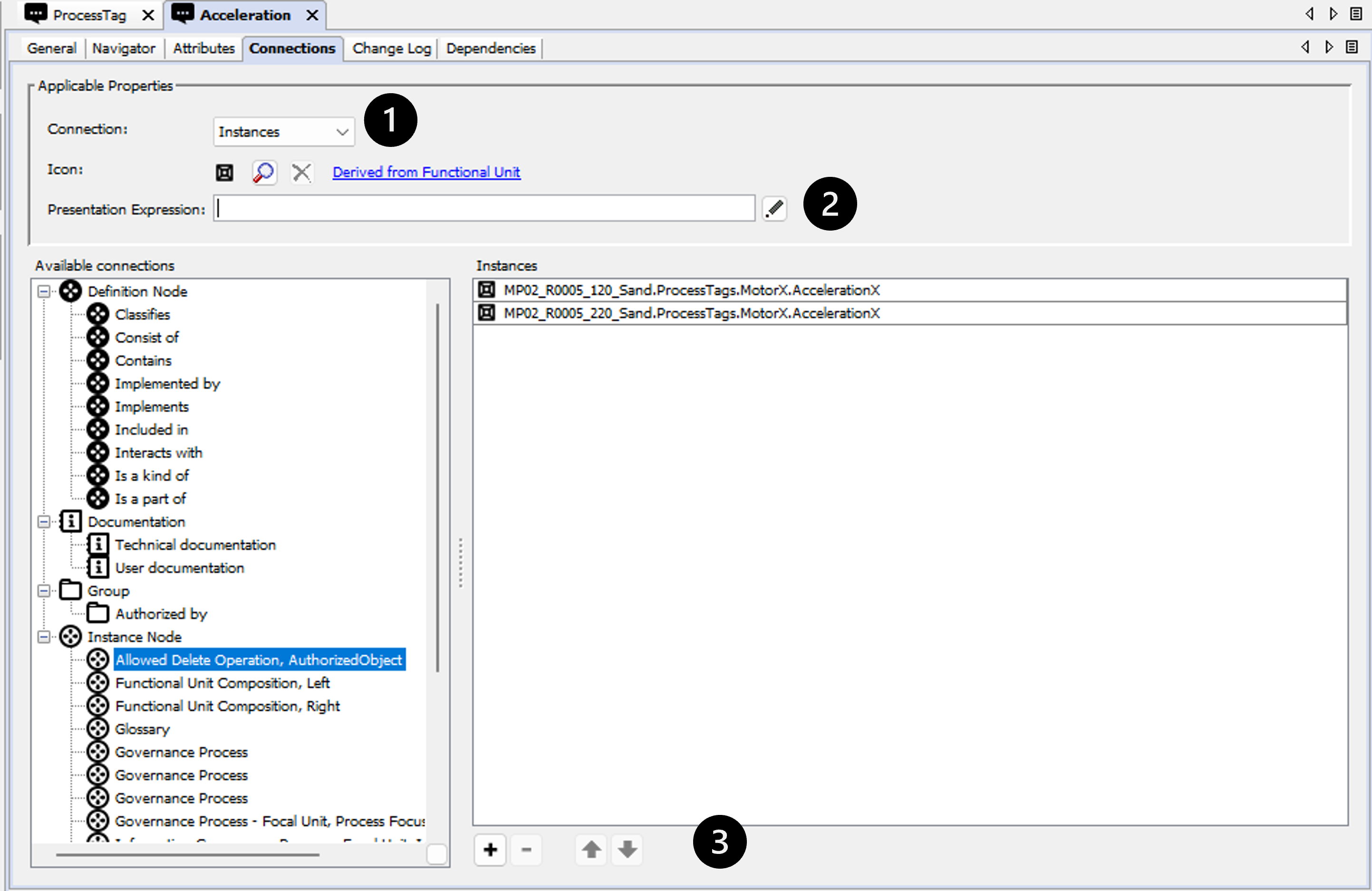
Connections
The most common adjustments are to either changing the icon on the instances Number 1, change the Presentation Expression, Number 2, and in some cases change the order in which the instances are sorted in the Navigation tree, Number 3.
Change Log
The change log tab allows the user to get an overview of the changes made to the unit, but also allows the user to undo certain (but not all) changes.
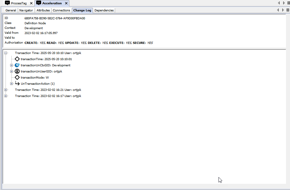
To undo a transaction the log level must be set to 2 or higher. Only transactions that consist of delete- and/or disconnect actions may be undone. Clarification: if the transaction contains an insert-, update- or connect action in addition to the delete- and/or disconnect actions, the transaction may not be undone. Other than that, if any of the objects involved in the transaction are updated after the transaction was executed, the transaction may not be undone.
The upper part of the tab holds the fundamental data. It consists of the following fields:
| ID | The global database ID of the unit. |
| Class | The kind of unit. |
| Context | The context the unit resides in. |
| Valid from | The date and time the unit is created. |
| Valid to | The date and time the unit is deleted. |
| Rights | The rights set on the object. If no rights are set, all rights are set to true (i.e. all users have all rights). |
The lower part shows the actual change occasions (transactions). Expand the transactions to see them in as much detail as the server settings has allowed it to be logged.
To Undo a transaction, right click the transaction and choose Undo transaction.
The only changes possible to undo are those involving the deletion or disconnection of a unit from another unit. In addition to that, to undo a change, none of the units involved may have been changed.
Dependencies
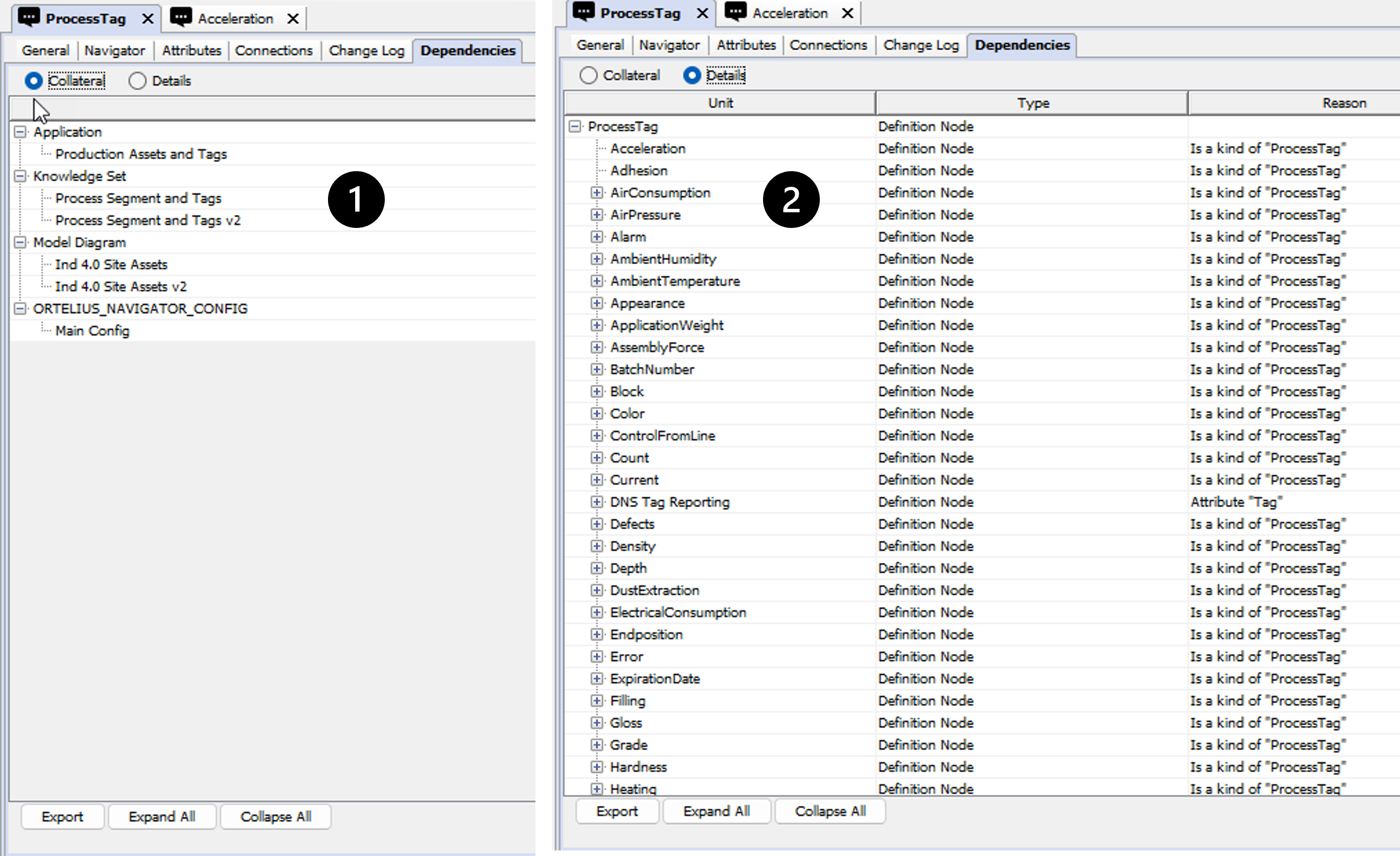
The dependency overview has been added as a tab to a Node when viewed in model builder, to supplement the usages functionality in the web interface.
Dependencies is a powerful governance tool to trace where and how objects are used throughout inorigo®, to understand the impact changes will have on that unit.
Collateral (Number 1) displays the most critical dependents for an unit, listed under the following classes
- Applications
- Data Sources
- Knowledge Sets
- Methods
- Process Unit Definitions
- Resources
Details (Number 2) displays all dependents for a unit in a recursive structure that can be traversed to view the whole dependency chain.
Tabs
| Unit | Type | Reason | Remark |
| Lists the object names that are dependent of the current object | Lists the class/type of each dependent object | Describes what causes the dependency | Describes what unit/class/component that causes the dependency |
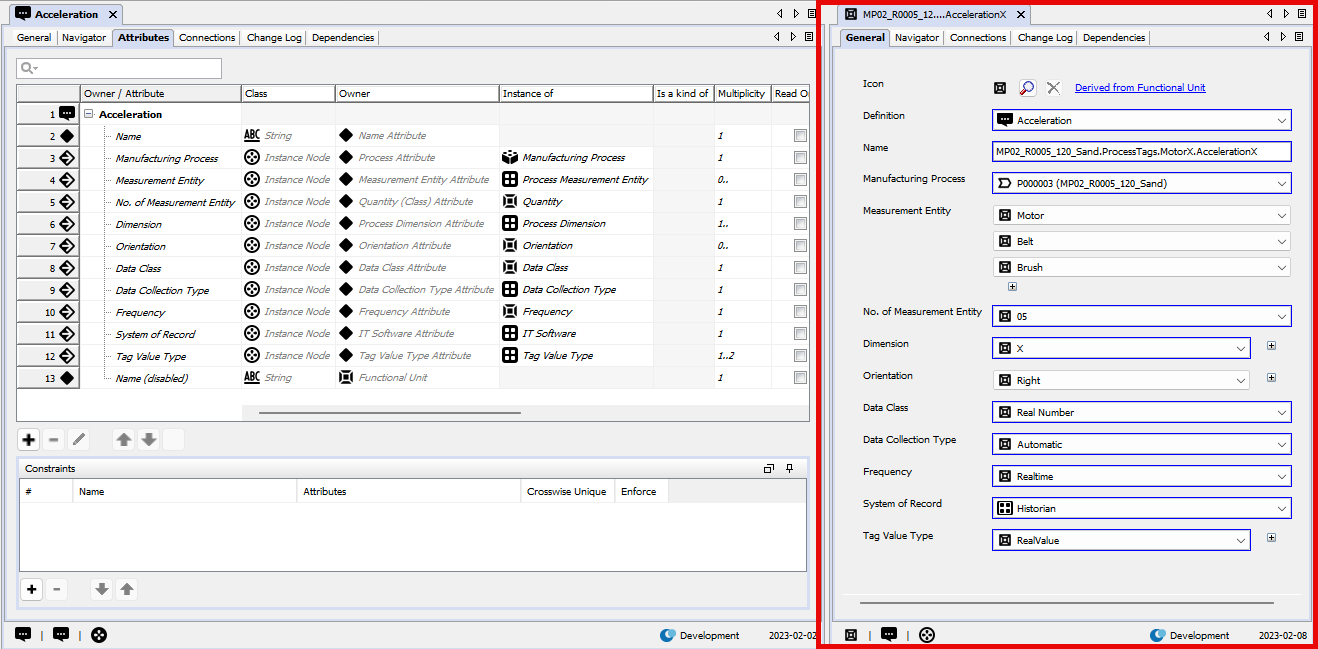
TABS - Instance Node
The one TAB that differs from the Definition Node is the General TAB. The Instance Node tab displays the Attributes as Fields in a Form, defined by the Definition Node. In the Example below since the MP02__ Instance is Defined by the Acceleration Definition Node then the attributes are Sorted in the same order as they are defined.
Not the following:
- In the Model Builder Every instance has an Extra Field namely Definition which is always placed at the top. The same Instance could have multiple Definitions with their attributed added respectively.
- In this example most attributes are Defined as instances from another Definition Node and hence the instances appear as value list object for each Field. As an example the Manufacturing Process must be selected from the Manufacturing Process instances.
- Note the measurement Entity with the multiplicity set to 1.. , by the Acceleration Node, which means there can be more than one value selected like in the examples showing Motor, Belt and Brush.
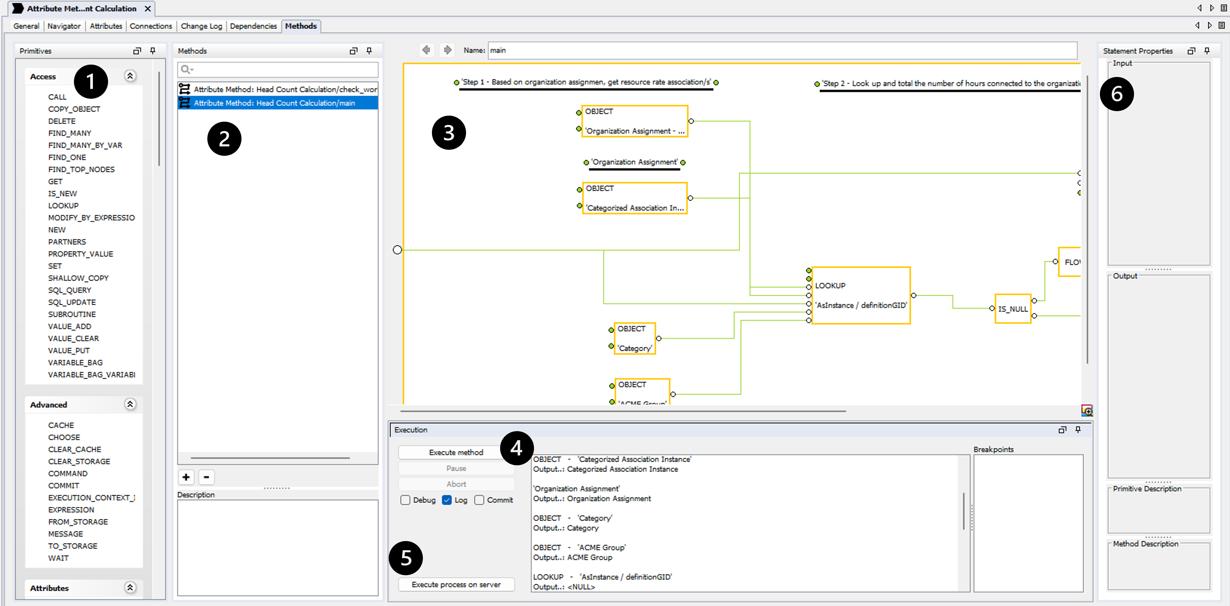
TABS - Process Definition
Process definition objects has an extra TAB named Methods tab, where you can design automation flows. Please note that the methods will be deprecated and replaced by a non proprietary execution framework.
Methods tab
Methods can be used for a variety of purposes, integration; import or export, calculation, validation, messaging etc. The method tab is only visible for the Process Unit Definition entity, i.e. a method is always associated with a process. Generally you identify a method by the name of the process unit definition and the method, e.g. My Process Unit Definition / My Method. Unless you specify a method name, the method engine will assume that there is a method called main. If no such method exists, an exception is thrown stating that the method is missing.
The methods tab contains several components and this is a short description of their purpose.
-
Primitives
- This panel contains all primitives that can be executed within a method. A primitive performs a (relatively) simple and well-defined task. The functionality ranges from adding two integers to creating Excel- and XML-documents to performing complex queries to the inorigo® database.
-
Methods
- The panel contains a list of all methods associated with this Process Unit Definition. You create and delete a method by clicking on the plus or minus-button at the bottom of the panel. The filter box at the top allows you to filter the list of methods.
-
Method panel
- The method panel is where you “drag and drop” your primitives and in- and output links to define your method. You specify in- and output parameters to the method by holding the CTRL-key down and left-click on the left hand side of the panel. In the picture below there is a single input visualized as an empty white circle.
The procedure is the same when you want to add parameters to a primitive statement inside the panel; hold down the CTRL-key and left click. When you want to submit a value from one statement to another, select the in- our out-parameter, press the SHIFT-key and left click on the next parameter. IF you want to create a synchronization line, hold down the CTRL-key instead of the SHIFT-key.
The Back and Forward button at the top left of the panel allows you to navigate through the history of selected methods. The Name text field allows you to change the name of a method.
- Right click on the panel and you will get the available primitives as a popup-menu along with the possibility to Copy the selected primitives or entire method, and Paste it into another method or instance of Inorigo® Model Builder.
Please note that the input and output does not automatically follow the method, need to be added manually.
- If you drag and drop another method onto the panel a CALL-primitive is created with the proper name. If you press CTRL at the same time a FOR_EACH-primitive is created. Pressing CTRL+ALT while dragging the method will create a SUBROUTINE-statement with the correct method name.
If you drag and drop a bookmark (query) onto the methods panel, two primitives are created, OBJECT and SEARCH. This behavior saves you the effort to add the objects separately since you always want to associate the two primitives with each other.
- To add in- and output parameters to a statement you should position the mouse cursor directly to the left (input) or right (output) of a statement until the cursor changes to a +. Hold down CTRL and left-click with the mouse and a new parameter should be added. You can also select a statement and press CTRL+I to add input and CTRL+SHIFT+I to remove resp. CTRL+O and CTRL+SHIFT+O for output-parameters.
- The method panel is where you “drag and drop” your primitives and in- and output links to define your method. You specify in- and output parameters to the method by holding the CTRL-key down and left-click on the left hand side of the panel. In the picture below there is a single input visualized as an empty white circle.
-
Execution
- The execution panel allows you to execute the currently selected method. The Execute method executes the method on the client, while the Execute process on server submits the task to be performed by inorigo® Engine. Executed on the server, the application waits for the method to complete in the background, allowing the user to continue working with other parts of the application. The user is also granted an option to abort the execution.
-
Background processes should be performed by the inorigo® Engine while other tasks can be performed on the client. Please remember that if you have references to external resources such as files or URLs, they are probably not the same from the inorgio® Engine’s perspective as from your client machine.
- If you check the Debug only one primitive statement will be executed and then you have the possibility to Step to the next one or Abort. This is intended for debugging purposes.
- The Log check box is a way to reduce the amount of log-information that is shown in the log text area. In some cases the sheer number of method and primitive invocations may cloud the overall picture of the execution. It is recommended to uncheck the box if you expect the method to be a long running execution; the output may consume all memory thus making the invocation impossible. Please note that if the method is executed by the inorigo® Engine, this has no effect.
- The Commit-flag instructs the method runner to perform a commit or not. In many cases you are only interested in retrieving data, not updating it, then the commit-flag should be set to false. You can consider it to be a “read only”-flag, i.e. no updates will remain.
- The Breakpoints-table contains breakpoints set on different primitives. Select a primitive statement and press CTRL+B and the breakpoint will appear in the list. Press CTRL+B again to remove it. You have the possibility to activate / deactivate them and if you double click on the breakpoint the denoted primitive will be selected and the method will appear in the method panel. If you have an active breakpoint the method will execute until it encounters the breakpoint and then it will stop. Breakpoints only have effect when running the method on the client.
- If you check the Debug only one primitive statement will be executed and then you have the possibility to Step to the next one or Abort. This is intended for debugging purposes.
-
Statement properties
- The properties panel allows you to specify input to the different primitive statements.
- The properties panel allows you to specify input to the different primitive statements.
If used and run a Method execution will be saved in the data base and found by help of the
Real Process Unit Occasion found in the menu, if it has been configured to be displayed there.
Running a method now only creates a Real Process Unit Occasion if the method is run on the server and the commit-flag is true (real occasions are not created for sub routines).
If a method fails, the Real Process Unit Occasion get a failed message in the remark field.
TABS - Resources
The General tab of a Resource unit looks slightly different from other General tabs, in that it has an image representation of the selected resource.
If you upload an SVG image you will not see what it looks like (Number 1)
If an image is uploaded like a png or a bmp (Number 2)you have the opportunity to have three different sizes, any other resource type only have the “full” size. The search button will open a file-dialog where you can select the desired file with the limitation that the resource type already exists, i.e. a file type which has an unknown file-extension may not be selected.
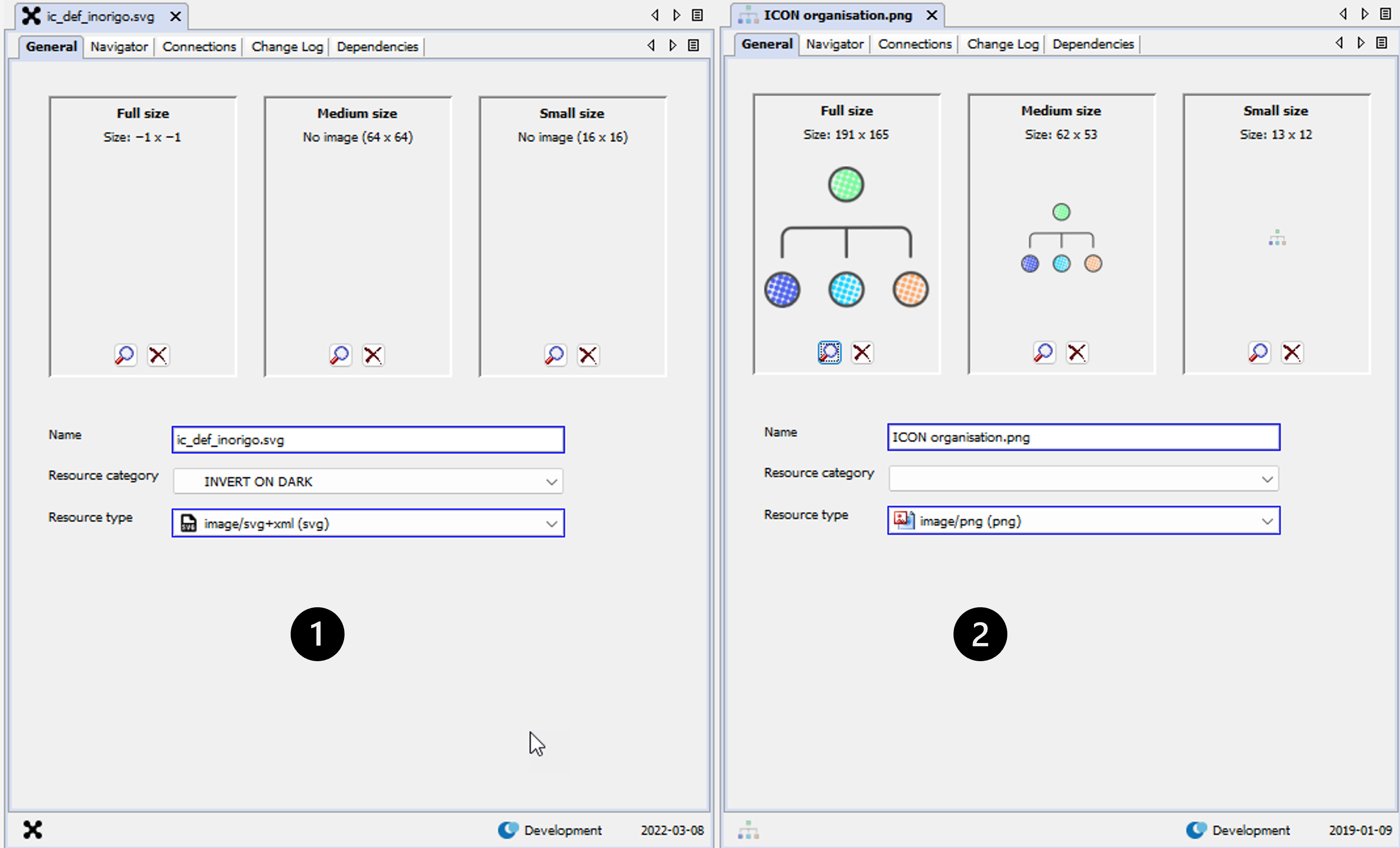
Note: To optimize application handling of images, only save the image once (in the appropriate size), and leave the two other image-size-boxes empty (the system will handle a downsize automatically). If the medium- and/or small sized images should be different from the full size (in other aspects than mere size), upload them separately by clicking the lookup buttons in each box. The Full Size should always be populated.
The Full Size should ALWAYS be populated.
The other two are intended for icons, to be used ONLY when you require a special representation for your image in smaller contexts. It might be that your original image is huge and causes lots of overhead when it is to be used as an icon, or the original image does not scale very well and therefor you need a custom icon version of the image.
Other than that, it is advised to leave the small versions empty, they will only cause redundant overhead and occupy space in the database and on the server.
The medium size field allows for a 64 x 64 pixels large image for representation of the full size image on the General tab. Double click on the representation image on the General Tab to open the full size image.
The small size field allows for a 16 x 16 pixel image for representation of the full size image in the navigation tree.
Image types supported are GIF, JPEG and PNG & SVG. Any other file type will cause an error message.
If you double click on any of the resource representations in the image areas the file will be saved in the system temp directory, e.g. "C://users{user}AppDataLocalTemp" as read only, and is opened in the associated program (if any). Optionally, click on and drag the image to any location.
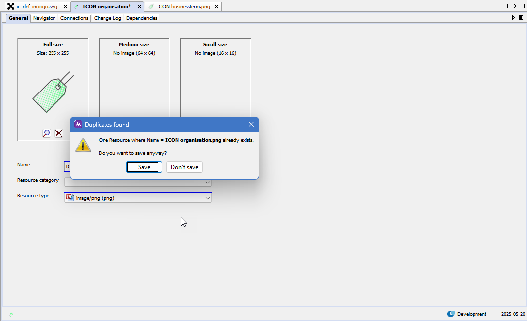
Selecting a Resource
When you are selecting a resource you will get the option to either select a file or an existing resource
If you select a file which has the same name you will be prompted to either update the existing resource or to create a new one. This feature prevents the risk of having duplicate resources in inorigo®.
Another way of adding a new Resource is to drag the source file into the Full Size area in Model Builder. The Resource Type will be detected automatically and a Name suggestion will also be provided as illustrated below:
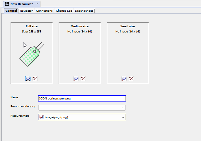
The dragging of Resources is bi-directional, which means it is possible to drag the Resource back to any client computer.
Resource Update
An update of a resource will immediately refresh the display of the resource throughout the application. There is one exception though; static icons & images in user interface elements (such as buttons, menus and toolbars) are NOT guaranteed to be refreshed directly as a resource is updated. If the icon is located within a document tab or an Application a mere reopen of the tab or Application will show the new icon. In other cases it may even require a restart of the entire application in order to refresh certain elements.
Temporary Matrix
The temporary matrix is a tool to provide a quick and easy way to handle large bits of information in no time. The look and feel is similar to common spreadsheet-applications with which it also shares much of its controls for operations like copy, fill-down, cut, paste and delete data in multiple cells in one go. It also supports copy and paste data to and from spreadsheets. But beware – this is not a spreadsheet application.
The content of the cells are richer, i.e. they may contain one or several inorigo® entities which may in turn control the behavior of other objects displayed in the matrix. So – there is a lot more under the surface than in an ordinary spreadsheet application.
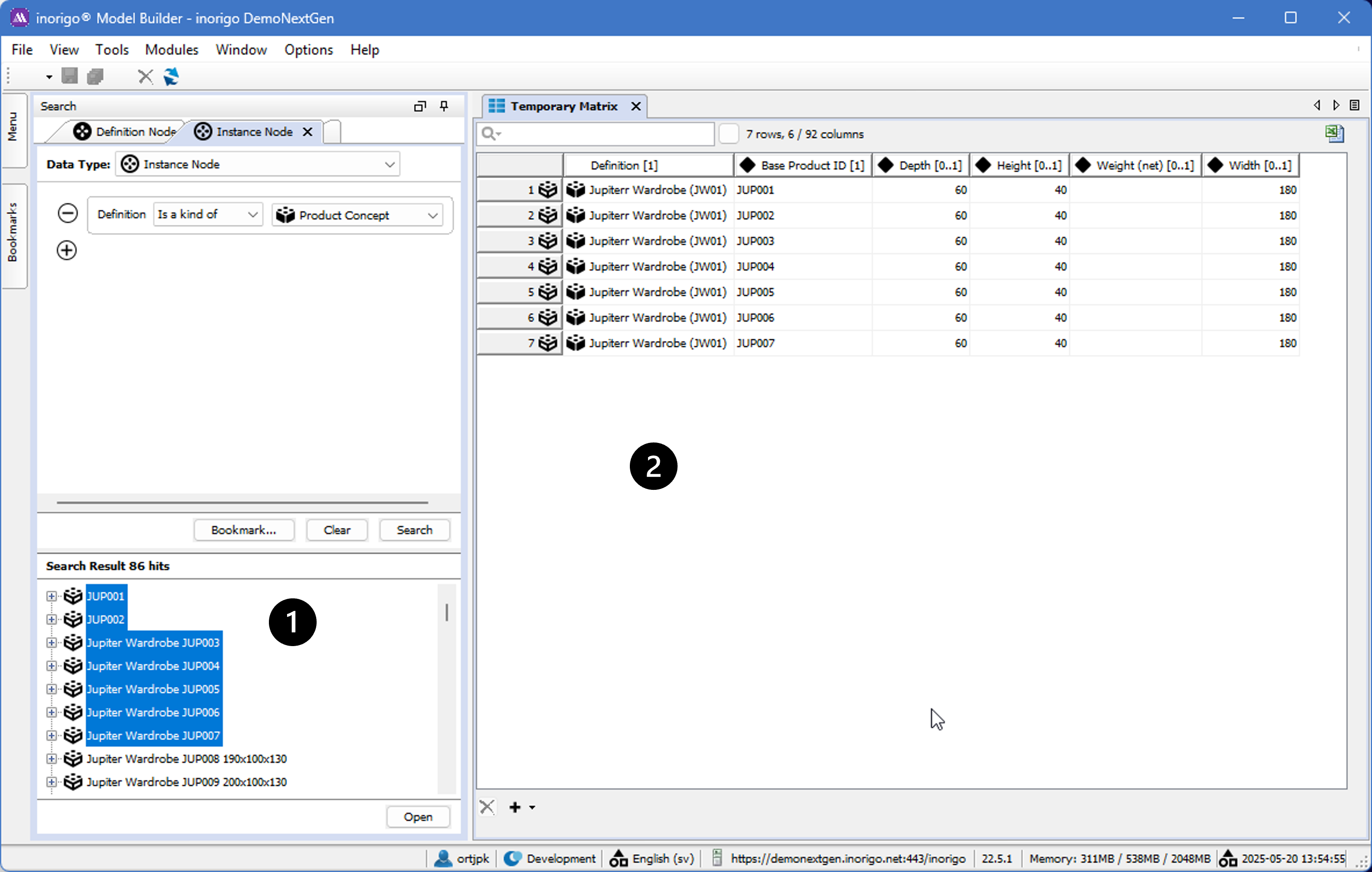
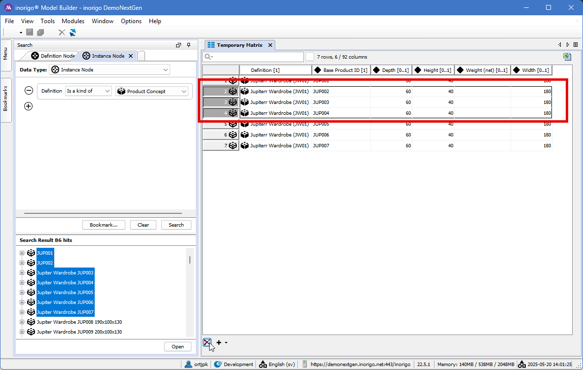
One common way to open a matrix is to select a number of rows in a search (Number 1) and the right click on the selection and choose the Open in Matrix option.
The objects will be opened with the attributes as columns besides the Definition. (Number 2)
The matrix is about offering the ability to handle units of information of different kinds, from numbers, text and images to geopolitical units or user defined objects with complex relationships to the world around them. Besides supporting rapid editing of large quantities of data, the matrix also gives the user the option of sorting the data and hiding or rearranging columns to increase overview.
Matrix overview
Each object opened in the matrix gets columns holding information on the icon of their type (in the first column), definitions ( ) when applicable, inherent attributes ( ), defined attributes ( ) and relations ( ). By default the columns containing relations gets hidden, as they sometimes take up a lot of room and is not as often edited in the matrix; but these can easily be displayed.
One exception exist though; the “Is a kind of” relation is displayed when applicable in the Generic Domain since it is commonly used (Generic Types, Generic Units and Association Definitions).
Following the icon and name in each column header is the information on the multiplicity of the data. For all units of information where the multiplicity has not been set in any way this will read as “[0..]”. Multiple objects in the same cell are separated by semicolon (;).
If any special ordering is set for any column its multiplicity information will be followed by an icon signifying ascending ( ) or descending ( ). The number 1 signifies that this sorting is the primary out of many possible.
On top of the data grid is a search field for filtering.
Below the grid you find a delete button ( X) and an add button ( + ).
Editing data in the Matrix
Maneuvering in the matrix is very similar to common spreadsheet applications, with the slight exception of the different functionality of the Home-button:
| Move around between cells | Up / Down / Right / Left |
| Move to the cell below | Enter |
| Move to the cell to the right (unless you are in the rightmost cell) | Tab |
| Move to the topmost cell | PgUp |
| Move to the bottom cell | PgDn |
| Move to the last cell in the row | End |
| Select the whole row | Home or click in left margin |
| Edit | F2, double click or first character of value to input |
| Copy | Select cells / rows + Ctrl + C |
| Cut | Select cells / rows + Ctrl + X |
| Paste | Select all target cells or simply the initial cell + Ctrl + V |
| Fill down | Select source cells (topmost) and target cells (below) + Ctrl+ D |
| Fill down Series | Press Shift+Ctrl+D to create a series of values where each new row will be increased by one. Supported classes are: |
| Delete values | Select target cells or rows + Delete |
| Delete rows | Select target row(s) + Delete or press the delete-button ( X ) that’s below the grid. If rows were added (and not saved) pressing the delete button will immediately remove the rows. Deleting previously saved rows only marks the rows as deleted. They are not removed until the save button is pressed. To un-mark delete marked rows, just select them and press the delete button again. |
| Add new rows | To add one new row: Press the add button ( + ). To add several new rows: Press the downward arrow on the add button and choose 5, 10 or enter a custom amount of new rows. |
| Reload | Ctrl + R or press the reload button ( ) in the application toolbar or the File menu. |
| Save | Ctrl + S or press the save button ( ) in the application toolbar or the File menu. |
| Export to Excel | Ctrl + E or press the “Export to Excel button ( ) to the right of the filter field. |
Beware that no changes, including deletion, will be committed until you have saved. If you regret the changes you have done since your last save you can undo them by reloading the data. Also note that you have to leave a cell after you have edited it for the system to beware of the change and to able to save that change. It is not possible to save only some changes while not saving others. This applies even if you have applied a filter or have hidden columns.
Notes on copying and pasting information from outside sources
Copying certain data from spreadsheets may require a little bit more effort due to its special formatting. In that case this formatting has to be reset:
-
Select the data you want to copy from your spreadsheet application.
-
Reset the formatting can be done through either of two ways:
- If you can find an Autoformat-option in your application (often accessible through the pull down menu: Format Autoformat): Select its none or no formatting-option and press OK. Check that your data is still selected.
- The alternative approach: Copy the data. Either do a Paste Special to a new spreadsheet or a normal paste to any simple (that does not support formatting) text editor. Now select again what you just pasted.
-
Copy selected data
-
Select the target columns/rows in the temporary matrix in inorigo® Model Builder.
-
Paste
Although this procedure does the trick in most cases, situations exist where a more manual approach is necessary. One such is when you need data from cells containing line breaks in certain spreadsheet applications. To properly get the data from these cells you have to enter each cell, select and copy its content, enter (not merely select) the target cell in the temporary matrix and then paste.
To paste a value from an outside source to a cell that allows multiple values is no different than pasting data to any other cell. To paste multiple values from an outside source to a single cell in the matrix is also very simple. First check that the column (the attribute) of the target cell supports the amount of values you want to paste. Then, before you paste, just make sure that all values are delimited by a semicolon, much like multiple respondents in an email.
Copy/Paste of nameless units
The temporary matrix also supports pasting units that doesn’t have a name. A nameless unit is for example an Association Instance or a Specific Unit without a name.
The copied values must either correspond with the association presentation names (as plain text) or, also valid for Specific Units, their Global IDs.
Examples: The Employment Association instance, e.g. “Jens is employed at ACME.inc”, may now be pasted either as a plain text or with its Global ID (e.g. “74E520EA-F152-430A-B59C-AD6F4A8205F4”) found on the Change Log tab. The unnamed Specific Unit “#3FBBA67D-1775-1700-8C3F-A322009A4D26 (Chair)” may be pasted with its presentation name (“#3FBBA67D-1775-1700-8C3F-A322009A4D26 (Chair)”) or just its Global ID (“3FBBA67D-1775-1700-8C3F-A322009A4D26”).
Selection and row deletion
Row Selection
As the user selects entire rows by clicking (and dragging) in the row header part of the Matrix component, the row header will render as a blue pressed button. The data area will render a selection border around the outer perimeter of the selected cells.
Cell Selection
As the user selects individual cells by clicking (and dragging) in the data area part of the Matrix component, the row header will render as a gray pressed button. The data area will render a selection border around the outer perimeter of the selected cells. Also there will be a bold border around the last cell selected, this indicates the focused cell (which is not applicable during row selection).
The rendering of row header color is dependent on component focus, so while other windows or Applications are in focus rather than the Matrix component, the Matrix might render gray row headers even if rows were selected. They will become blue again as soon as focus is switched back to the Matrix component.
Row Deletion
To delete an entire row, the row must be selected (it is not enough to select all cells in the row). If the row is selected, deletion of it is enabled both via the delete button on the keyboard and the delete button underneath the matrix ( X ). If the row unit may not be deleted (due to links to other units) the delete button underneath the matrix is disabled and pressing the keyboard delete button has no effect.
Deleted rows are not immediately deleted, but only marked for deletion until the matrix is saved (see the image below). The exception to this is if a row is added, but not yet saved, and then deleted. In that case the row will be immediately removed.
To undo (not yet saved) deleted rows, select the rows marked for deletion and press the delete button again. This will remove the row deletion marks. It is also possible to reload the entire matrix ( ), but then all changes are lost.
Cell Content Deletion
When cells are selected (as opposed to rows) the delete button underneath the matrix is disabled and the delete key on the keyboard can be used to clear cell content.
Note that any change in the matrix will mark the Temporary matrix* with an asterix.
Adjusting the view of the data
There are three different ways to set how and what data is shown in the matrix: filters, column-setup and sorting.
Applying a filter
Applying a filter to the data in the matrix is an easy way to find and view only the rows matching a certain text typed criteria. This can be done straight away by typing in the filter box.
For more advanced filtering, press the magnifier icon to reach filter settings. The first section of these settings set which columns the filter applies to. The second section sets whether the filter should differentiate between upper- or lowercase letters. The third concerns whether filter should permit the use of joker characters (like % and *) and the forth is how the filter will match your filter string: from the start, exact match or everywhere match.
Adjusting columns setup
To rearrange the order of a column just hover the mouse pointer above its header, hold the left mouse button down and move the column to wherever you like.
To set the width of a column just let the mouse pointer hover a bit to the right or left of the border connecting two columns. The pointer will change into a double-sided arrow and you are ready to adjust the width. To auto resize any or all columns, hover above its header and right click to get a menu with these options present.
In this right click-menu you also find options of hiding current column, showing/hiding all columns and all relation columns. At the top is the option More… which brings up a dialog box containing the column names and check-boxes, making it easier to set the visibility status for many columns at the same time.
Add calculated column
The option “Add calculated column…” available from the context menu, allows you to insert a new column right on the spot where command was issued (context menu). The expression field make use of the input object (@Y_Object) and can invoke any expression function available in inorigo®. The example below shows where you have an object which has the attributes Amount and Tax and I’m interested in showing the tax percentage, i.e. 100 * (Tax / Amount).
The option “Remove this column” available from the context menu in Edit mode, allows you to delete a calculated column right on the spot where command was issued (context menu).
It is not possible to remove any non-calculated column, i.e. columns with data from definitions ( ) when applicable, inherent attributes ( ), defined attributes ( ) and relations ( ).
Web rendering enables other interpretation than default; Link and Html.
| Link | Render column cells as a link to web page. In the Application, the content of the cell will be a clickable link, i.e. the text string “http://www.ortelius.com” will be converted into http://www.ortelius.com |
| Html |
There is an option to add dynamically calculated cell values to the matrix, but this option will be deprecated.
Sorting the data
To sort the data, click the column heading you want to order by. The first click will set up a sort of ascending type. A second click on the same header will change the sort to descending and a third ends the sort on that column.
To sort rows based on many columns at the same time, hold down CTRL and click as described above. There is no limit to how many additional sorts you can apply.
Note that the sorting you set up wont effect coming changes to cells and rows. The way to reenact the sorting is simply to redo the clicking of column headers you want to order by.
Notes on concurrency
In inorigo® Model Builder it is possible for multiple users to be logged in and work simultaneously with the same or connected sets of data. This becomes even more important when it comes to working with data through the matrix. Whenever any changes has been made from outside to the data you are currently working with, the matrix will automatically update the concerned cells and rows.
The only exception to this is if a user is currently in edit mode in a cell with data that is updated from somewhere else. In this case the matrix will report unsaved changes to the cell, even if the user hasn’t made any changes, because the value in the cell differs from the saved value. If the user saves his value will be saved, if the user reloads the value in his cell will be as consistent as the rest of the cells with the current “real” data.
Limitations
There are a couple of known limitations of the matrix:
- It is not possible to view/edit objects from different information domains within the same matrix. This is a consciously set limitation and exist for a couple of reasons. First off this paves the way for a use of the matrix which encourages a cleaner look and overview of the information being worked with in the matrix. With just a couple of objects from different information domains the matrix would be quite stretched horizontally and the user would need to, either do a lot of scrolling, or showing/hiding of attributes (or relations) as they moved down and up their rows of different data. Another reason is that a limitation like this makes the matrix more maintainable behind the scenes and thus easier to improve both in the areas of functionality and performance.
- For this version of the matrix the handling of complex attributes is no longer supported. Legacy still support the existing complex attributes to avoid inorigo® upgrade issues. It should be considered to remove complex attributes at customer sites.
- Beware when deleting many units at the same time. Since the matrix performs a single delete for every unit, the operation may be time-consuming, i.e. although the application seems to hang, the operation continues in the background. Currently there is no “bulk”-delete, if this functionality is deemed to be important it may also be implemented in future version of inorigo®.
© 2025 Inorigo AB. All rights reserved.